Task 3.1
The scenario is that you have been contacted by a local animal rescue organisation with an existing website. You need to create a low fidelity prototype (wireframe) for the dog category page as well as a profile page that displays the features of each individual dog. The category page needs to show the dogs that are available for adoption. Make space for 15 dogs on the page.
On the individual feature page, users can see the following (in any order that you choose):
- Dog’s name;
- Dog’s photo;
- Dog’s description;
- If the dog is good with cats or not;
- Dog’s age;
- If the dog is house trained;
- Dog’s size;
- If the dog is good with children or not;
- Dog’s gender;
- Dog breed (if applicable);
- Link to a form that they can use to book a visit with the dog.
Step 1
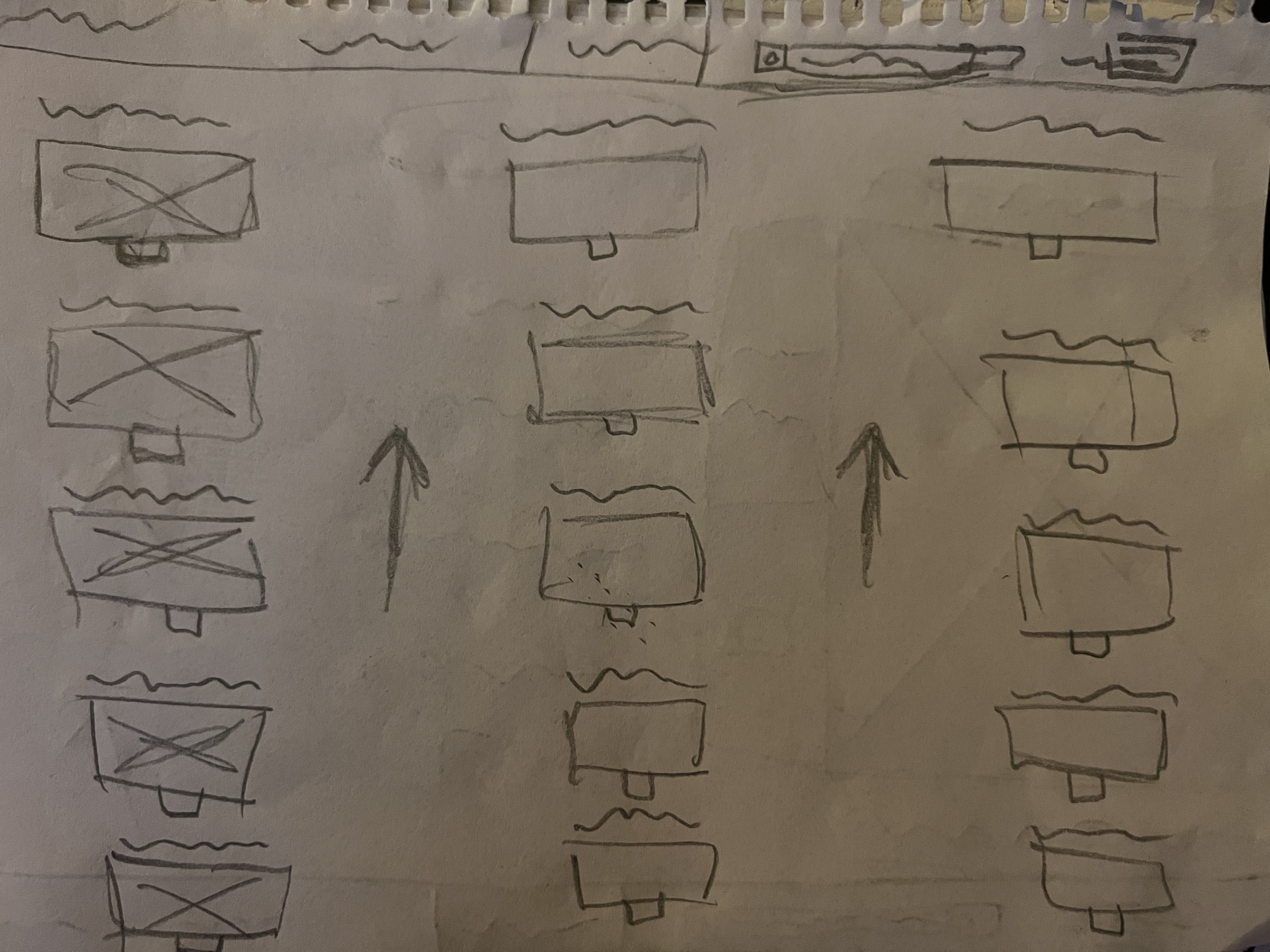
Ideate and create low fidelity prototypes (pen and paper sketches) to show how the dog category page might look. Aim for at least three different options to practice ideation – each on a different sheet of paper.
Result:
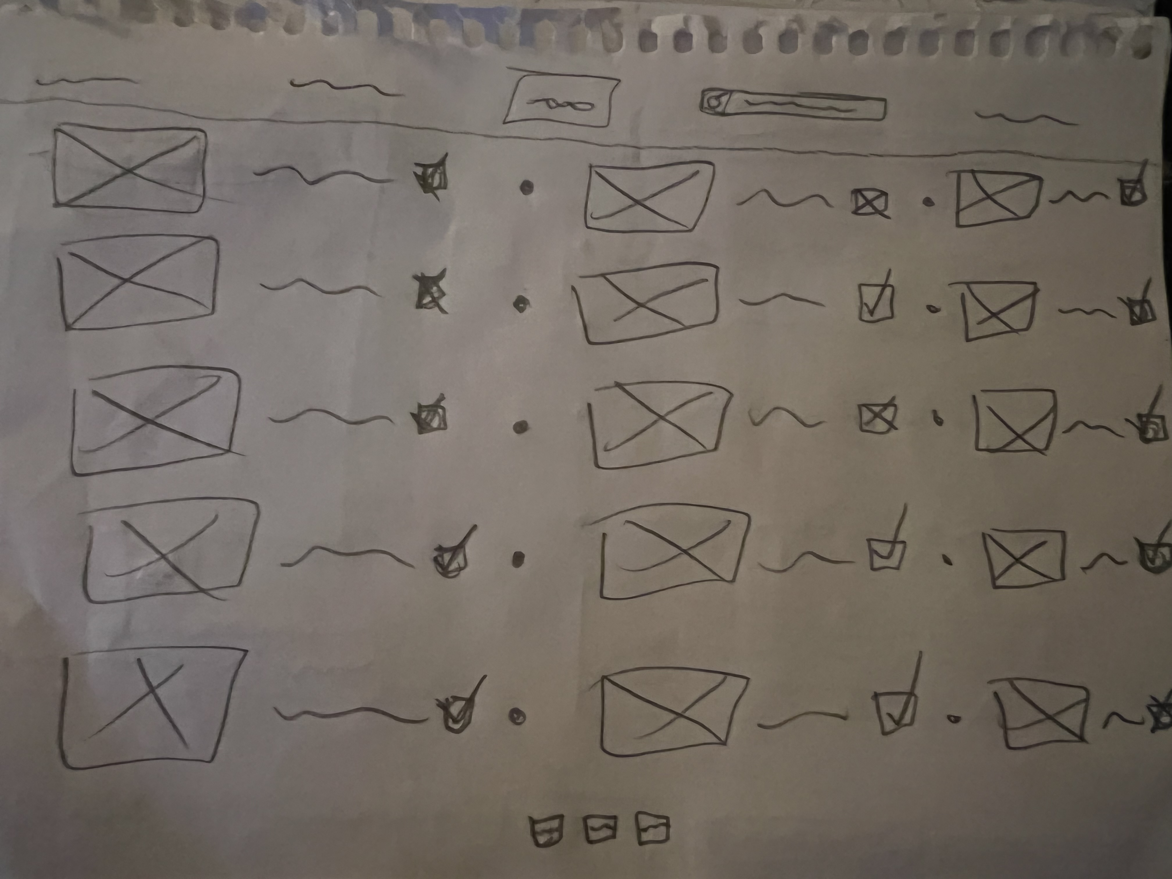

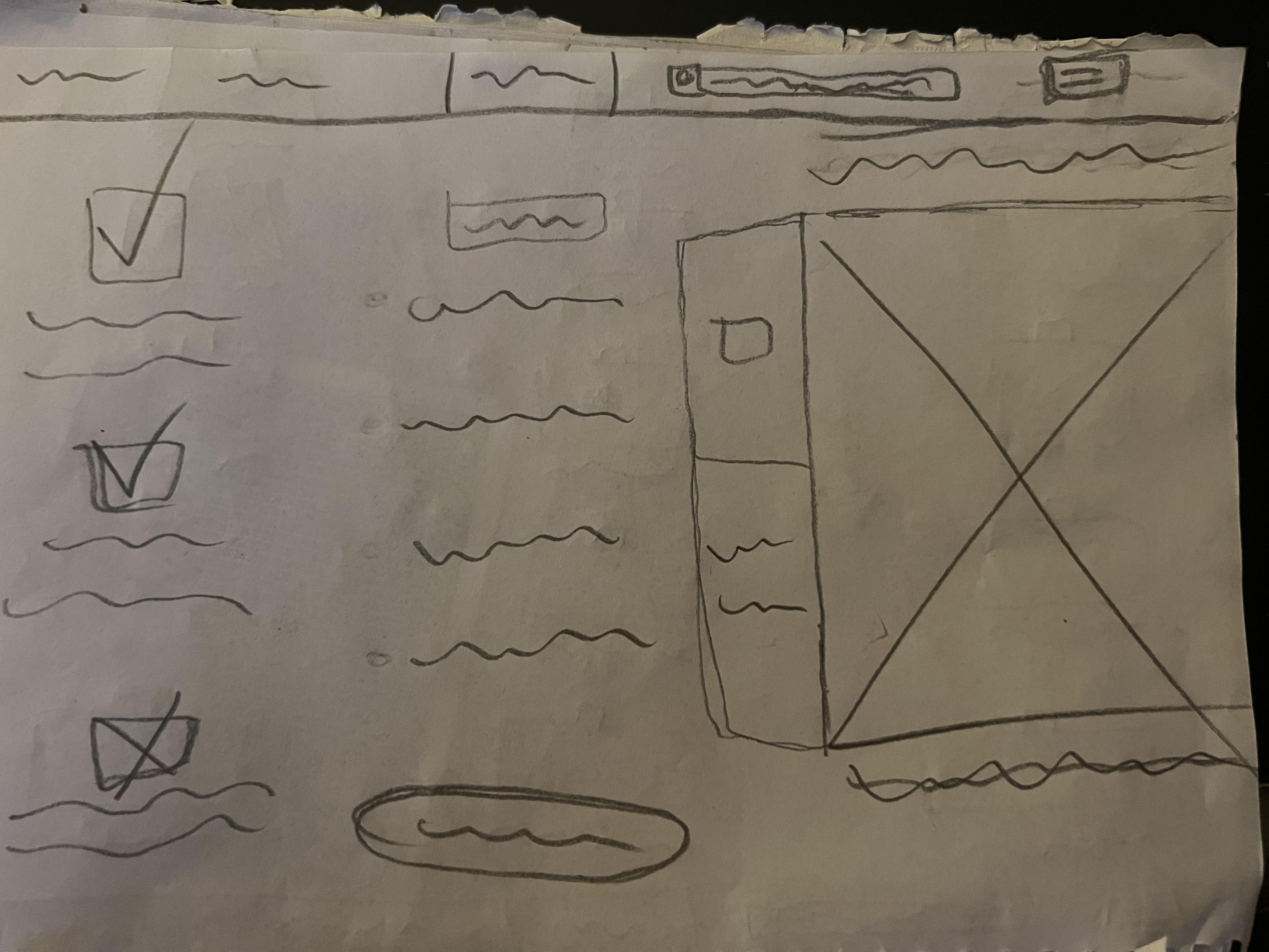
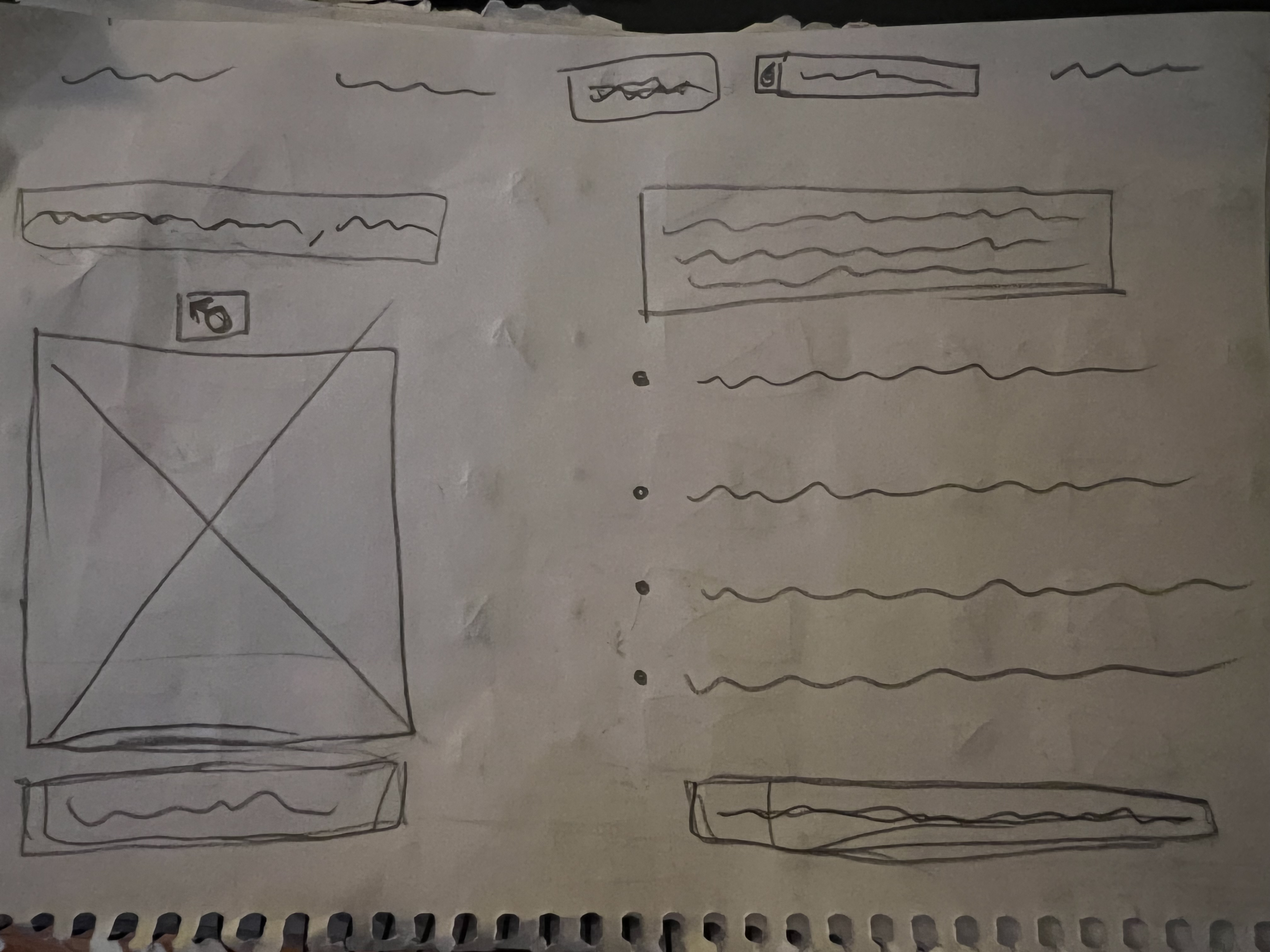

Step 2
Critique your own options and use the best aspects to create a new, more refined sketch. This should still be a low-fidelity prototype (pen and paper sketch).
Step 3
Ask for constructive criticism from friends or family. (i.e., how you can improve the UI design). Use their feedback to further refine the sketch. This should still be a low-fidelity prototype (pen and paper sketch).
Result:


Task 3.2
Follow along with these tutorials to create a low-fidelity wireframe in Adobe XD and Figma and decide which software you want to work with going forward.
WATCH:
Tutorial: Adobe XD
Tutorial: Figma
After trying out both softwares, I like Adobe XD more.
Task 3.3
We have talked quite a bit about designing for smaller screens. In this lesson task, you’ll be tasked with redesigning the contact form of a mobile app to ensure some much-needed improvements.
Use what we have learned and apply it to your design. Please include these form fields in your design:
- Name;
- Surname;
- Email;
- Message;
- Call to action.
After an hour or so of testing in Adobe XD, this is a link to my result on this LT: https://xd.adobe.com/view/d3bb7438-104d-4ec7-a2e8-e3630d4b0b07-86e8/?fullscreen
Task 3.4
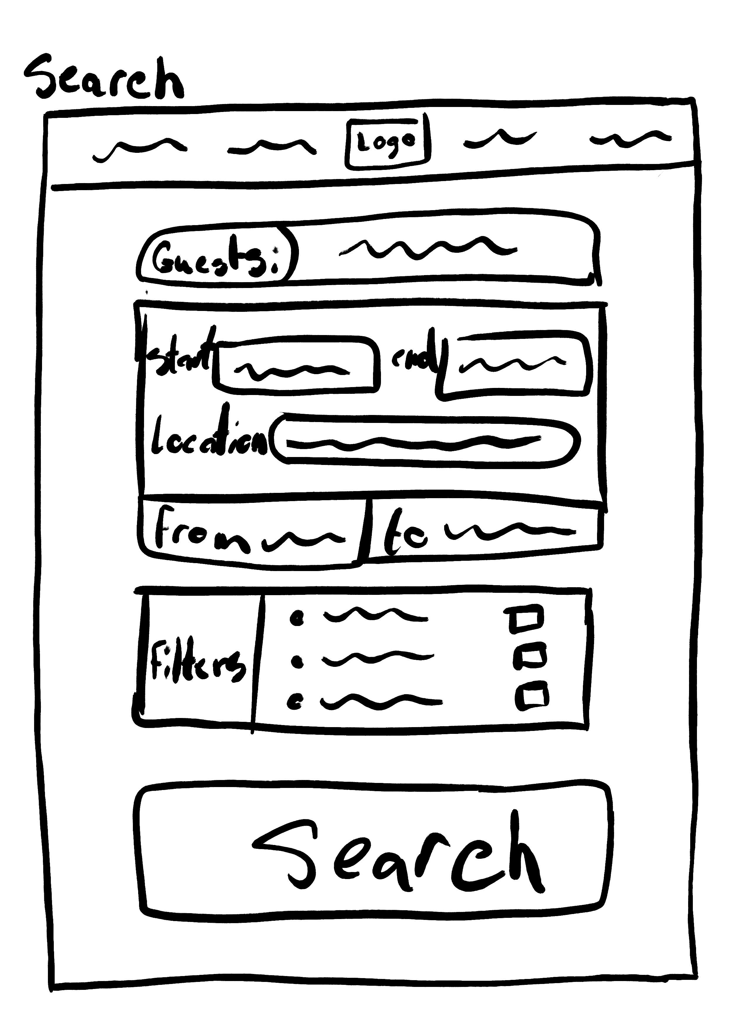
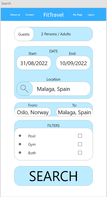
Create a medium-fidelity prototype for a new fitness website for travellers called FitTravel. The website is to be created to help people who travel a lot (for business or pleasure) find accommodation that has a gym or pool. Start thinking about how you would go about designing such a website from scratch. We suggest you start with ideation and then move onto wireframing to plan the layout of your User Interface Prototype:
Search:
- Users will want to enter a location (destination) to search for accommodation.
- Users will enter the dates of their trip (start and end)
- Users will enter the number of guests/travellers that need accommodation.
- Users will filter accommodation search results based on if they want access to a pool, gym or both.
- Users will hit search.
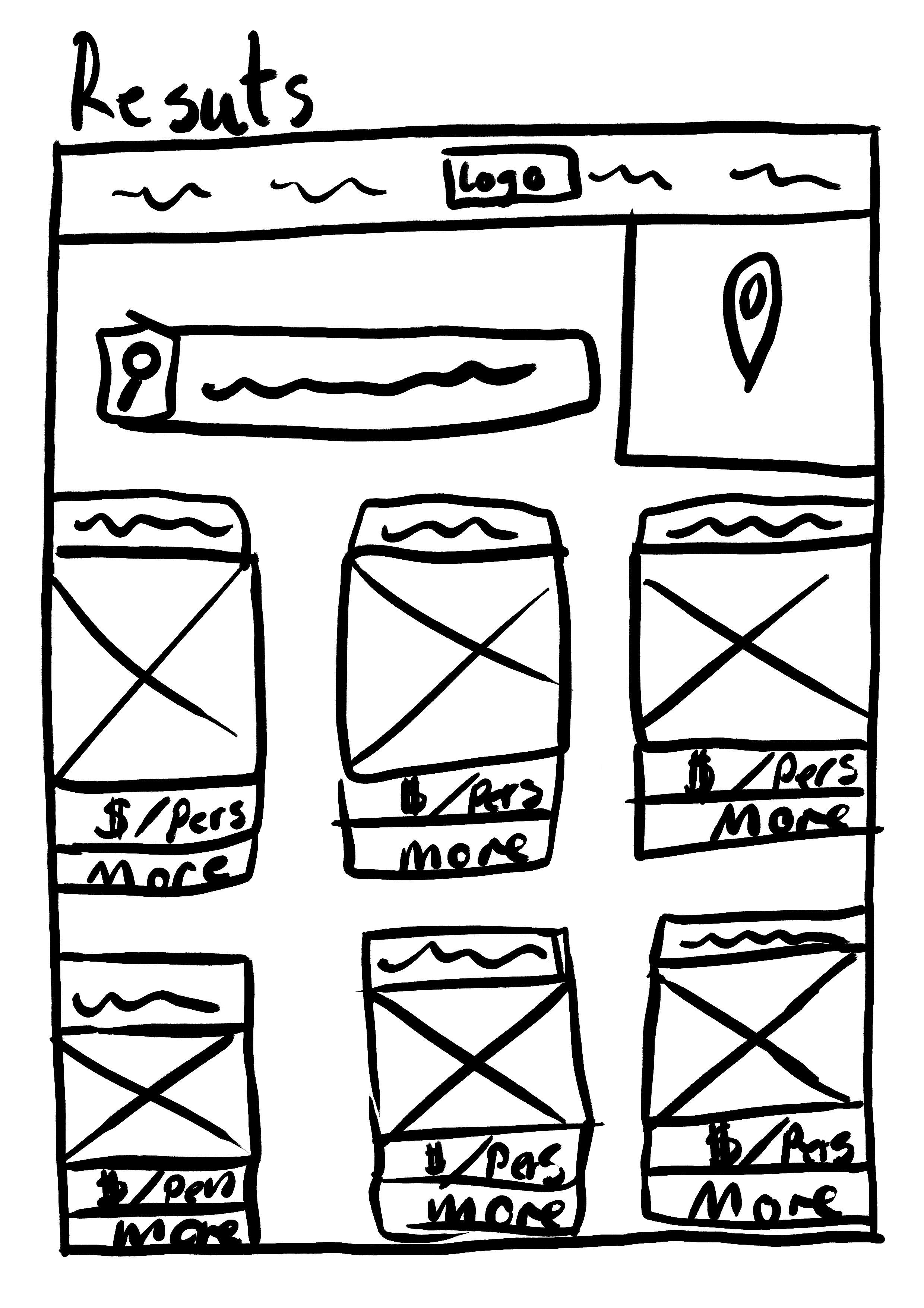
Results:
- Users will see a list of accommodation options for the available dates
- For each option in the list, users will see that establishment’s:
- Name;
- Single photo;
- The price per person
- A more information button.
Individual establishment page:
- When viewing a specific establishment, users will see that establishment’s:
- Name
- Multiple photos of the room, gym and pool (gallery)
- A short description;
- The price per person;
- A book button.
Users should always be able to navigate back to the previous view.
Post screenshots of both your low- and mid-fidelity prototypes, as well as a link to your mid-fidelity prototype in Adobe XD or Figma.”
This is the results of my prototypes:
Working link: https://xd.adobe.com/view/672b96f9-c6d7-4e7f-98bb-1d52f5fc328a-3278/?fullscreen
