Task 5.1
Ask two friends or family members to pick a nice-looking website at random. Study the website and answer these questions:
- What type of website are we looking at?
- Which industry is this website in?
- What is its purpose?
- Which different types of content are used?
- How is the content presented?
Pay attention to how the website looks visually and try to identify if there are any common design trends you might pick up on. Ask yourself if these design trends are common to a certain industry or type of brand? It’s also likely that certain designed trends are common to specific target audiences.
https://dbjourney.com/
- It is an E-commerce website.
- The website is in the travel industry.
- The purpose is to sell their products, which is mostly bags and backpacks for travel. There is also travel clothing.
- Shop, About us, Journal and search bar
- The content is presented in their own boxes and shapes with much negative space on the overall design.
https://www.wowhead.com/
- It is a community website.
- The website is in the gaming industry
- The purpose of the website is to have people talk to each other on forums, and giving necessary information about different games.
- News, Database, Guides, Transmog, Community, Shop.
- The content is presented more chaoticly, but it is categorized. There is also boxes for each content here and there.
Task 5.2
Part 1
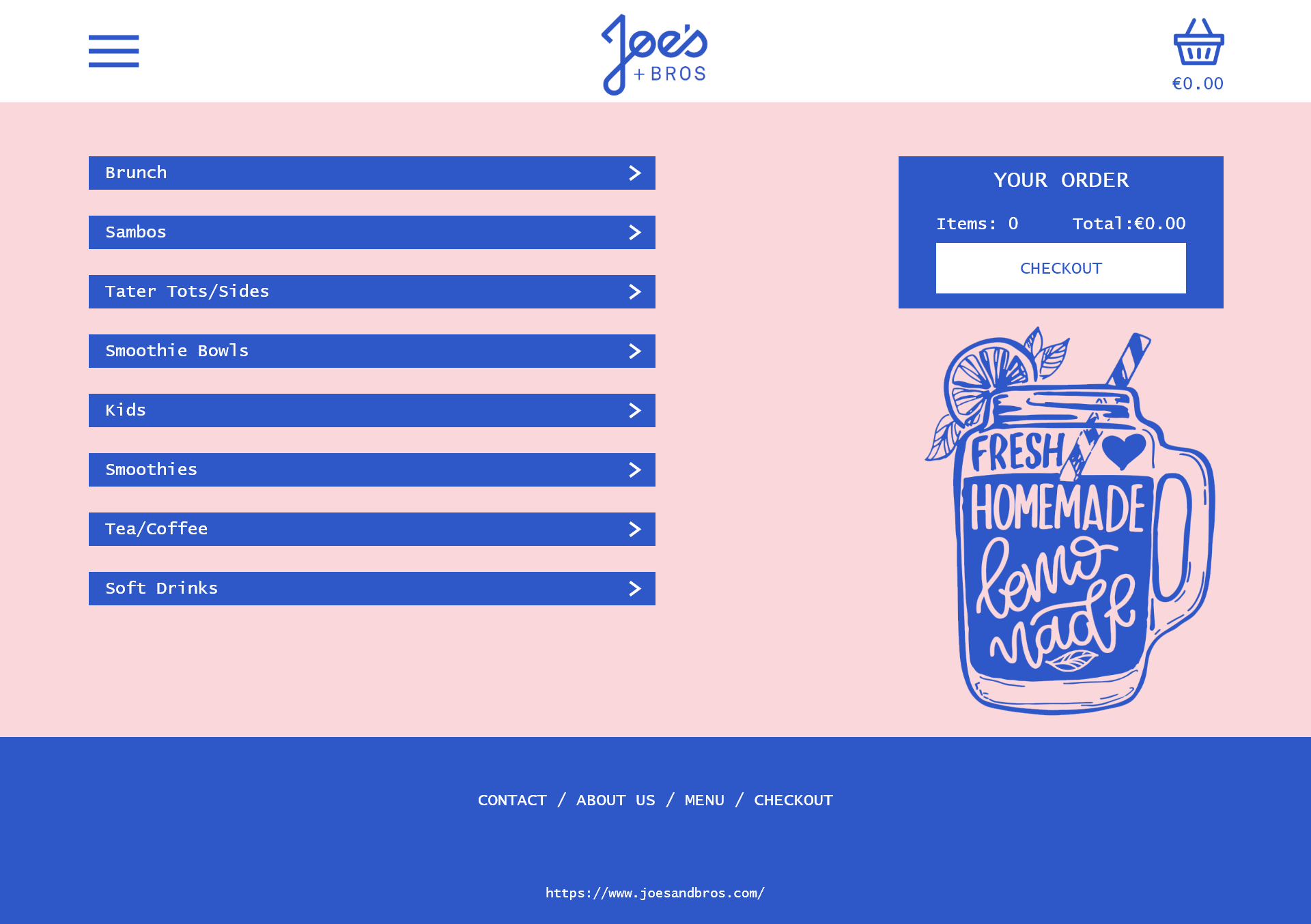
You’ve been tasked to update the Click and Collect section of the Joe’s and Bros website.
Use a prototype software of your choice to mock up one idea. You only need to do the first page of the menu (choose a location and click on ‘Start Ordering’ to open the first menu page you need to work on).
Firstly I did some general research on Joe’s and bros original website to get an idea of a color palette I could use. There I found out they use pink a lot for their backgrounds, so that’s what I went with. Then I tried to find a font that looked somewhat like theirs.

Part 2
Based on the website examples we have seen today, make a list of which other changes you would make to the Joe’s and Bros website?
Maybe use illustrations or images to represent the different dishes on the menu. Seperate the header/navigation more from the rest of the page.
Task 5.3
Part 1
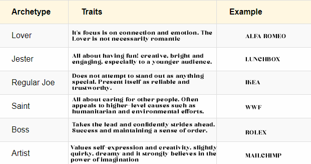
Create your own table with details about the archetypes we discussed today:

Part 2
If you were creating a brand for your own portfolio, to represent your personality, which archetype would you choose? How would this archetype be presented with the:
- Overall visual style (use three descriptive words)
- Fonts (choose two fonts)
- Colour (create a colour palette)
- Layout (use three descriptive words to define this)
- Photography style (use three descriptive words to define this)
I would probably choose the Artist archetype due to my overall personality.
- Colorful, Expressive, Illustrated
- Begika and Bronson

- 1 column grid layout, unique, spaceful
- Minimalistic, Nature, Motion blur
Task 5.4
You have been asked to design the brand and website for an eco-friendly zero-waste soap brand called: eKo. Think about which brand archetype you would choose and choose one or more website design trends that would work well for their website. Then, bring your ideas together by creating a mood board first.
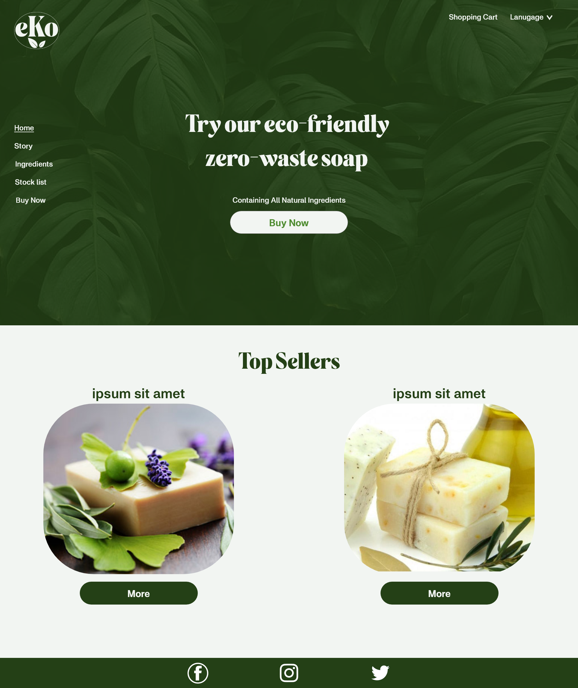
Proceed to create a high-fidelity prototype of the landing page, using Adobe XD or Figma.
Firstly I did some thinking about the archtype and trend I wanted to aim for. Due to the brand being eco friendly I decided a Tradisionalist archtype with a focus on the natural world trend for their website would be perfect.
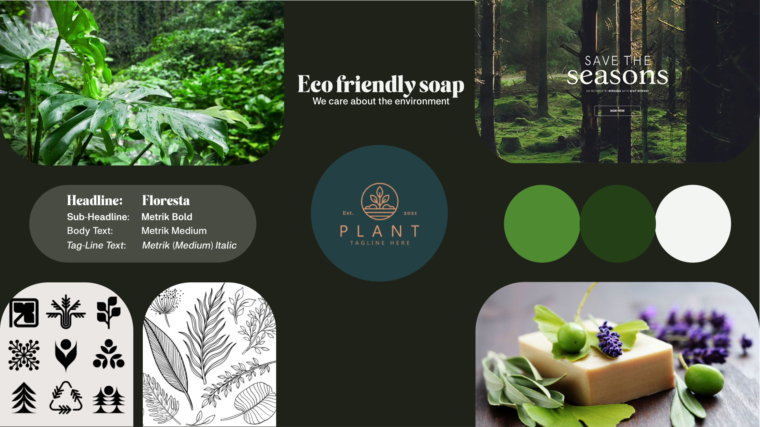
After this was decided I started making a moodboard to represent the feel and get a better direction of the website design.
Moodboard:

I made a quick logo for the brand first. Then I put together a website with the help of my moodboard and also inspiration from images and example websites like https://afallonmon.com/pages/english for the navigation part.
High fidelity prototype of landing page:
