LT 8.1
For this lesson task you must review two eCommerce websites, preferably small businesses (not in the category of Amazon or Walmart). Give star ratings out of five for the following categories:
- First impression
- Trust/credibility established
- Loading time
- Professionalism
- Creativity
Along with the star rating for each category, name three reasons for your rating and one suggestion on how to improve the rating.
Combine the star ratings and reasons for each website in a creative and visual way and post it to your WordPress blog.
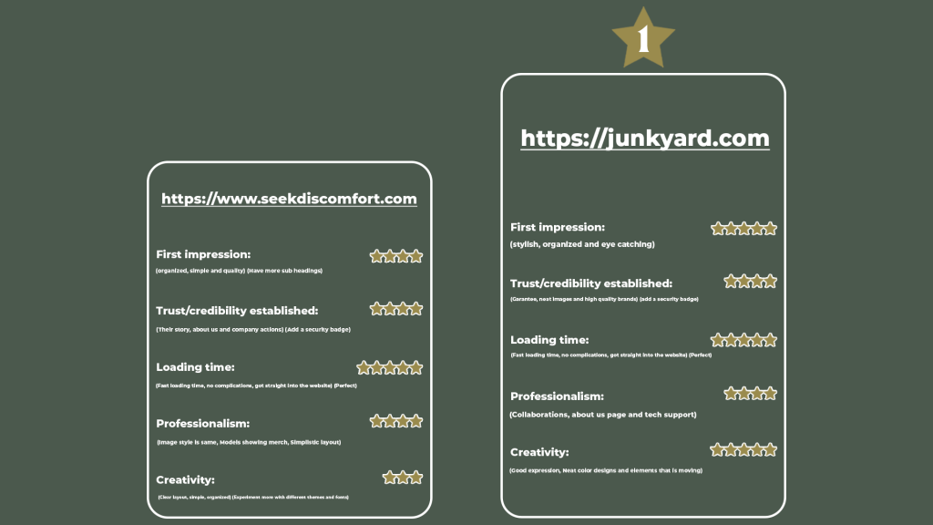
https://www.seekdiscomfort.com
First impression: 4 (organized, simple and quality) (Have more sub headings)
Trust/credibility established: 4 (Their story, about us and company actions) (Add a security badge)
Loading time: 5 (Fast loading time, no complications, got straight into the website) (Perfect)
Professionalism: 4 (Image style is same, Models showing merch, Simplistic layout)
Creativity: 3 (Clear layout, simple, organized) (Experiment more with different themes and fonts)
https://junkyard.com
First impression: 5 (stylish, organized and eye catching)
Trust/credibility established: 4 (Garantee, neat images and high quality brands) (add a security badge)
Loading time: 5 (Fast loading time, no complications, got straight into the website) (Perfect)
Professionalism: 4 (Collaborations, about us page and tech support)
Creativity: 5 (Good expression, Neat color designs and elements that is moving)

LT 8.2
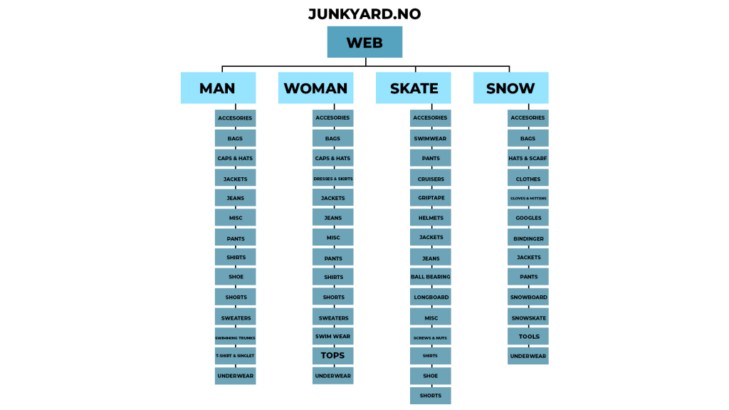
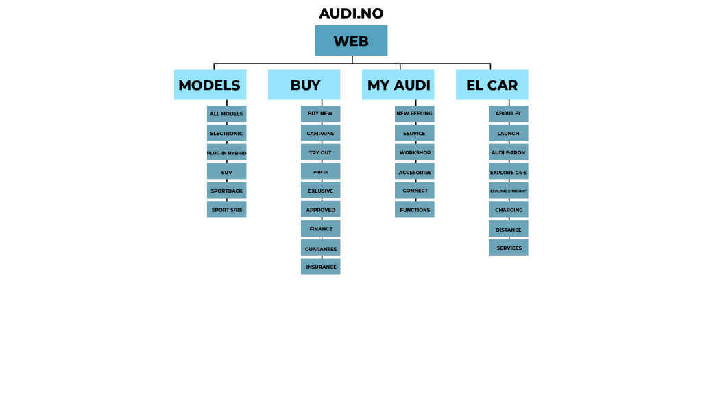
Choose two eCommerce websites from different retail fields. Create a diagram illustration of their category trees. Your diagram should clearly indicate the different levels of categories, as well as product attributes.
Post the diagrams with the website addresses as reference to your WordPress blog.
The first e-commerce website I chose is in the clothing field. Junkyard.no

The secondary e-commerce website I chose is in the car field

LT 8.3
Which are your favourite eCommerce sites that you use regularly? Pick one to focus on for this Lesson Task.
Think about the functional design and discuss why each of the following pages are effective:
- Homepage
- Category page
- Product page
- Cart
- Checkout
Post your conclusion about the effectiveness of each of the five pages to your WordPress blog and share screenshots to support your writing.
Junkyard.no
- The homepage has a neat animation that draws the viewers in. They throw a campain straight in your face the second you load in, making it interesting and having viewers engaging. There is a lot of call to action buttons which again engages the viewers. Showcasing of popular brands gives you a feeling of professionalism and security that the page is legit.
- The category page has a breadcrumbs which is good. They also include a lot of filtering that has their own space above the products, making it easily accesible. On the left side of the page there is the categories. Once clicked in on one category, the heading will go into several sub-headings to specify for example which kind of jacket, fleecejacket etc. From here you can easily switch from jacket to pants if wanted. Under the products there is different color choises if available.
- The product page uses real models to showcase their products. There is a feature showing how many people recently watched the product, also how many that bought. Above the price is an offer (which will only be there if there is an offer available) which encaurages people to buy more. Underneath the product there is a ”this would fit with” section which also helps with this effect.
- The cart page only shows up on half on your web-page. You can add/remove discount codes here if wanted, which will calculate the total automaticly. You can also switch between buy online and select local shop which will differ the price.
- When you click checkout there is a question if you want to sign in or continue as guest, and adding as quest i think makes it more effective for most buyers. On checkout page there is very little private information needed at first, only post code and e-mail which is comforting at glance. They have alot of payment options, including 30 days pay-off, home delivery etc.