LT 9.1
You’ve been asked to design a campaign to advertise a specific product: keto bars.
The purpose of the campaign is to get Instagram followers to click on the link on the Instagram account, view a specially designed product page and purchase the product. You’ve been tasked with designing 3 graphics for Instagram posts. Use your creativity and the images on the website to get started.
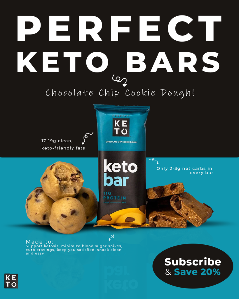
For my first campaign design I wanted to get the feeling in, so I went with a minimalistic and simple design with high color contrast. I though this design reflected the brand pretty nice.

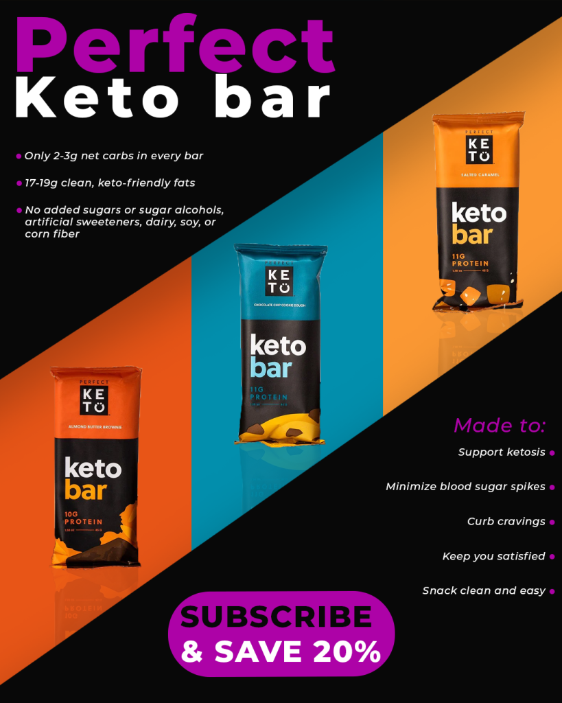
For my second design, I wanted to go for a more engaging and exciting style. Here most bars are represented, and i tried using the color palette from them in my design. To make the design more exciting I experimented with the heading, and made a more custom one.

For my last campaign design I wanted to have some more fun with a slightly different color palette. I played around with general contrast, which I think makes the products pop out more and also gives a better visual satisfaction.

Task 9.2
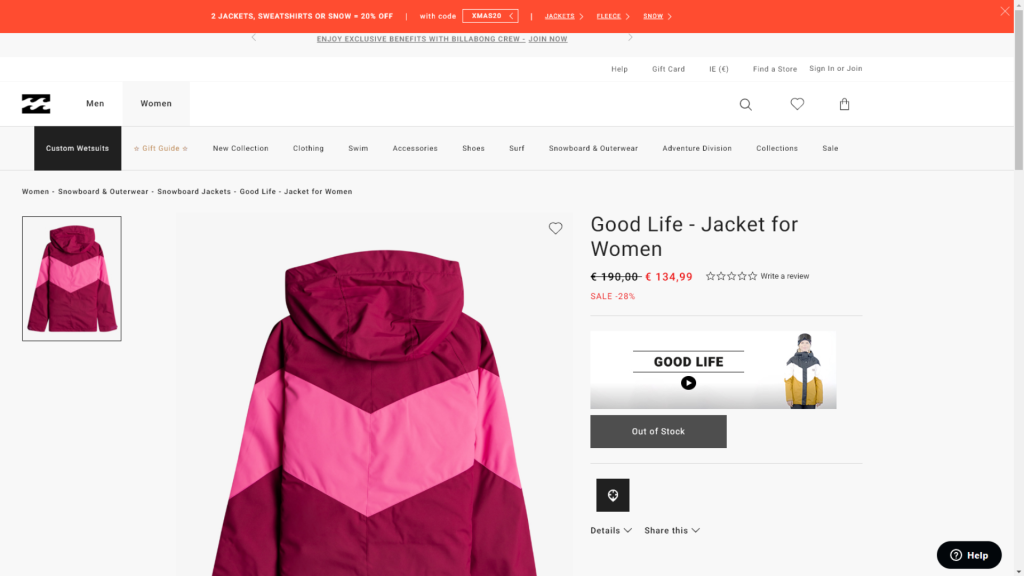
Billabong has decided to create a campaign especially for a new item of clothing, a snow jacket like this one.
Potential customers who see the product on Instagram, can click through to the landing page to learn more about it. Your task is to design a high-fidelity long-form landing page for this product (using Figma or Adobe XD). Check out the Mac Pro landing page for inspiration. Upload a link to your prototype, as well as screenshots of the final page.
To get inspiration for my landing page, I looked at the provided Mac pro link, as well as the good life jacket video on youtube. I used Adobe XD for this project. To get started with the first look on the landing page I decided to show a simple image of the product with a simple learn more with arrow down to encourage viewers to scroll down the page. After this I pasted in information provided from the Billabong product page, and wanted to have a minimalistic look. After a scrolling down a while, we get to zoomed in images of the product showcasing different features. At the bottom is a CTA button to encourage people to go buy the product.
LINK TO PROTOTYPE: https://xd.adobe.com/view/8e99ea92-a53b-46f4-8634-de97b803f3e4-dbca/?fullscreen

The CTA button will take you to the original product page on Billabong’s website.

LT 9.3
Web content management systems often have SEO tools built in. There is a few examples but let’s take a look an example, wordpress.
For this tool, plugins like Yoast SEO are useful. Read this article to find out more about this.
ACTIVITY (OPTIONAL)
If you still have access to a free WordPress website and account, let’s add the Yoast plug in!
Part 1
Install the Yoast plugin on your WordPress website (this may not be possible without a business account – do not upgrade your account just for this lesson unless you want to do so on your own terms). Read about how to do so here.
Part 2
Check out the feedback about SEO given to you by the Yoast plugin on your site and make the suggested changes.
LT 9.4
For today’s task you can watch this great LinkedIn course referenced below. If you’d like to challenge yourself, you can do the challenges and quizzes as well.
WATCH
Video course: CSS: Enhancing website graphics (2h 6m) by Patrick Carey on LinkedIn Learning.