Part 1
For this module and all the lesson tasks, we’ll focus on the article layout of your course assignment.
Go through the checklist below to ensure you have what you need to design a look and feel for Magnetic Magazine.
- Who is the target audience for the design?
The target audience for the design is veterans and neophytes in the music lifestyle, age ranging mostly from 18-34. There is a 16% ranging from 35-44. The target market likes to stay active on social-media, and with that stay active with new trends. I feel the audience likes all types of music genres, but for my cover design I have focused on the pop genre and a chaotic nostalgic style.
- What is the format/size of the magazine?
Proposed size of magazine when closed: 203mm (width) x 276mm (height)
- Which four articles are going to feature?
- Sabrina Carpenter ”Taste” Lyrics (MUSIC)
- Can Music Have a Measurable Impact on Mental Health? (CULTURE)
- Top 11 Must-See Artists At Hocus Pocus 2024 (EVENTS)
- Label Spotlight: Istoria Recordings’ Founder Talks Past, Preset, And Future Of The Imprint (INDUSTRY)
- Which parts of the text need emphasising?
For article 1, I would say the actual lyrics and then the explanation of the text meaning.
For article 2, How it works and the benefits of music in mental health.
For article 3, Name of artist, date of performance and an interesting image to follow.
Article 4, The questions and answers from the interview. Highlight different answers to catch the viewers attention.
- Will there be photographs, illustrations, diagrams, and infographics? Which elements are provided, and which do you need to source?
There will be photographs that are provided, but I will probably also find some more appropriate and neat looking elements to fit the styling of the article. For some of the articles I might try to bring some connecting illustrative elements throughout. I will also try my best to customize the imagery to the article theme, and by mixing and editing photography.
If you haven’t done so, prepare a layout in InDesign according to the specifications given in the course assignment brief (CA05). Don’t forget to add bleed.
Done
Today we are only focusing on the cover and all the text elements that need to feature. You may not have a finished cover picture yet, but today you can:
- add all the cover lines and any other graphic elements that go with it;
My main cover lines are already included in the cover design, so I started testing out implementing some minor cover lines at the bottom of the design.
- make a few options for the masthead (see if you can make the wordmark unique).
Done
Part 2
Today you are going to focus on the structure of your article layout. It’s good to start with one article and then use your finished layout as a blueprint for the other three articles.
Be careful of simply duplicating the same layout for each article. Some elements can be pulled through and stay the same to create consistency and unity between the articles, but each article should have a strong presence inspired by the specific content.
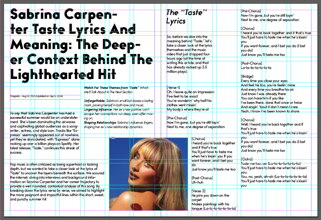
Working with your first article then, consider the following:
- What kind of grid system are you going to use? If you need some guidance, here is a helpful tutorial by Lumenbrite.
To have a lot of possibility to customize the layout, I will be using a modular grid system with a baseline grid. I think a grid with 6 columns, 8 rows with a gutter of 5mm will work well. My margins are 8mm.
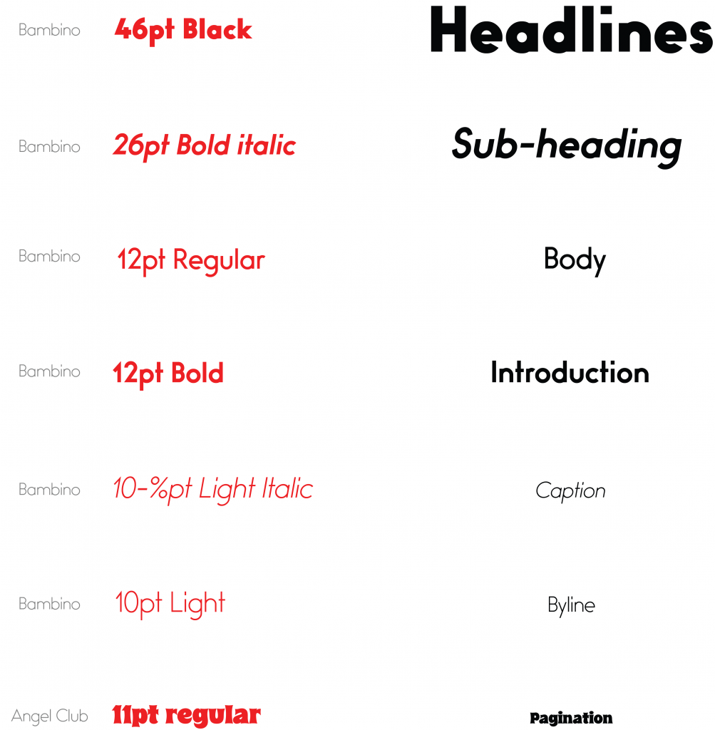
- Create a separate typography style sheet for your text with specific notes on fonts and sizes see the examples below). Remember to include the styles for:
- headlines;
- bylines;
- introduction text;
- sub-headings;
- body text;
- Captions;
- pagination.
- Now, start to place text and images for your first article. This will be your first rough draft. Use your own text style sheet as guidance.
Part 3
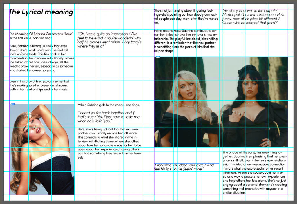
Open your magazine layout and critically look at the rough layout you’ve made for the first article.
Check if your images are technically correct.
- Enhance the images in Photoshop if needed (it needs to be 300dpi for printed magazines).
- Do all the elements that go to the edge of the page bleed off? If not, make sure they do.
Yes, they do.
Now, take a long, hard look at the body text. See how many ways you can enhance the text by the use of:
- pop-up blocks;
- integration of text and pictures;
- any other graphic elements like labels, stickers, frames, or icons;
- can you enhance the intensity of some elements by adding negative space?
I started testing out all these different things. By making sticky note vectors I used these and pop-up blocks to highlight lyrical text. I pulled through elements and icons from my cover throughout to make a connection and unity. I tried playing around with negative space, and new imagery.
Part 4
Share your progress on the Discussion Forum to get feedback and tips from the tutors on your article layout. Implement this feedback on your design and keep it in mind when doing the rest of the articles.
I’ve sent my progress to the Discussion Forum on Moodle to get feedback and tips from the tutors, and also sent this in my Teams class for further feedback there.
Part 5 (self-study)
After you’ve completed Ina Saltz’s foundational course on typography in Module 2, you are now ready for her intermediate course on hierarchy and navigation using typography.
In this short course, she will teach you the best techniques for creating clear levels of importance (hierarchy) and pointing readers in the right direction (navigation), whether for print-based or screen-based communication design.
Certificate: