Lesson Task 2.1 (Introduction to Photoshop and Illustrator)
Lesson Task 2.2 (Design Principles part 1)
Part 1
- Step 1 – Watch the video carefully and analyse each shot.
- Step 2 – Take screenshots and write a motivation on where your spot contrast, emphasis and balance.

In this shot I spot contrast in the colors and typography. The empashis is in the text and image, and the composition balances out the design having the main focus in the middle.

In this shot I can see contrast in the way the red color is used together with black and white, but also in texture and type. There is a emphasis on the front image, and the left image gives a sense of balance due to the heavy elements on the right side.

Here we have contrast in the image, half man half eagle, the red colors and size of type. There is also a emphasis on the image due to the contrast of the two images. Image in the middle, text on each side giving it balance.

The contrast here having a real image in the background compared to cutout text elements, but also the color difference in the image and foreground. There is a emphasis on the text elements, with the globe being in focus. The shot feels balanced because of the perspective and weight of elements.

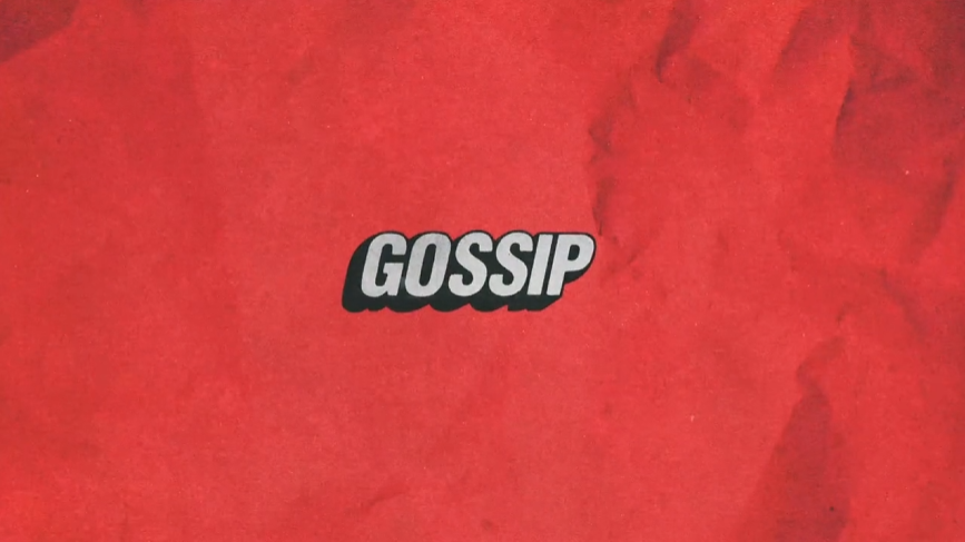
The obvious contrasts here are the colors between red black and white, but also that there is a lot of white space around the logo/text giving an extra contrast effect. The emphasis is on the only element on the page, which is the logo, and it is all balanced due to the logo/text being centered with only white space around it.
Part 2
A sports brand is launching three new products: ‘Noon’, ‘Kayak’ and ‘Radar’. They also happen to be three palindromes to make our design choices a bit easier.
- Pick one of the words above.
- Step 2 – Create a quick logo that has contrast, emphasis and balance.
- Step 3 – Write down how you added the above principles.Ask your classmates on the student discussion Forum if they can spot these elements in your design (optional).

I added the above principles by using contrasting colors of blue, yellow and dark orange. I used emphasis on the O’s to symbolize the sun being up which contributes attention and recognisability. To include balance, I spaced out the lettering equal, and centered the double O’s in the middle.
Lesson Task 2.3 (Design Principles part 2)
Lesson Task 2.4 (Color Theory)
Your colleague is struggling to colour their artwork. They’ve asked you to help and create a colour palette based on the lessons you’ve learnt. The client wants a unique colour palette that doesn’t exist on any trending colour websites, so it’s up to you to build a palette from scratch!
You can download the Illustrator vector art.
Upload your colour palette and your finished illustrations.


MODULE 2
By now, you should’ve come up with a concept and rough sketches for your three-second project. You can now focus on creating beautiful illustrations by implementing the lessons you’ve learnt in this module.


