Lesson Task 3.1 – Deep dive into storyboarding
To recap the process:
- Step 1 – Write down some visual ideas for the script.
- Step 2 -Storyboard the entire script into several storyboard panels with any extra information written as text.
- Step 3 -Once it’s done, export those boards out into an image file (with all camera notes).
Here’s your task for today:
- Watch how we’ve storyboarded our version of the Scoops Ice Cream script in this timelapse. Pay careful attention and learn from this.
- Make notes of what you learnt, look at how we solved this and post this to your blog. Once you start with your module assignment, ensure you apply these same principles.
- Thumbnails or storyboards onto a timeline to understand their actual pace and timing.
- Storyboards are all about communication, so the level of detail does not always need to be extremely high. This is called thumnails.
- Use a variation of composition shots to make the animation more interesting, but also to convey different feelings and emphasize an emotion or action.
- Think about camera movement. Used to imagine the frame and movement in the shot.
- Pay attention to posing of characters and timing of shots.
- The storyboard should convey how the final version will feel. How will it develod? Key movement in narrative. No confusion for a random viewer.
- Make an animatic to get a feel of the timing visually.
- Optional – Getting practical exercise with storyboarding will improve your animation skills. If you have extra time, doing your own version of this task will give you valuable exercise.
Lesson Task 3.2 – Deep dive into style, frame test and treatments
- Step 1 – Choose one frame from your Module Assignment storyboard.
- Step 2 – Find three diverse styles online that you feel could work for this frame.
- Step 3 – Compile these styles with a rationale on why you feel they’d work.
Optional – If you have time and if you’ve created a storyboard of your own for Scoops in the previous lesson task, you are welcome to do the style exploration for that as extra practise.
Due to already having a style made, I will be exploring for two more styles using the same frame.
Step 1: The frame from my storyboard that I will be finding three diverse styles for.
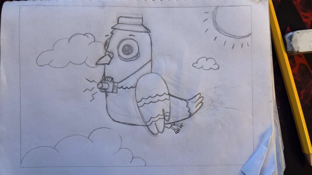
Step 2 & 3
Style 1:
SOFTWARE: Illustrator
STYLE: Vector based with some black outlines, a hint of 3D
PALETTE:


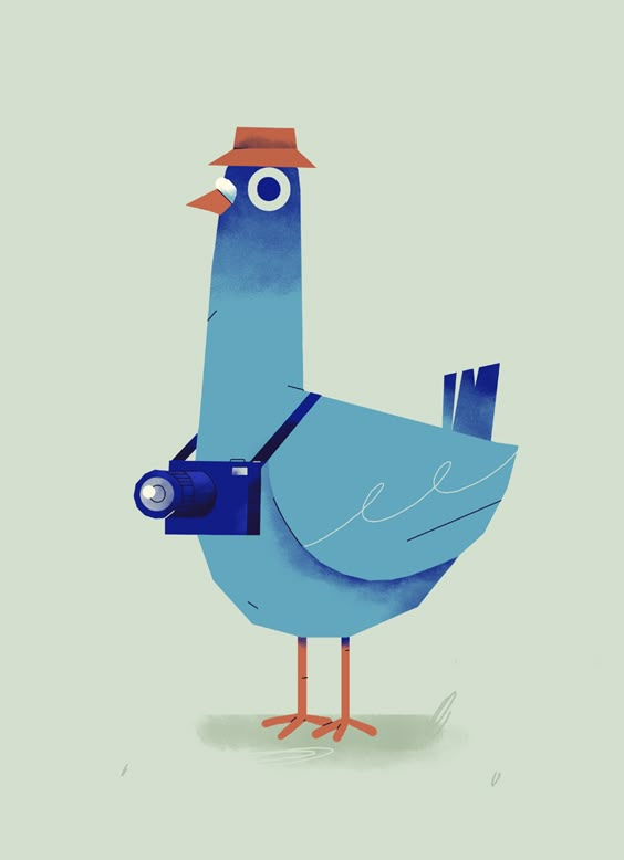

The reason I think this style will work is because having more of a three dimentional style I would be able to have greater detail and play on expressions of the bird. The vector style is also playing on simple geometrical shapes, making it simple and attractive for the eye. The color palette has contrasting highlight colors, but also a calm blue to balance it out. I wanted to have some highlight colors to make the character stick out, and with the calm blue as a background I felt this palette worked great.
Style 2:
SOFTWARE: Photoshop
STYLE: Loose/sketchy with black outline
PALETTE:
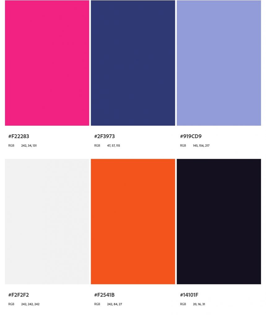
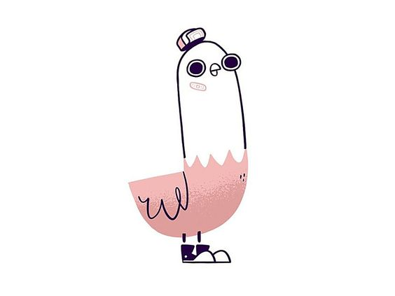

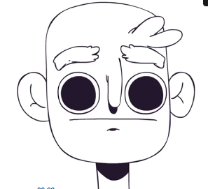
The reason I feel this style could work for this frame, is because the 2d format and minimalistic styling makes it easy to focus on motion. I also feel it works well with the overall story, being kind of goofy. Playing on this sketchy/loose style I will have freedom to focus on expressions and motion which will bring more life to the animation.
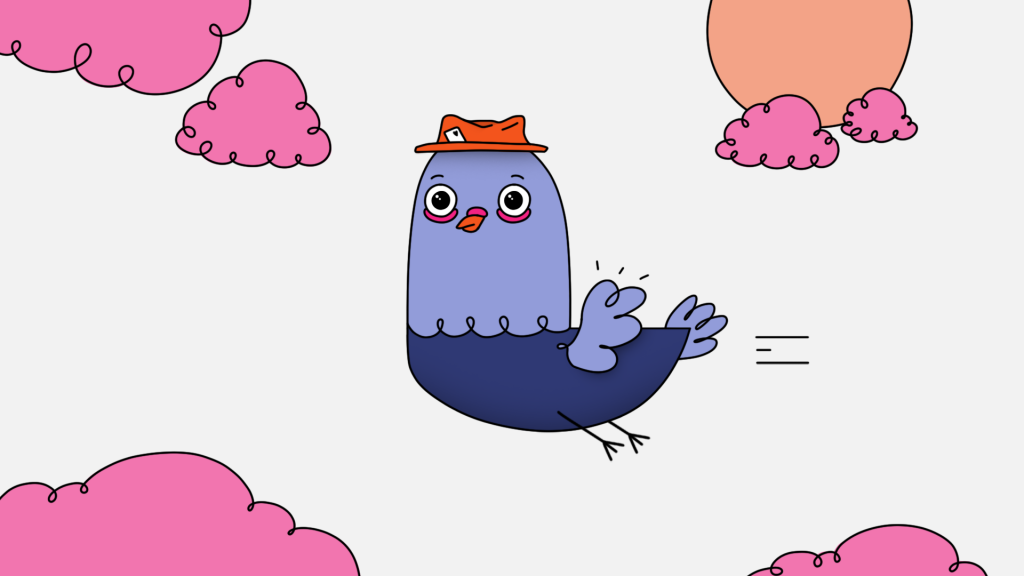
Style 3:
SOFTWARE: Illustrator
STYLE: Cute modern vector based with thick black outlines, 2D
PALETTE:
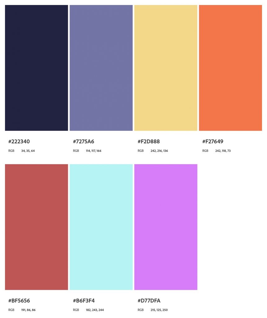
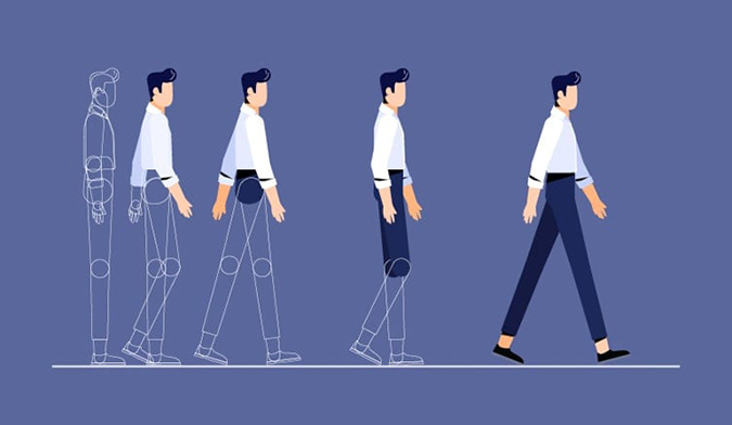


The reason I feel this style could work for this frame, is because the 2d format and modern vector styling makes it interesting and easy to digest. I chose a color palette with high contrast making the main subject stick out better, with warm and cold colors to give a soothing balance between the background and character. For this style I wanted to play a lot more on contrasts to give a better feeling of a modern vector style. With this kind of styling I could play a lot more on motion of the character, but also use elements to emphazise the motions and actions.
Lesson Task 3.3 – Deep dive into illustration in Adobe Photoshop and Illustrator
Your task is to:
- Step 1 – Look at what we’ve done and learn as much as you can from it. Then, you can apply your knowledge to your module assignment.
- Step 2 – Make notes of what you learn and post them on your blog.
- Step 3 – Use any extra time you have to work on your module assignment.
Optional – If you have time and have created a storyboard for Scoops in the previous lesson tasks, you are welcome to now illustrate this for extra practise.
Lesson Task 3.4 – Introduction to After Effects
In today’s task, we’re going to be animating a simple text and shape intro in After Effects.

- Step 1 -Open Adobe After Effects and create a new composition with the following settings:

- Step 2 -Using the text tool – write your name and align it to the centre of the composition:

- Step 3 -Create two black rectangle blocks (with no stroke) above and below your name:

- Step 4 -Ensure your anchor points are positioned correctly per the image below. Use the ‘Y’ hotkey, also known as the ‘pan behind
- tool’:

- Step 5 -Select the top rectangle and hit ‘Enter’ to rename the layer. Call it ‘Top Rectangle’ and do the same for the bottom. Click on your rectangles and press ‘S’ to bring up the scale in your timeline.

- Step 6 -Click the ‘stopwatch’ icon to create a keyframe at 0 seconds. Deselect the ‘constrain proportions’ icon, drag your playhead to the one-second mark and make a new keyframe there too.

- Step 7 -The first value you see on the scale property is the ‘horizontal scale’, and the second value is the ‘vertical scale’. We want only to animate the horizontal scale so you can make that value zero at your first keyframe (on 0 seconds).

- Step 8 -Let’s make our second keyframe into an ‘Easy Ease’ by pressing the F9 key.

- Step 9 -We’ll animate the ‘Opacity’ (also known as the transparency) of the text layer. To do so, let’s click ‘T’ to bring up our opacity property. Then we can create two keyframes in the same position as the rectangle scale keyframes. Make the first keyframe 0% opacity and make the second keyframe 100% opacity. You can also give that second keyframe an ‘Easy Ease’.

- Step 10 -Lastly, we can trim our timeline or the duration of our composition down to two seconds by pulling the ‘Work Area End’ bar down to the two-second mark. Then, right-click on that bar and select ‘Trim Comp to Work Area’.

- Step 11 -Let’s render this out by adding it to the ‘Render Queue’. Using our shortcut key Ctrl + M, we can add the composition to the queue.

- Step 12 – Render Settings: Leave as ‘Best Settings’.Output Module – Unless you want a massive file size video, it’s best to change this to Quicktime > Apple Prores 442 HQ, so it’s a good quality lowish size file.
Output To – Where you want the export to render to. - Step 13 -Click render! This will be a fairly large file size that’s super high quality. If you want something to upload to YouTube, choose the preset in Media Encoder designed for YouTube.
RESULT: