Graphic Design
Clothing Campaign Advertisement
Designed a bold, adaptable launch poster for a clothing brand, optimized for both large-format prints in Oslo and digital use on social media platforms like TikTok and Instagram.
Year :
2023
Industry :
Clothing
Client :
DeVries
Project Duration :
8 weeks
Problem :
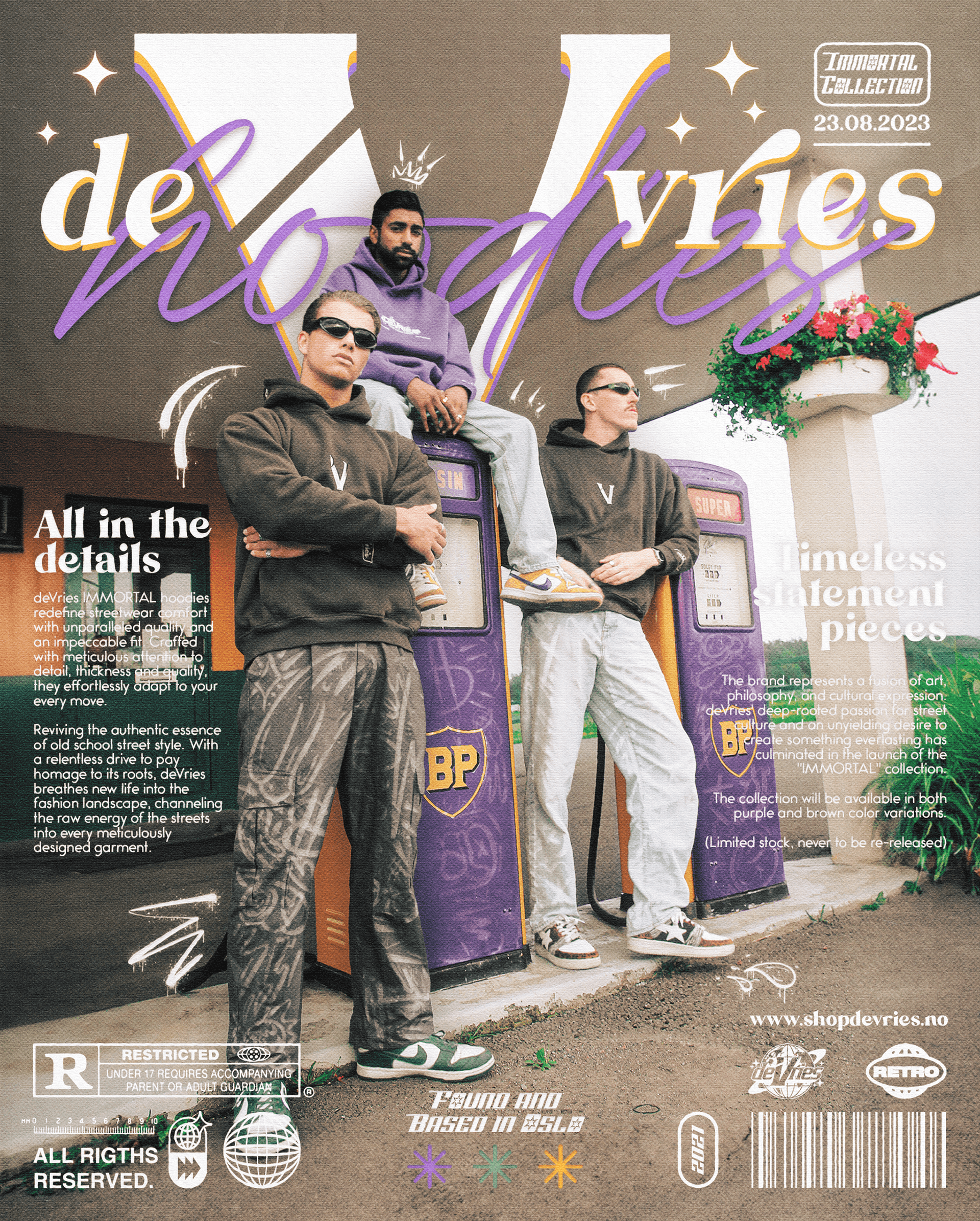
deVries needed a visually striking campaign poster to introduce the “Immortal Collection,” a streetwear drop built around durability, identity and old-school attitude. The brand already had a strong underground presence, but lacked a cohesive visual piece that could communicate its aesthetic, philosophy and garment quality in a single promotional asset. The challenge was merging fashion photography, typography and brand storytelling into a composition that felt both premium and raw—true to streetwear culture.
Solution :
The campaign poster was designed as a layered visual narrative combining fashion photography, nostalgic visual cues and contemporary streetwear branding. A collage-driven layout allowed the product shots to blend with typographic elements, graphic overlays, textures and era-inspired details. This created a rich, editorial-style composition that communicates the personality of the collection while highlighting garment craftsmanship and cultural positioning.
Color Palette :
The palette focuses on earthy browns, muted purples and soft off-whites, reflecting the two hoodie colorways in the Immortal Collection. These tones sit on a warm, grain-textured background that adds depth and nostalgic character. Pops of gold, white and green are used to highlight key brand elements and text. Overall, the palette balances retro warmth with contemporary streetwear energy.
Typography :
The typography is built on a mixture of expressive script and high-impact serif styles.
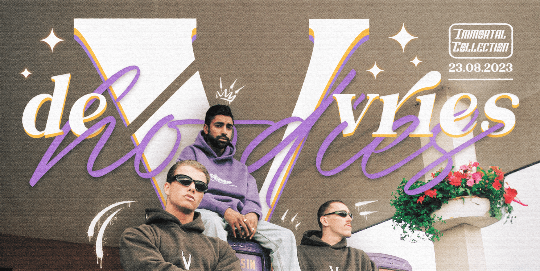
The large script typography (“hoodies”, “deVries”) adds movement and personality, echoing hand-drawn street culture aesthetics.
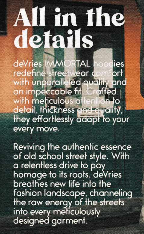
The serif and bold condensed fonts carry the editorial voice, anchoring the promotional messaging (“Timeless statement pieces”, “All in the details”).
Supporting text uses clean serif styles to maintain readability in dense copy blocks.
This combination creates a dynamic typographic rhythm while reinforcing the premium yet rebellious tone of the brand.
Logo & Visual Elements :
The poster integrates several brand elements: the deVries logo, custom iconography, an R-rated tag (referencing vintage film posters), and subtle sketch-style drawings. Additional graphic details—stickers, barcodes, retro corner badges—contribute to the collage feel. A textured grain overlay and soft color wash help unify photography and graphics into one cohesive visual story.
Layout & Composition :
The layout uses asymmetrical balance, with the main photography cluster positioned centrally for emphasis. Typography wraps organically around the subjects, creating a circular visual flow from left to right. The left side features the descriptive copy block (“All in the details”), while the right side highlights collection identity and availability. The bottom section is dense with graphic elements, mimicking early 2000s streetwear magazines and music posters. This intentional layering reinforces brand attitude and visual richness without sacrificing hierarchy.
Interaction & Digital Decisions
The poster was built to scale for both print and digital use. The 4:5 format is optimized for Instagram feed posts, while the composition preserves clarity even at smaller sizes due to controlled contrast and strong typographic anchors. Overlays were kept within acceptable compression limits to avoid artifacts when posted online. Exported versions allow for use across feed, story and website banners.
Challenge :
The complexity of the composition—layered photos, heavy typography, textures and multiple brand marks—required strict control to avoid visual overload. Early drafts leaned too chaotic. Refinement focused on grouping text logically, balancing color intensity and aligning graphic elements to maintain a clean reading path through the piece.
Outcome / Summary :
The final campaign poster captures the identity of the Immortal Collection with a strong editorial aesthetic and layered streetwear sensibility. It merges product presentation with storytelling, using expressive typography, textured photography and nostalgic design cues. The result is a cohesive visual asset that strengthens deVries’ brand presence and elevates the collection beyond a standard clothing release.
More Projects


Graphic Design
Clothing Campaign Advertisement
Designed a bold, adaptable launch poster for a clothing brand, optimized for both large-format prints in Oslo and digital use on social media platforms like TikTok and Instagram.
Year :
2023
Industry :
Clothing
Client :
DeVries
Project Duration :
8 weeks
Problem :
deVries needed a visually striking campaign poster to introduce the “Immortal Collection,” a streetwear drop built around durability, identity and old-school attitude. The brand already had a strong underground presence, but lacked a cohesive visual piece that could communicate its aesthetic, philosophy and garment quality in a single promotional asset. The challenge was merging fashion photography, typography and brand storytelling into a composition that felt both premium and raw—true to streetwear culture.
Solution :
The campaign poster was designed as a layered visual narrative combining fashion photography, nostalgic visual cues and contemporary streetwear branding. A collage-driven layout allowed the product shots to blend with typographic elements, graphic overlays, textures and era-inspired details. This created a rich, editorial-style composition that communicates the personality of the collection while highlighting garment craftsmanship and cultural positioning.
Color Palette :
The palette focuses on earthy browns, muted purples and soft off-whites, reflecting the two hoodie colorways in the Immortal Collection. These tones sit on a warm, grain-textured background that adds depth and nostalgic character. Pops of gold, white and green are used to highlight key brand elements and text. Overall, the palette balances retro warmth with contemporary streetwear energy.
Typography :
The typography is built on a mixture of expressive script and high-impact serif styles.
The large script typography (“hoodies”, “deVries”) adds movement and personality, echoing hand-drawn street culture aesthetics.
The serif and bold condensed fonts carry the editorial voice, anchoring the promotional messaging (“Timeless statement pieces”, “All in the details”).
Supporting text uses clean serif styles to maintain readability in dense copy blocks.
This combination creates a dynamic typographic rhythm while reinforcing the premium yet rebellious tone of the brand.
Logo & Visual Elements :
The poster integrates several brand elements: the deVries logo, custom iconography, an R-rated tag (referencing vintage film posters), and subtle sketch-style drawings. Additional graphic details—stickers, barcodes, retro corner badges—contribute to the collage feel. A textured grain overlay and soft color wash help unify photography and graphics into one cohesive visual story.
Layout & Composition :
The layout uses asymmetrical balance, with the main photography cluster positioned centrally for emphasis. Typography wraps organically around the subjects, creating a circular visual flow from left to right. The left side features the descriptive copy block (“All in the details”), while the right side highlights collection identity and availability. The bottom section is dense with graphic elements, mimicking early 2000s streetwear magazines and music posters. This intentional layering reinforces brand attitude and visual richness without sacrificing hierarchy.
Interaction & Digital Decisions
The poster was built to scale for both print and digital use. The 4:5 format is optimized for Instagram feed posts, while the composition preserves clarity even at smaller sizes due to controlled contrast and strong typographic anchors. Overlays were kept within acceptable compression limits to avoid artifacts when posted online. Exported versions allow for use across feed, story and website banners.
Challenge :
The complexity of the composition—layered photos, heavy typography, textures and multiple brand marks—required strict control to avoid visual overload. Early drafts leaned too chaotic. Refinement focused on grouping text logically, balancing color intensity and aligning graphic elements to maintain a clean reading path through the piece.
Outcome / Summary :
The final campaign poster captures the identity of the Immortal Collection with a strong editorial aesthetic and layered streetwear sensibility. It merges product presentation with storytelling, using expressive typography, textured photography and nostalgic design cues. The result is a cohesive visual asset that strengthens deVries’ brand presence and elevates the collection beyond a standard clothing release.
More Projects
Graphic Design
Clothing Campaign Advertisement
Designed a bold, adaptable launch poster for a clothing brand, optimized for both large-format prints in Oslo and digital use on social media platforms like TikTok and Instagram.
Year :
2023
Industry :
Clothing
Client :
DeVries
Project Duration :
8 weeks
Problem :
deVries needed a visually striking campaign poster to introduce the “Immortal Collection,” a streetwear drop built around durability, identity and old-school attitude. The brand already had a strong underground presence, but lacked a cohesive visual piece that could communicate its aesthetic, philosophy and garment quality in a single promotional asset. The challenge was merging fashion photography, typography and brand storytelling into a composition that felt both premium and raw—true to streetwear culture.
Solution :
The campaign poster was designed as a layered visual narrative combining fashion photography, nostalgic visual cues and contemporary streetwear branding. A collage-driven layout allowed the product shots to blend with typographic elements, graphic overlays, textures and era-inspired details. This created a rich, editorial-style composition that communicates the personality of the collection while highlighting garment craftsmanship and cultural positioning.
Color Palette :
The palette focuses on earthy browns, muted purples and soft off-whites, reflecting the two hoodie colorways in the Immortal Collection. These tones sit on a warm, grain-textured background that adds depth and nostalgic character. Pops of gold, white and green are used to highlight key brand elements and text. Overall, the palette balances retro warmth with contemporary streetwear energy.
Typography :
The typography is built on a mixture of expressive script and high-impact serif styles.
The large script typography (“hoodies”, “deVries”) adds movement and personality, echoing hand-drawn street culture aesthetics.
The serif and bold condensed fonts carry the editorial voice, anchoring the promotional messaging (“Timeless statement pieces”, “All in the details”).
Supporting text uses clean serif styles to maintain readability in dense copy blocks.
This combination creates a dynamic typographic rhythm while reinforcing the premium yet rebellious tone of the brand.
Logo & Visual Elements :
The poster integrates several brand elements: the deVries logo, custom iconography, an R-rated tag (referencing vintage film posters), and subtle sketch-style drawings. Additional graphic details—stickers, barcodes, retro corner badges—contribute to the collage feel. A textured grain overlay and soft color wash help unify photography and graphics into one cohesive visual story.
Layout & Composition :
The layout uses asymmetrical balance, with the main photography cluster positioned centrally for emphasis. Typography wraps organically around the subjects, creating a circular visual flow from left to right. The left side features the descriptive copy block (“All in the details”), while the right side highlights collection identity and availability. The bottom section is dense with graphic elements, mimicking early 2000s streetwear magazines and music posters. This intentional layering reinforces brand attitude and visual richness without sacrificing hierarchy.
Interaction & Digital Decisions
The poster was built to scale for both print and digital use. The 4:5 format is optimized for Instagram feed posts, while the composition preserves clarity even at smaller sizes due to controlled contrast and strong typographic anchors. Overlays were kept within acceptable compression limits to avoid artifacts when posted online. Exported versions allow for use across feed, story and website banners.
Challenge :
The complexity of the composition—layered photos, heavy typography, textures and multiple brand marks—required strict control to avoid visual overload. Early drafts leaned too chaotic. Refinement focused on grouping text logically, balancing color intensity and aligning graphic elements to maintain a clean reading path through the piece.
Outcome / Summary :
The final campaign poster captures the identity of the Immortal Collection with a strong editorial aesthetic and layered streetwear sensibility. It merges product presentation with storytelling, using expressive typography, textured photography and nostalgic design cues. The result is a cohesive visual asset that strengthens deVries’ brand presence and elevates the collection beyond a standard clothing release.