Graphic Design
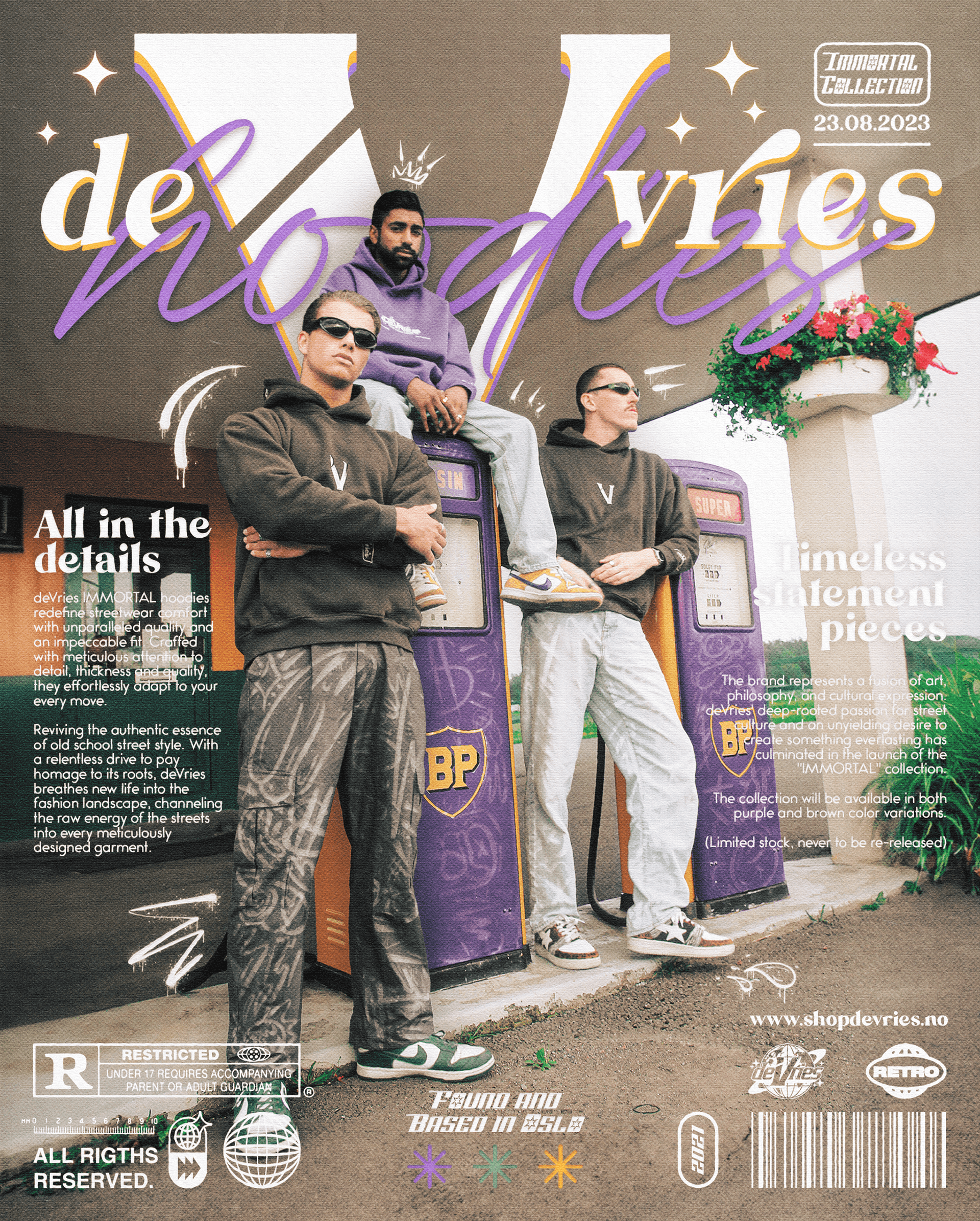
Concert Advertisement Poster
Designed bold and memorable visuals to promote P-Flow’s Fungi Boi concert, creating artwork that stood out across posters and social media while reflecting the album’s unique theme.
Year :
2023
Industry :
Event / Concert
Client :
P-Flow
Project Duration :
1 week

Problem :
Promoting a single concert requires strong, memorable visuals that immediately communicate the artist’s identity and the event details. Competing with countless posters and social media campaigns, the challenge was to design artwork that stood out in crowded environments while aligning with the theme of P-Flow’s new album, Fungi Boi.
Solution :
I developed three distinct poster concepts, each visually inspired by the album’s artistic direction. The chosen poster was built around a layered collage of artist photography combined with organic, flowing shapes inspired by the album’s psychedelic theme. A modular layout system was established to separate expressive visuals from information-heavy sections, ensuring legibility while maintaining an intense visual atmosphere. The final composition merges high-energy color, texture and movement with a clean structural hierarchy that works across both print and social platforms.
Color palette :
The palette is built on warm, saturated yellows and oranges paired with a neutral white-gray background to make the typography stand out. These colors mirror the hallucinogenic, fluid feel of the album. Dark tones are reserved for the footer, proviThe palette is built on warm, saturated yellows and oranges paired with a neutral white-gray background to make the typography stand out. These colors mirror the hallucinogenic, fluid feel of the album. Dark tones are reserved for the footer, providing a grounded base where practical information can sit with high contrast and strong readability.ding a grounded base where practical information can sit with high contrast and strong readability.
Typography :
Typography follows a dual structure:
A clean, bold sans-serif for artist name, venue and date to maintain clarity at all sizes.
A custom, fluid display typographic treatment for the Fungi Boi title, designed to visually echo the psychedelic shapes surrounding it.
Hierarchy is strictly controlled. Event details sit at the top in tight alignment, while the display type forms the expressive focal point of the composition.


Visual Elements :
The poster incorporates a stylized sun emblem for the event organizer, positioned in the footer to anchor the composition. Fluid, organic shapes surround the central title and form visual bridges between text and photography. Grain, texture and subtle distortion were applied to unify photographic elements with the illustrated shapes, creating a cohesive visual environment without overpowering the event information.


Layout & Composition
The layout is structured around three layers:
Expressive title region — dominated by the fluid Fungi Boi lettering and surrounding shapes.
Central collage — multiple photos of the artist layered with texture to create depth and movement.
Information base — a dark footer containing event details, lineup information and ticket call-to-action.
This segmentation ensures the poster remains visually intense while the reading order stays predictable and functional.
Digital Decisions
Although designed initially for print, the poster was optimized for digital use, including Instagram and event banners. High contrast text, simplified alignment rules and careful edge spacing ensure the poster reads well even at smaller mobile sizes. The composition was built to crop effectively across 1:1, 4:5 and 9:16 formats without losing hierarchy or cutting essential information.

Challenge :
The main challenge was keeping the psychedelic, high-energy expression from overwhelming the clarity of the event information. Early drafts pushed too far into visual chaos. Refinements focused on tightening the type hierarchy, controlling contrast in the collage, and anchoring all practical details inside a clearly defined base section.
Outcome / Summary :
The final poster delivers a strong, atmospheric identity that reflects the tone of the Fungi Boi album while remaining structured and readable. The combination of expressive illustration, collage photography and formal typographic hierarchy creates a promotional visual that works across formats and enhances the artist’s branding without sacrificing functionality.
More Projects


Graphic Design
Concert Advertisement Poster
Designed bold and memorable visuals to promote P-Flow’s Fungi Boi concert, creating artwork that stood out across posters and social media while reflecting the album’s unique theme.
Year :
2023
Industry :
Event / Concert
Client :
P-Flow
Project Duration :
1 week
Problem :
Promoting a single concert requires strong, memorable visuals that immediately communicate the artist’s identity and the event details. Competing with countless posters and social media campaigns, the challenge was to design artwork that stood out in crowded environments while aligning with the theme of P-Flow’s new album, Fungi Boi.
Solution :
I developed three distinct poster concepts, each visually inspired by the album’s artistic direction. The chosen poster was built around a layered collage of artist photography combined with organic, flowing shapes inspired by the album’s psychedelic theme. A modular layout system was established to separate expressive visuals from information-heavy sections, ensuring legibility while maintaining an intense visual atmosphere. The final composition merges high-energy color, texture and movement with a clean structural hierarchy that works across both print and social platforms.
Color palette :
The palette is built on warm, saturated yellows and oranges paired with a neutral white-gray background to make the typography stand out. These colors mirror the hallucinogenic, fluid feel of the album. Dark tones are reserved for the footer, proviThe palette is built on warm, saturated yellows and oranges paired with a neutral white-gray background to make the typography stand out. These colors mirror the hallucinogenic, fluid feel of the album. Dark tones are reserved for the footer, providing a grounded base where practical information can sit with high contrast and strong readability.ding a grounded base where practical information can sit with high contrast and strong readability.
Typography :
Typography follows a dual structure:
A clean, bold sans-serif for artist name, venue and date to maintain clarity at all sizes.
A custom, fluid display typographic treatment for the Fungi Boi title, designed to visually echo the psychedelic shapes surrounding it.
Hierarchy is strictly controlled. Event details sit at the top in tight alignment, while the display type forms the expressive focal point of the composition.
Visual Elements :
The poster incorporates a stylized sun emblem for the event organizer, positioned in the footer to anchor the composition. Fluid, organic shapes surround the central title and form visual bridges between text and photography. Grain, texture and subtle distortion were applied to unify photographic elements with the illustrated shapes, creating a cohesive visual environment without overpowering the event information.
Layout & Composition
The layout is structured around three layers:
Expressive title region — dominated by the fluid Fungi Boi lettering and surrounding shapes.
Central collage — multiple photos of the artist layered with texture to create depth and movement.
Information base — a dark footer containing event details, lineup information and ticket call-to-action.
This segmentation ensures the poster remains visually intense while the reading order stays predictable and functional.
Digital Decisions
Although designed initially for print, the poster was optimized for digital use, including Instagram and event banners. High contrast text, simplified alignment rules and careful edge spacing ensure the poster reads well even at smaller mobile sizes. The composition was built to crop effectively across 1:1, 4:5 and 9:16 formats without losing hierarchy or cutting essential information.
Challenge :
The main challenge was keeping the psychedelic, high-energy expression from overwhelming the clarity of the event information. Early drafts pushed too far into visual chaos. Refinements focused on tightening the type hierarchy, controlling contrast in the collage, and anchoring all practical details inside a clearly defined base section.
Outcome / Summary :
The final poster delivers a strong, atmospheric identity that reflects the tone of the Fungi Boi album while remaining structured and readable. The combination of expressive illustration, collage photography and formal typographic hierarchy creates a promotional visual that works across formats and enhances the artist’s branding without sacrificing functionality.
More Projects
Graphic Design
Concert Advertisement Poster
Designed bold and memorable visuals to promote P-Flow’s Fungi Boi concert, creating artwork that stood out across posters and social media while reflecting the album’s unique theme.
Year :
2023
Industry :
Event / Concert
Client :
P-Flow
Project Duration :
1 week
Problem :
Promoting a single concert requires strong, memorable visuals that immediately communicate the artist’s identity and the event details. Competing with countless posters and social media campaigns, the challenge was to design artwork that stood out in crowded environments while aligning with the theme of P-Flow’s new album, Fungi Boi.
Solution :
I developed three distinct poster concepts, each visually inspired by the album’s artistic direction. The chosen poster was built around a layered collage of artist photography combined with organic, flowing shapes inspired by the album’s psychedelic theme. A modular layout system was established to separate expressive visuals from information-heavy sections, ensuring legibility while maintaining an intense visual atmosphere. The final composition merges high-energy color, texture and movement with a clean structural hierarchy that works across both print and social platforms.
Color palette :
The palette is built on warm, saturated yellows and oranges paired with a neutral white-gray background to make the typography stand out. These colors mirror the hallucinogenic, fluid feel of the album. Dark tones are reserved for the footer, proviThe palette is built on warm, saturated yellows and oranges paired with a neutral white-gray background to make the typography stand out. These colors mirror the hallucinogenic, fluid feel of the album. Dark tones are reserved for the footer, providing a grounded base where practical information can sit with high contrast and strong readability.ding a grounded base where practical information can sit with high contrast and strong readability.
Typography :
Typography follows a dual structure:
A clean, bold sans-serif for artist name, venue and date to maintain clarity at all sizes.
A custom, fluid display typographic treatment for the Fungi Boi title, designed to visually echo the psychedelic shapes surrounding it.
Hierarchy is strictly controlled. Event details sit at the top in tight alignment, while the display type forms the expressive focal point of the composition.
Visual Elements :
The poster incorporates a stylized sun emblem for the event organizer, positioned in the footer to anchor the composition. Fluid, organic shapes surround the central title and form visual bridges between text and photography. Grain, texture and subtle distortion were applied to unify photographic elements with the illustrated shapes, creating a cohesive visual environment without overpowering the event information.
Layout & Composition
The layout is structured around three layers:
Expressive title region — dominated by the fluid Fungi Boi lettering and surrounding shapes.
Central collage — multiple photos of the artist layered with texture to create depth and movement.
Information base — a dark footer containing event details, lineup information and ticket call-to-action.
This segmentation ensures the poster remains visually intense while the reading order stays predictable and functional.
Digital Decisions
Although designed initially for print, the poster was optimized for digital use, including Instagram and event banners. High contrast text, simplified alignment rules and careful edge spacing ensure the poster reads well even at smaller mobile sizes. The composition was built to crop effectively across 1:1, 4:5 and 9:16 formats without losing hierarchy or cutting essential information.
Challenge :
The main challenge was keeping the psychedelic, high-energy expression from overwhelming the clarity of the event information. Early drafts pushed too far into visual chaos. Refinements focused on tightening the type hierarchy, controlling contrast in the collage, and anchoring all practical details inside a clearly defined base section.
Outcome / Summary :
The final poster delivers a strong, atmospheric identity that reflects the tone of the Fungi Boi album while remaining structured and readable. The combination of expressive illustration, collage photography and formal typographic hierarchy creates a promotional visual that works across formats and enhances the artist’s branding without sacrificing functionality.