Graphic Design
SOCIAL MEDIA & CAMPAIGN MATERIAL FOR CLIENT
A collection of sharp, angular black prisms floating against a gradient dark background, showcasing a modern and sophisticated approach to digital 3D geometric composition.
Year :
2025
Industry :
Technology
Client :
Recellit
Project Duration :
10 months

Problem :
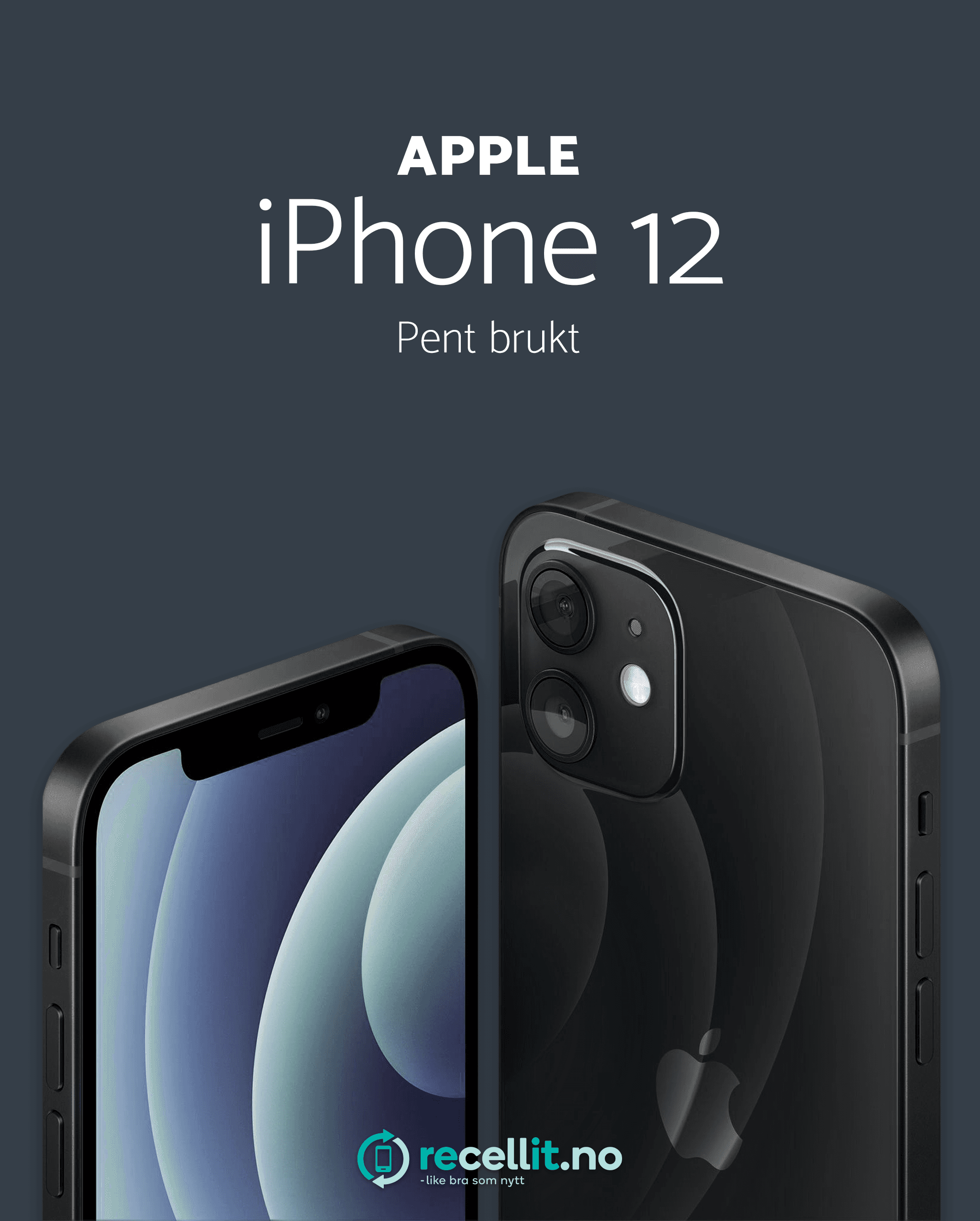
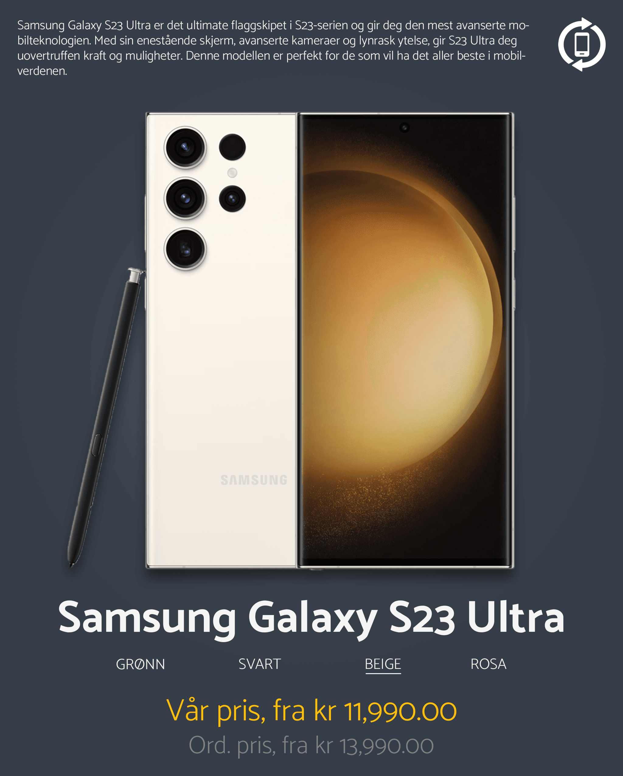
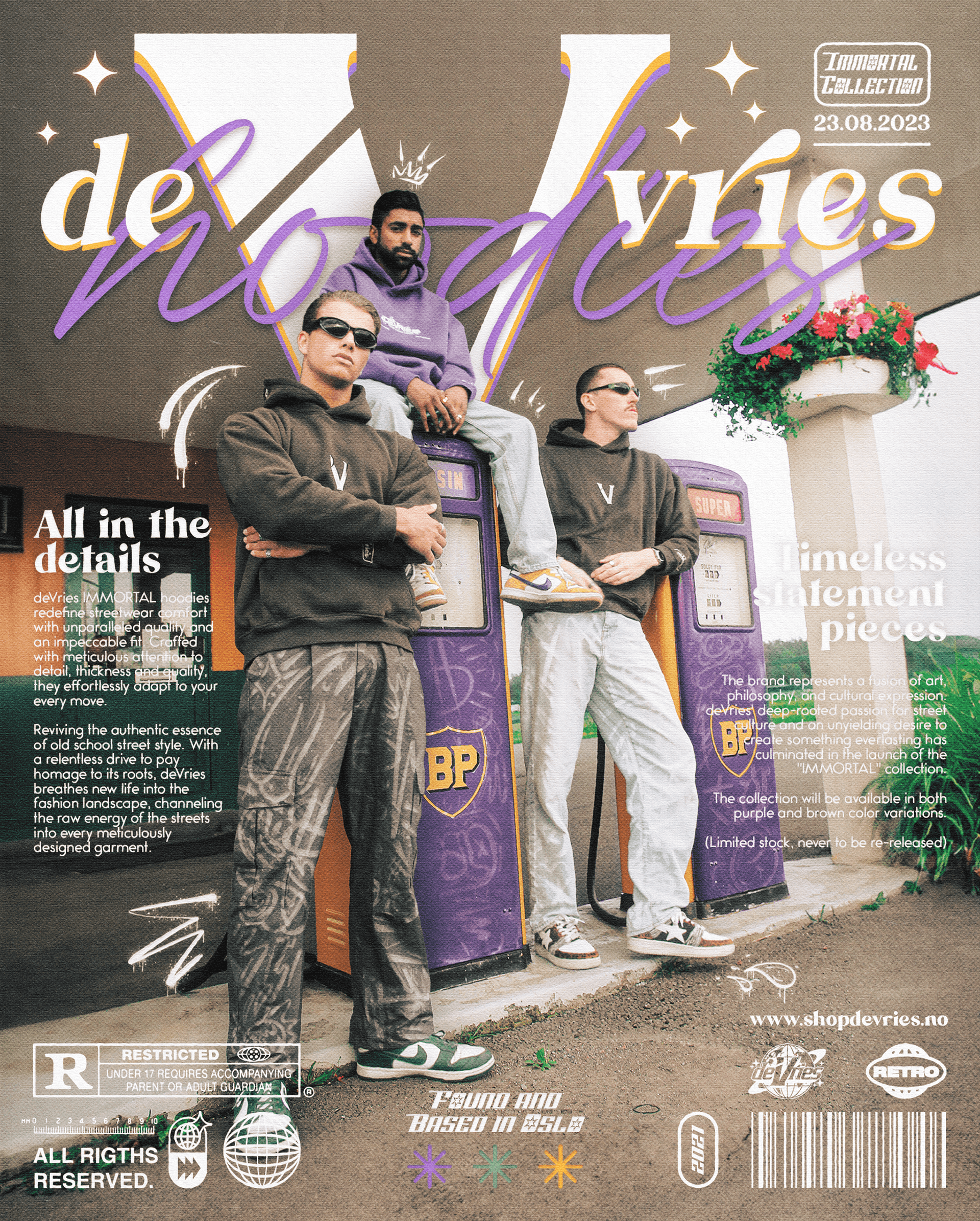
Recellit needed a steady flow of social media content that reflected their established identity and communicated their key values: sustainability, trustworthiness and affordability. Although the brand already had a defined visual language, their social presence lacked consistency in how colors, typography and messaging were applied. The challenge was to create content that stayed strictly within the brand manual while still being varied and engaging enough to function well across both Facebook and Instagram.
Solution :
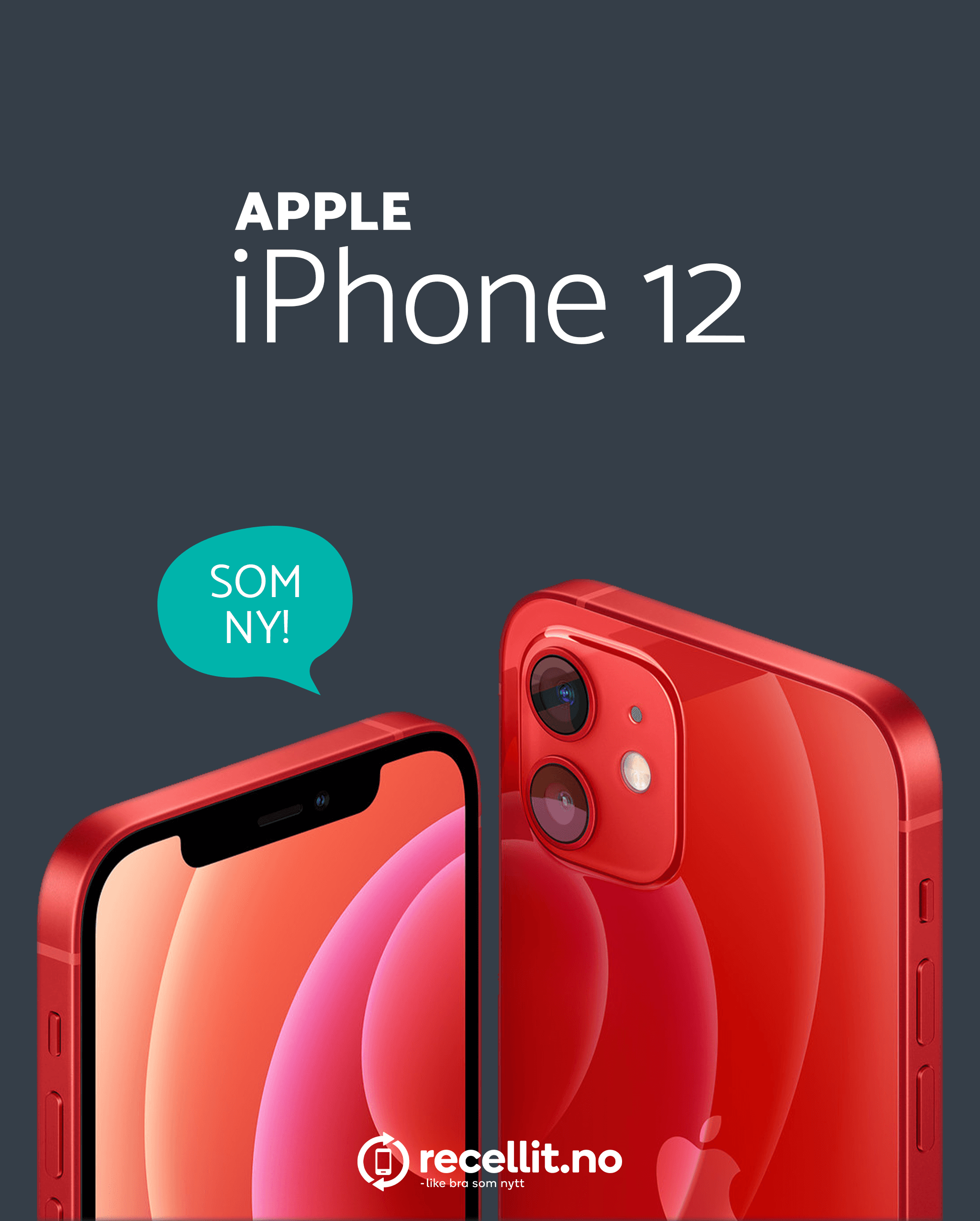
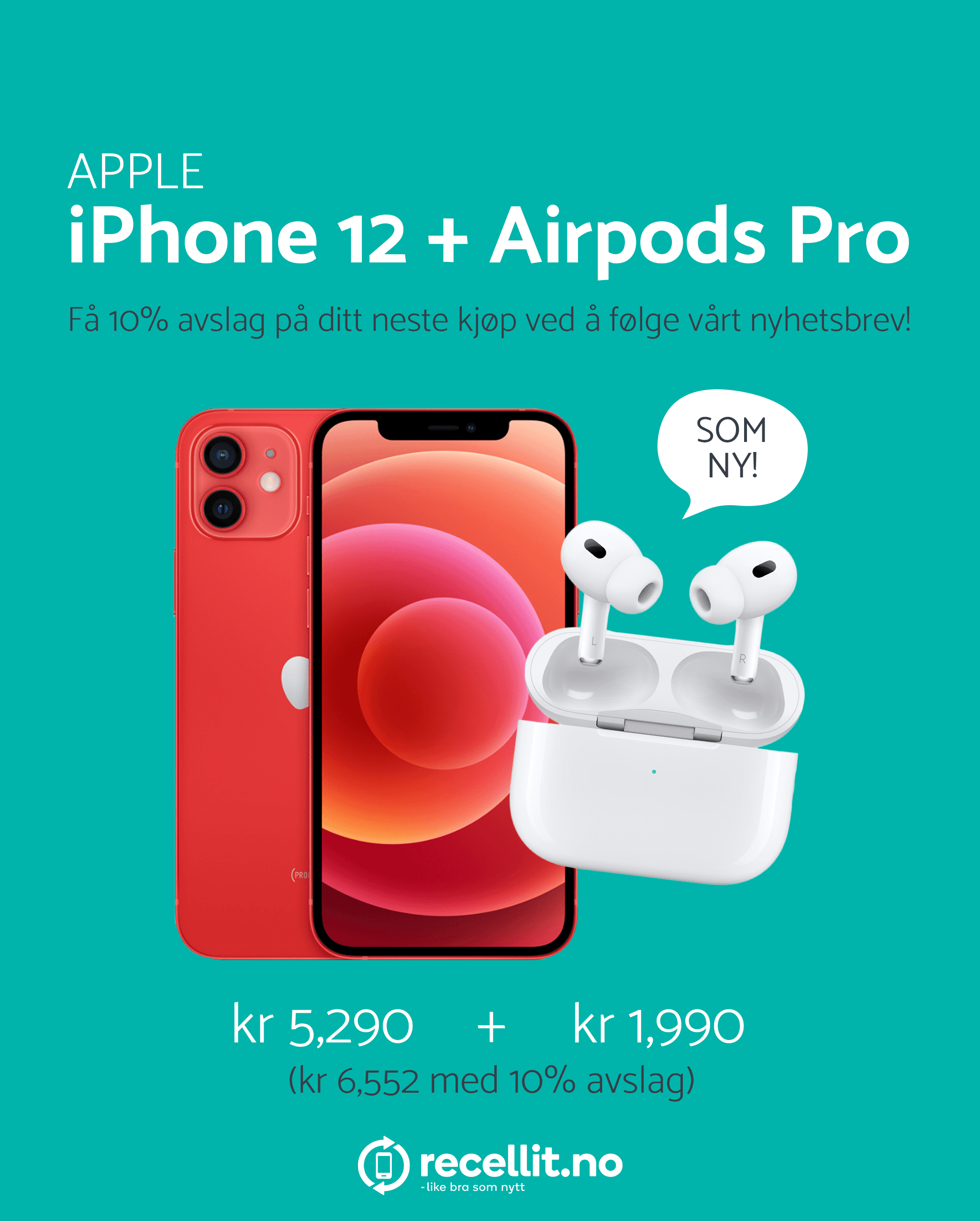
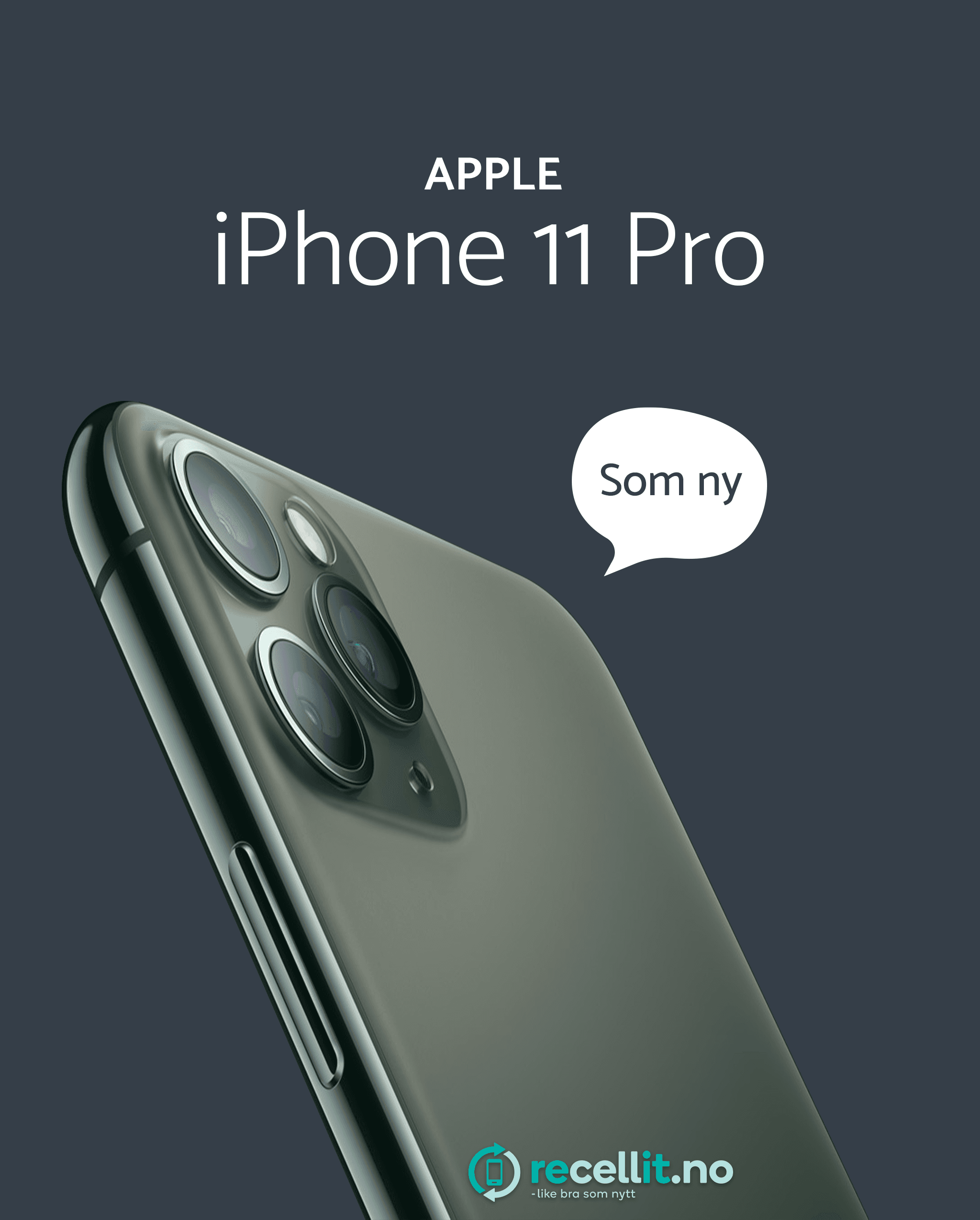
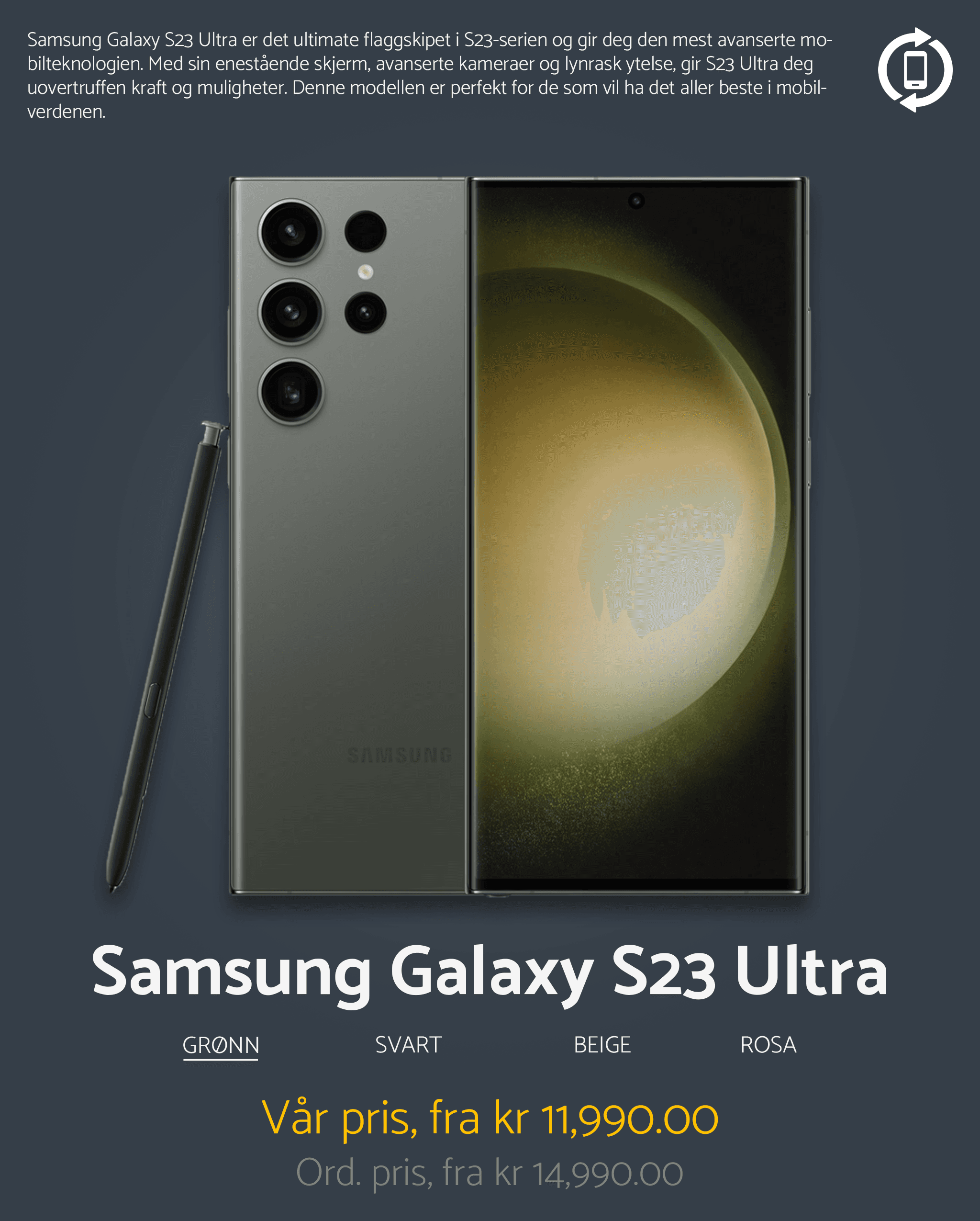
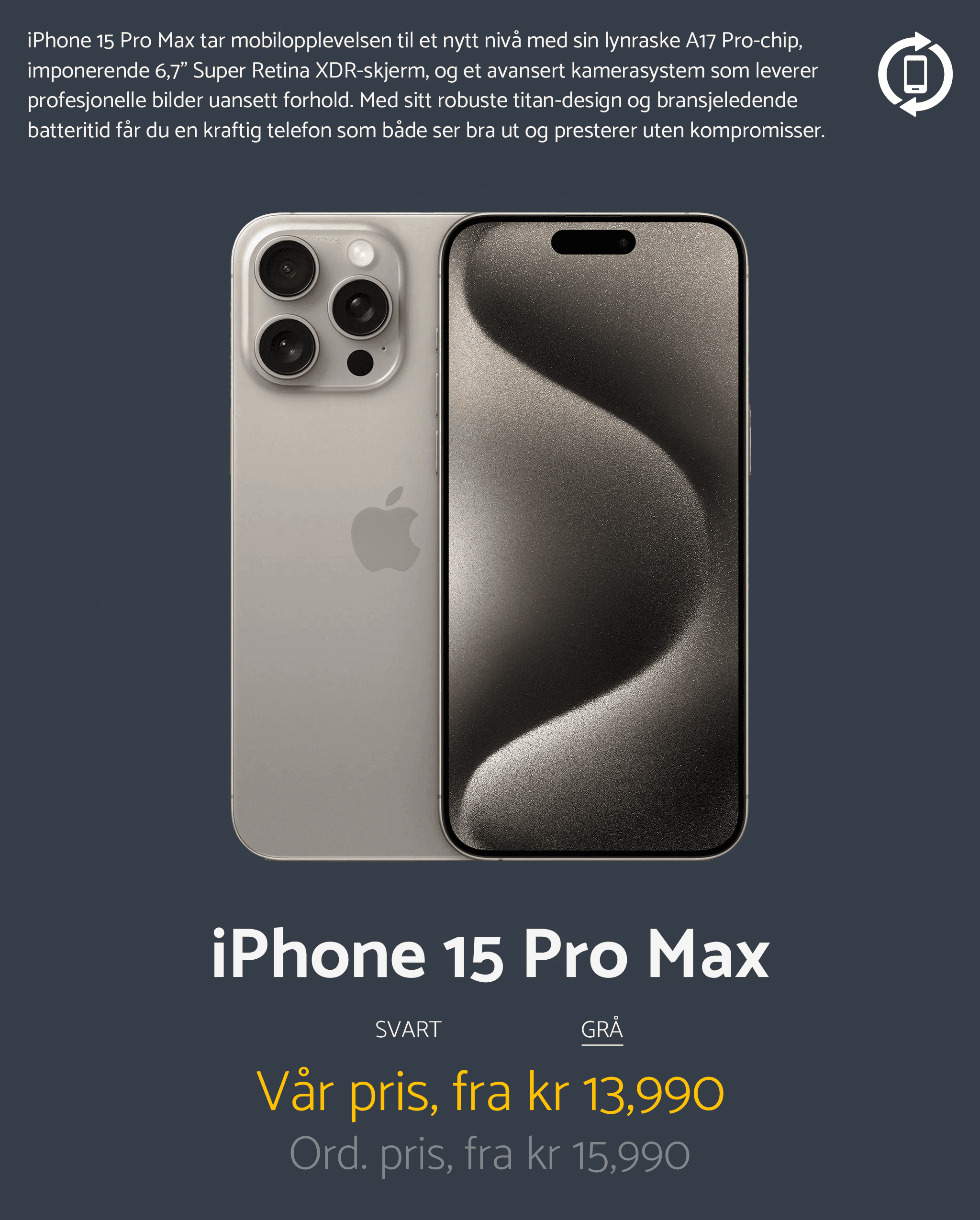
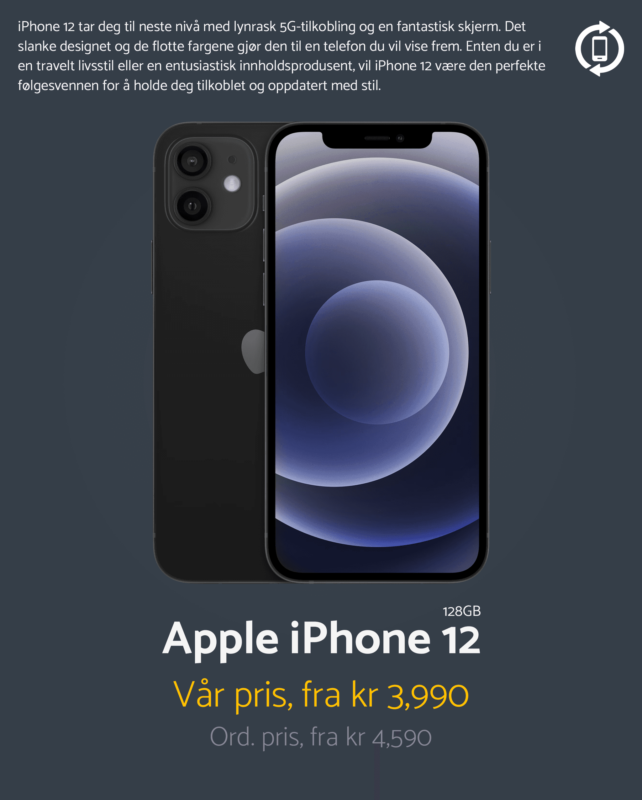
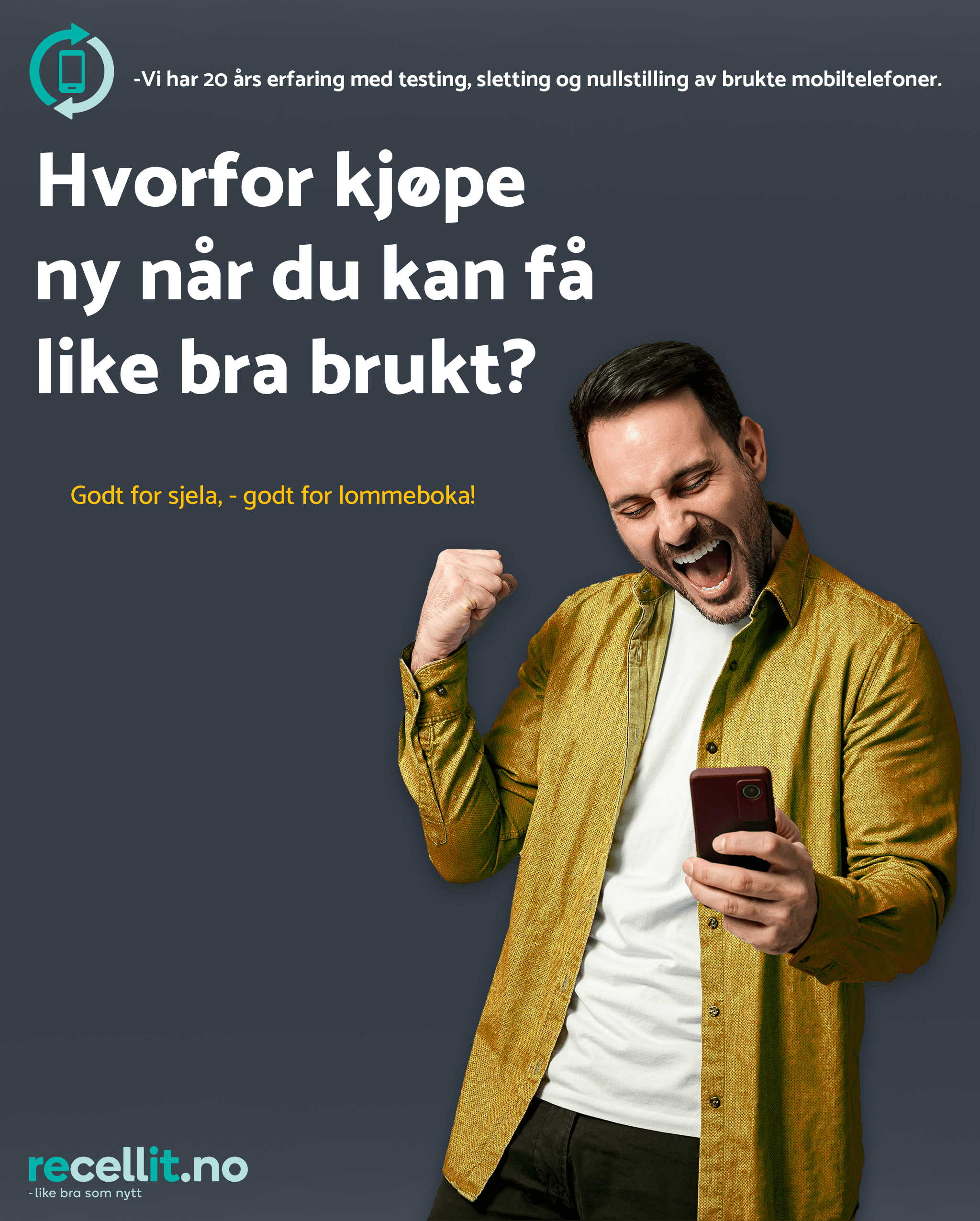
The solution was to build a cohesive set of social media posts based entirely on Recellit’s existing guidelines. Every design decision was grounded in the brand manual’s specifications for logo usage, color behavior, typography, icons and photography. The content highlighted product value, environmental benefits and service advantages using clear visual hierarchy and controlled color application. By approaching social media as an extension of the brand’s digital environment, the posts reinforced recognition while maintaining clarity and relevance for mobile-first consumption.


Color Palette :
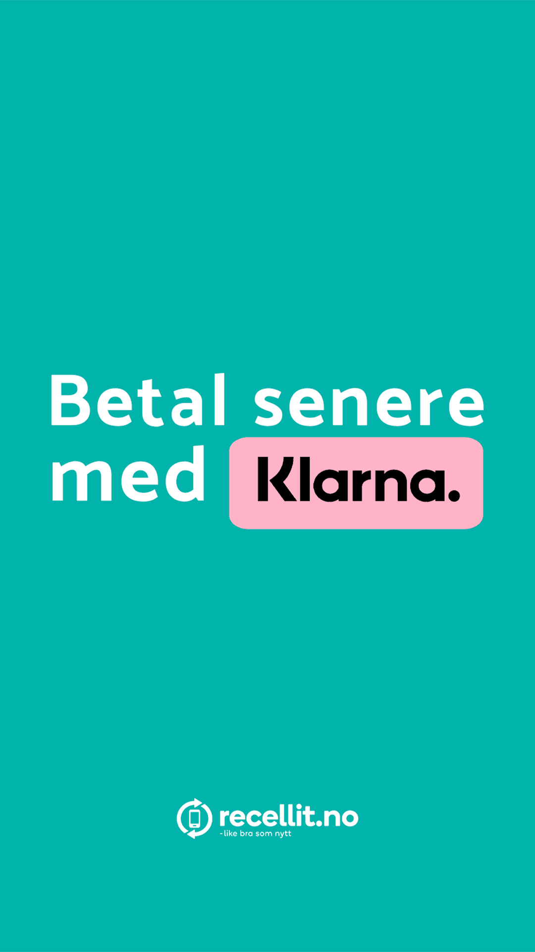
Recellit’s visual presence relies on a tight color system built around teal, dark grey, bright yellow and white. Dark grey served as the main identity color and was used to anchor backgrounds and branded panels for instant recognition. Teal provided contrast and stability, ensuring logo and icons remained readable at small social media sizes. Yellow functioned as a focused attention color, used sparingly to highlight benefits, announcements and promotional messaging. Lastly white is used for body text. The controlled balance between these three tones kept the content clear while reinforcing the brand’s identity.
Typography :
All content was built using the Catamaran type family. Bold weights were applied to headlines to maintain visibility in fast-scroll environments, while medium and regular weights handled supporting information. The typography’s clean, geometric structure made it ideal for mobile formats and matched the tone used across Recellit’s marketing and website, creating a consistent experience regardless of platform.
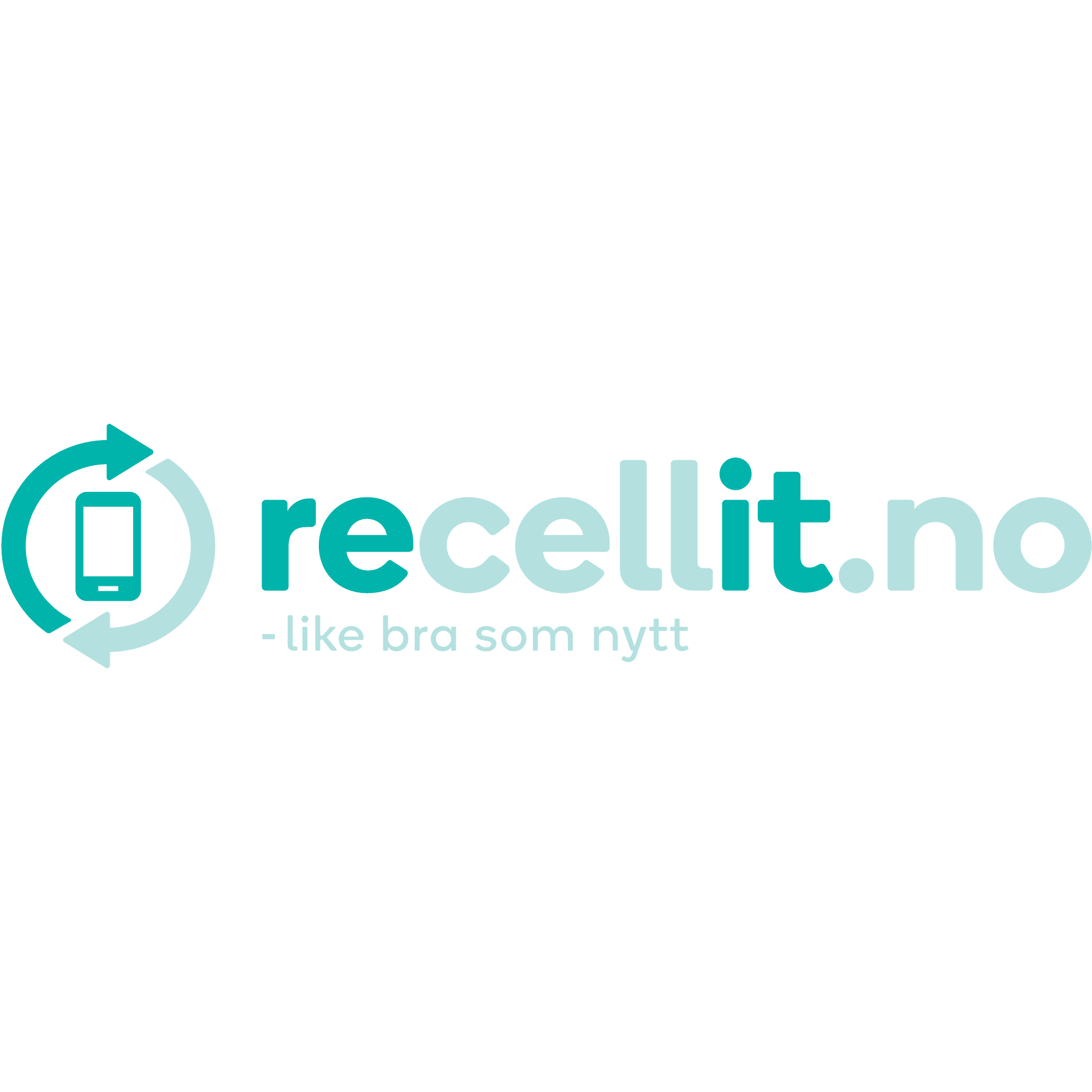
Logo & Visual Elements
The Recellit logo and symbol were used consistently and adapted to suit light or dark backgrounds as needed. Brand-approved service icons were integrated into benefit-driven posts to communicate key selling points quickly and clearly. Visual decisions focused on reinforcing brand familiarity without overwhelming the content with unnecessary decoration.

Layout & composition
Layouts were built around clear hierarchy and balanced spacing. Headlines, imagery and product information were organized into simple, predictable structures that read well at small sizes. The compositions drew on the visual tone of Recellit’s photography and marketing language, using negative space and clean alignment to keep the posts approachable and easy to navigate.
Interaction & Digital Decisions
All posts were optimized for mobile viewing, with high-contrast combinations and simplified visual density to avoid compression issues. Assets were exported in platform-specific ratios to ensure consistency across feed posts, stories and banners. The image choices and color usage aligned with the brand’s warm, friendly visual style, resulting in a cohesive digital presence.
Applications

Challenge :
The primary challenge was maintaining strict adherence to an established visual identity while avoiding repetition across a long timeline of content. With a limited color palette and a single type family, variation depended on careful control of composition, imagery and emphasis. Ensuring that each post felt fresh while still unmistakably Recellit required disciplined visual decision-making.
Outcome / Summary :
The final result was a cohesive and dependable social media presence that strengthened Recellit’s digital identity and improved the clarity of their communication. The posts aligned fully with the brand manual, supported ongoing sales and awareness campaigns, and delivered a professional, unified appearance that matched both the website and broader marketing efforts. The project demonstrates the ability to apply a strict identity system across high-volume digital content while retaining clarity, consistency and relevance.
More Projects


Graphic Design
SOCIAL MEDIA & CAMPAIGN MATERIAL FOR CLIENT
A collection of sharp, angular black prisms floating against a gradient dark background, showcasing a modern and sophisticated approach to digital 3D geometric composition.
Year :
2025
Industry :
Technology
Client :
Recellit
Project Duration :
10 months
Problem :
Recellit needed a steady flow of social media content that reflected their established identity and communicated their key values: sustainability, trustworthiness and affordability. Although the brand already had a defined visual language, their social presence lacked consistency in how colors, typography and messaging were applied. The challenge was to create content that stayed strictly within the brand manual while still being varied and engaging enough to function well across both Facebook and Instagram.
Solution :
The solution was to build a cohesive set of social media posts based entirely on Recellit’s existing guidelines. Every design decision was grounded in the brand manual’s specifications for logo usage, color behavior, typography, icons and photography. The content highlighted product value, environmental benefits and service advantages using clear visual hierarchy and controlled color application. By approaching social media as an extension of the brand’s digital environment, the posts reinforced recognition while maintaining clarity and relevance for mobile-first consumption.
Color Palette :
Recellit’s visual presence relies on a tight color system built around teal, dark grey, bright yellow and white. Dark grey served as the main identity color and was used to anchor backgrounds and branded panels for instant recognition. Teal provided contrast and stability, ensuring logo and icons remained readable at small social media sizes. Yellow functioned as a focused attention color, used sparingly to highlight benefits, announcements and promotional messaging. Lastly white is used for body text. The controlled balance between these three tones kept the content clear while reinforcing the brand’s identity.
Typography :
All content was built using the Catamaran type family. Bold weights were applied to headlines to maintain visibility in fast-scroll environments, while medium and regular weights handled supporting information. The typography’s clean, geometric structure made it ideal for mobile formats and matched the tone used across Recellit’s marketing and website, creating a consistent experience regardless of platform.
Logo & Visual Elements
The Recellit logo and symbol were used consistently and adapted to suit light or dark backgrounds as needed. Brand-approved service icons were integrated into benefit-driven posts to communicate key selling points quickly and clearly. Visual decisions focused on reinforcing brand familiarity without overwhelming the content with unnecessary decoration.
Layout & composition
Layouts were built around clear hierarchy and balanced spacing. Headlines, imagery and product information were organized into simple, predictable structures that read well at small sizes. The compositions drew on the visual tone of Recellit’s photography and marketing language, using negative space and clean alignment to keep the posts approachable and easy to navigate.
Interaction & Digital Decisions
All posts were optimized for mobile viewing, with high-contrast combinations and simplified visual density to avoid compression issues. Assets were exported in platform-specific ratios to ensure consistency across feed posts, stories and banners. The image choices and color usage aligned with the brand’s warm, friendly visual style, resulting in a cohesive digital presence.
Applications
Challenge :
The primary challenge was maintaining strict adherence to an established visual identity while avoiding repetition across a long timeline of content. With a limited color palette and a single type family, variation depended on careful control of composition, imagery and emphasis. Ensuring that each post felt fresh while still unmistakably Recellit required disciplined visual decision-making.
Outcome / Summary :
The final result was a cohesive and dependable social media presence that strengthened Recellit’s digital identity and improved the clarity of their communication. The posts aligned fully with the brand manual, supported ongoing sales and awareness campaigns, and delivered a professional, unified appearance that matched both the website and broader marketing efforts. The project demonstrates the ability to apply a strict identity system across high-volume digital content while retaining clarity, consistency and relevance.
More Projects
Graphic Design
SOCIAL MEDIA & CAMPAIGN MATERIAL FOR CLIENT
A collection of sharp, angular black prisms floating against a gradient dark background, showcasing a modern and sophisticated approach to digital 3D geometric composition.
Year :
2025
Industry :
Technology
Client :
Recellit
Project Duration :
10 months
Problem :
Recellit needed a steady flow of social media content that reflected their established identity and communicated their key values: sustainability, trustworthiness and affordability. Although the brand already had a defined visual language, their social presence lacked consistency in how colors, typography and messaging were applied. The challenge was to create content that stayed strictly within the brand manual while still being varied and engaging enough to function well across both Facebook and Instagram.
Solution :
The solution was to build a cohesive set of social media posts based entirely on Recellit’s existing guidelines. Every design decision was grounded in the brand manual’s specifications for logo usage, color behavior, typography, icons and photography. The content highlighted product value, environmental benefits and service advantages using clear visual hierarchy and controlled color application. By approaching social media as an extension of the brand’s digital environment, the posts reinforced recognition while maintaining clarity and relevance for mobile-first consumption.
Color Palette :
Recellit’s visual presence relies on a tight color system built around teal, dark grey, bright yellow and white. Dark grey served as the main identity color and was used to anchor backgrounds and branded panels for instant recognition. Teal provided contrast and stability, ensuring logo and icons remained readable at small social media sizes. Yellow functioned as a focused attention color, used sparingly to highlight benefits, announcements and promotional messaging. Lastly white is used for body text. The controlled balance between these three tones kept the content clear while reinforcing the brand’s identity.
Typography :
All content was built using the Catamaran type family. Bold weights were applied to headlines to maintain visibility in fast-scroll environments, while medium and regular weights handled supporting information. The typography’s clean, geometric structure made it ideal for mobile formats and matched the tone used across Recellit’s marketing and website, creating a consistent experience regardless of platform.
Logo & Visual Elements
The Recellit logo and symbol were used consistently and adapted to suit light or dark backgrounds as needed. Brand-approved service icons were integrated into benefit-driven posts to communicate key selling points quickly and clearly. Visual decisions focused on reinforcing brand familiarity without overwhelming the content with unnecessary decoration.
Layout & composition
Layouts were built around clear hierarchy and balanced spacing. Headlines, imagery and product information were organized into simple, predictable structures that read well at small sizes. The compositions drew on the visual tone of Recellit’s photography and marketing language, using negative space and clean alignment to keep the posts approachable and easy to navigate.
Interaction & Digital Decisions
All posts were optimized for mobile viewing, with high-contrast combinations and simplified visual density to avoid compression issues. Assets were exported in platform-specific ratios to ensure consistency across feed posts, stories and banners. The image choices and color usage aligned with the brand’s warm, friendly visual style, resulting in a cohesive digital presence.
Applications
Challenge :
The primary challenge was maintaining strict adherence to an established visual identity while avoiding repetition across a long timeline of content. With a limited color palette and a single type family, variation depended on careful control of composition, imagery and emphasis. Ensuring that each post felt fresh while still unmistakably Recellit required disciplined visual decision-making.
Outcome / Summary :
The final result was a cohesive and dependable social media presence that strengthened Recellit’s digital identity and improved the clarity of their communication. The posts aligned fully with the brand manual, supported ongoing sales and awareness campaigns, and delivered a professional, unified appearance that matched both the website and broader marketing efforts. The project demonstrates the ability to apply a strict identity system across high-volume digital content while retaining clarity, consistency and relevance.