Branding & UI / UX Design
Visual Identity & Web-design
Developed a full brand identity and responsive website for a cinematic video editor, including logo design, print materials, and social media assets. Built a cohesive and professional visual presence across all platforms. This was my final exam project at Noroff, where I collaborated with a real client to bring the assignment to life.
Year :
2025
Industry :
Film
Client :
Fredrik Sætaberget
Project Duration :
8 weeks

Website link
Website is currently down for maintenance.
Problem :
Fredrik Sætaberget, a video editor with a strong cinematic style, needed a cohesive brand identity that could work across digital platforms, print materials, and social media. His existing presence lacked consistency, which made it harder to stand out professionally and present his work in a polished way.
Solution :
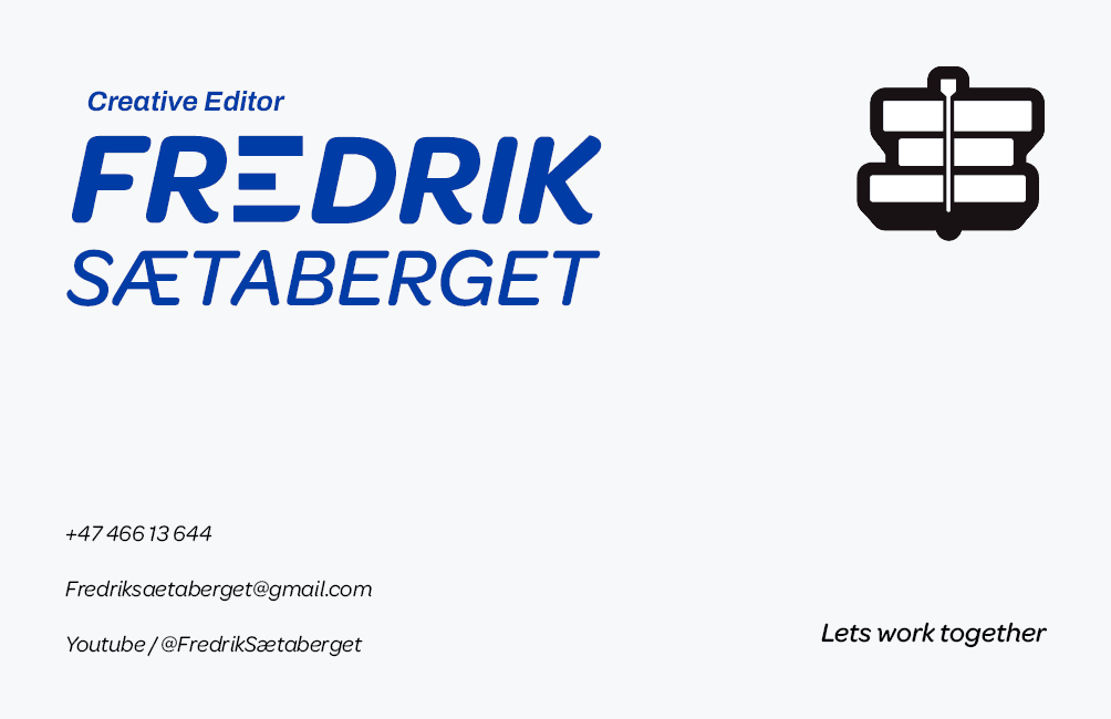
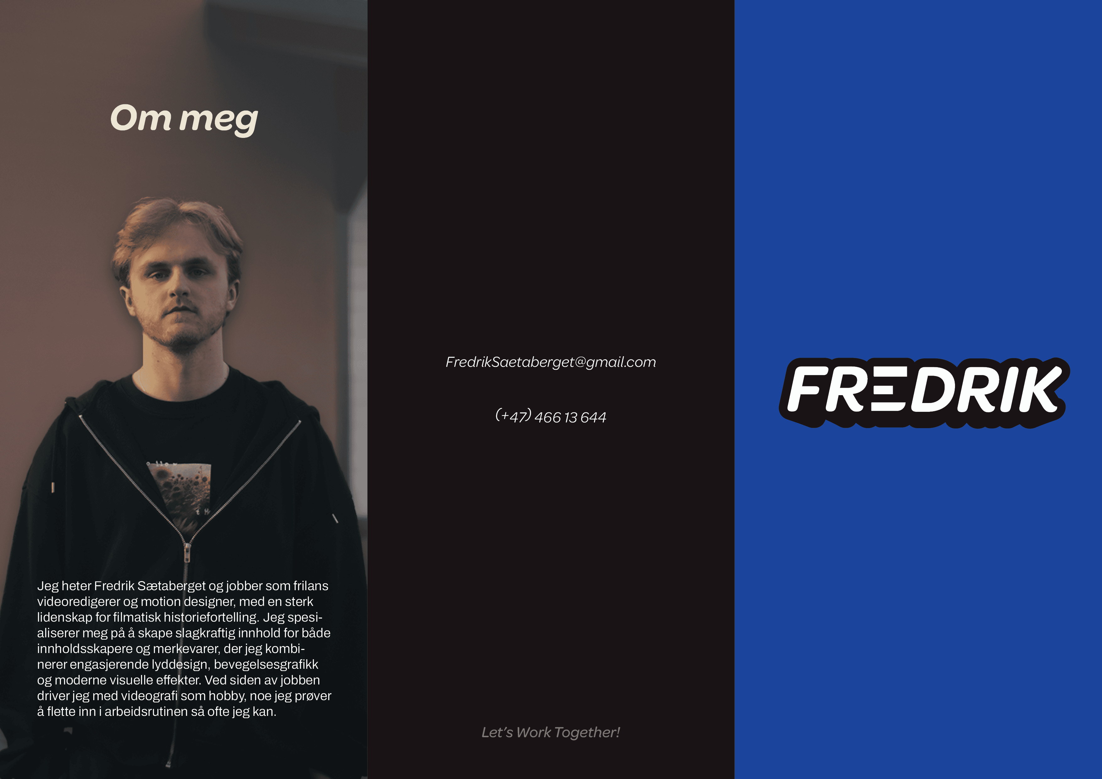
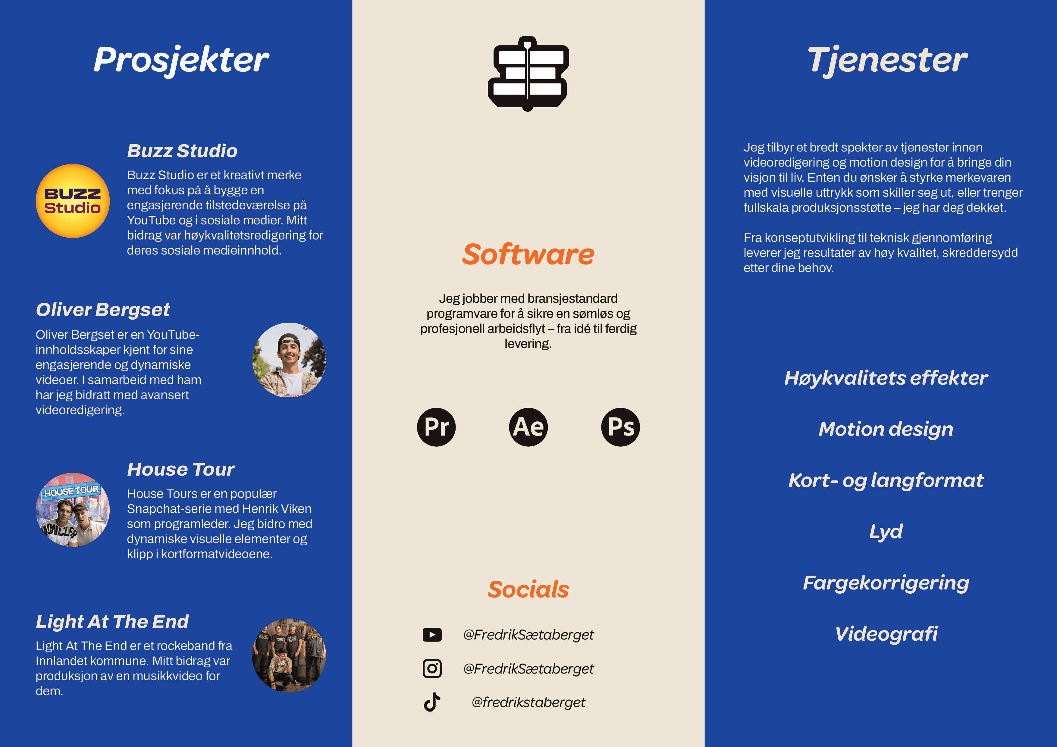
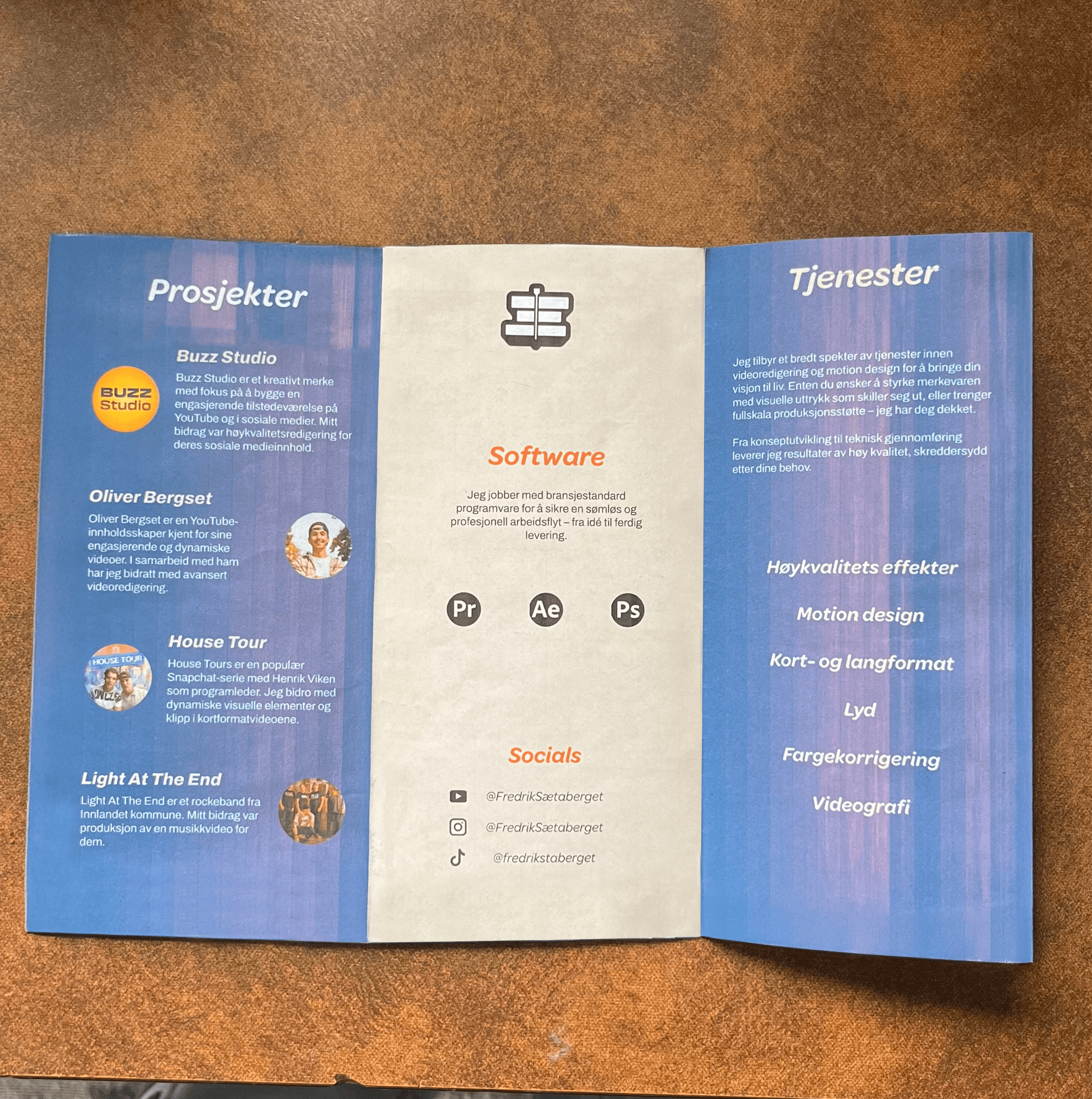
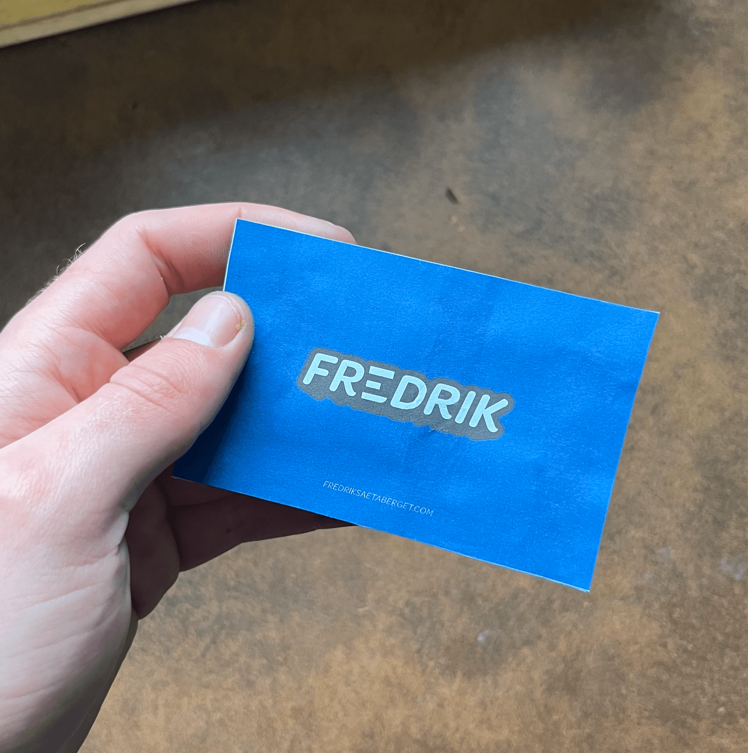
I designed a complete visual identity system, starting with a custom cinematic-inspired logo and a responsive website with interactive features. To extend the brand, I created business cards, brochures, and a social media kit for YouTube and TikTok. A shop was also integrated into the website, making the brand more versatile and functional. Every element was designed to reflect Fredrik’s creative energy and provide a scalable, recognizable identity.
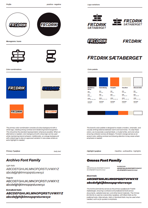
Color Palette :
The color palette is designed to support a cinematic and modern tone.
Blackberry Syrup (#191214) functions as a washed-black foundation that adds depth without overwhelming the content. Flint Bluing (#003CA8) is the primary brand color, used for strong visual presence and instant recognition across thumbnails, headers, and backgrounds. Tan Silver (#EDE8D8) and Dimmed White (#F9F9F9) soften the identity, creating balance and clarity in layouts. Finally, Pumpkin (#FF681F) is used sparingly as an accent to highlight key interactions and high-impact visual moments.
Together, these colors give the brand a bold, cinematic look that remains functional across both digital and print applications.
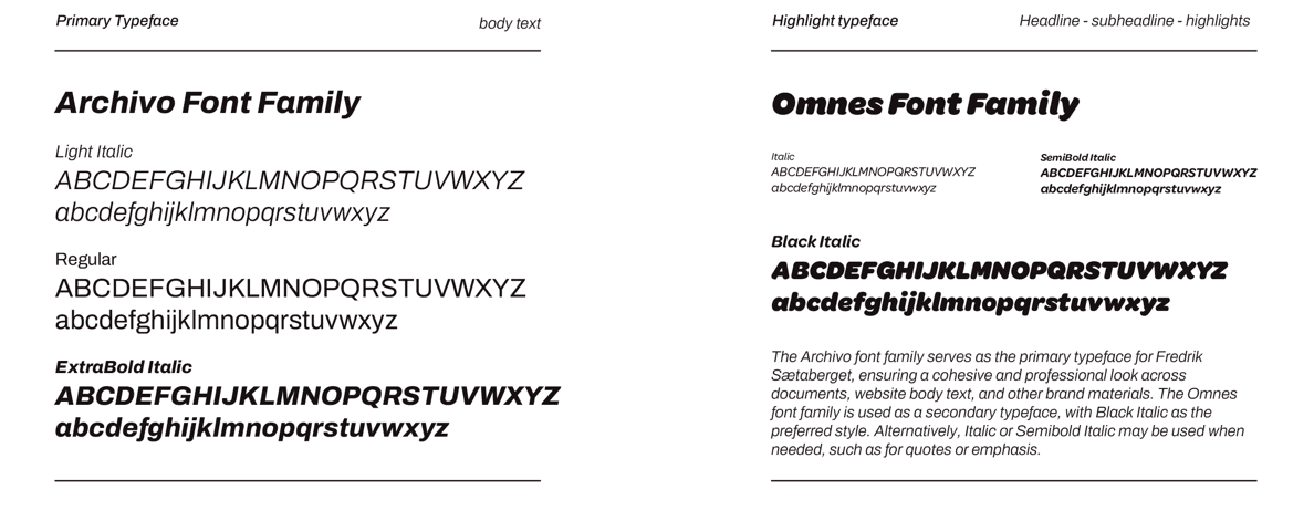
Typography :
The identity is built around a dual-typeface system combining Archivo and Omnes. Archivo serves as the primary typeface, used for body text and longer-form communication due to its geometric clarity and excellent readability at smaller sizes. Omnes introduces a more expressive tone through rounded forms and italic variations, making it ideal for headlines, highlights, and signature elements.
This pairing allows the identity to shift between professional precision and creative expression—matching Fredrik’s blend of technical editing skills and cinematic storytelling.
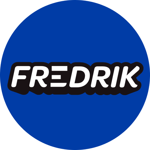
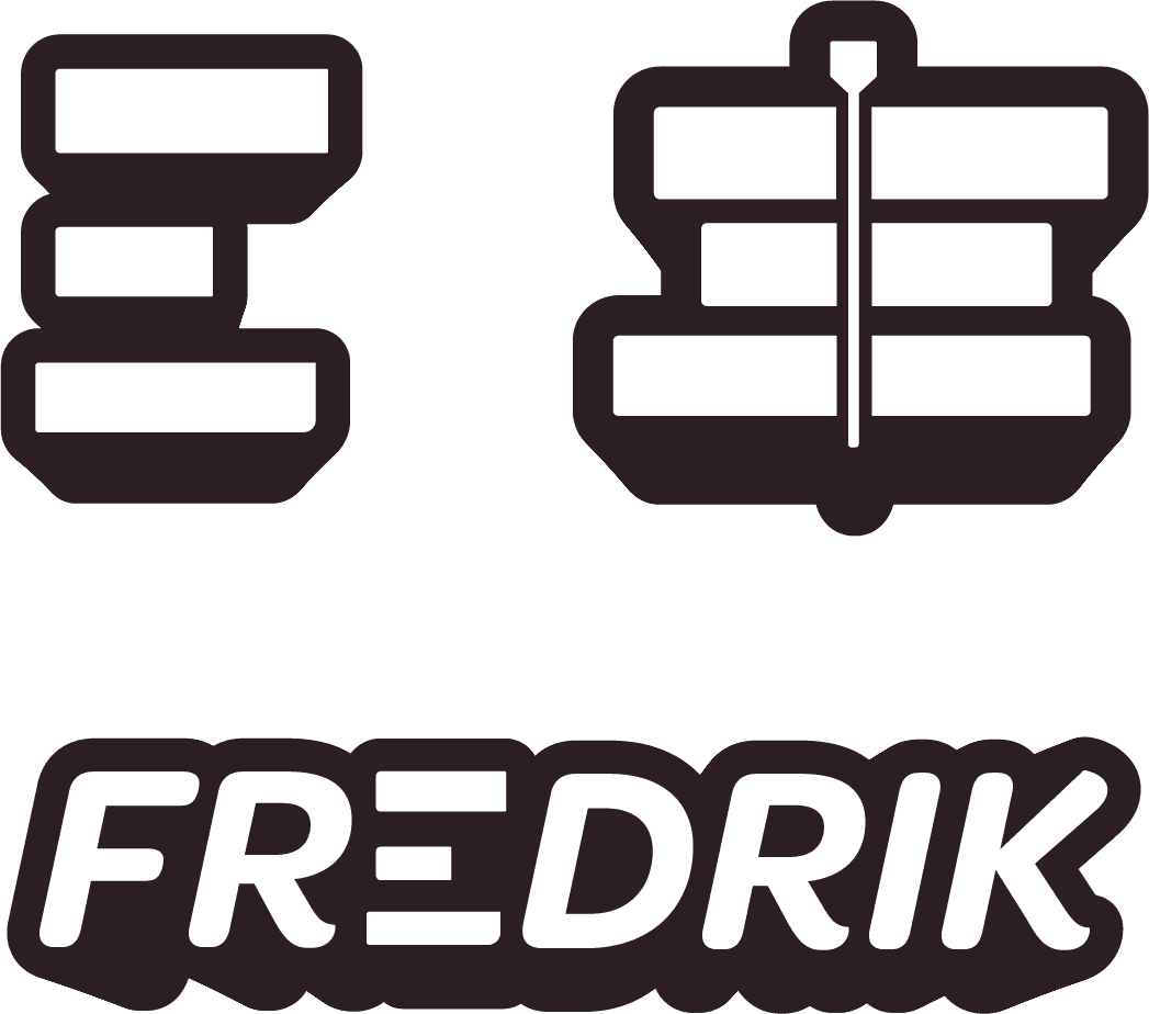
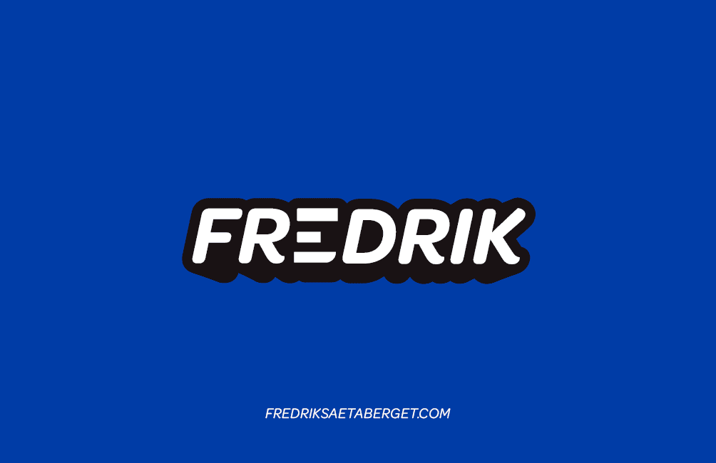
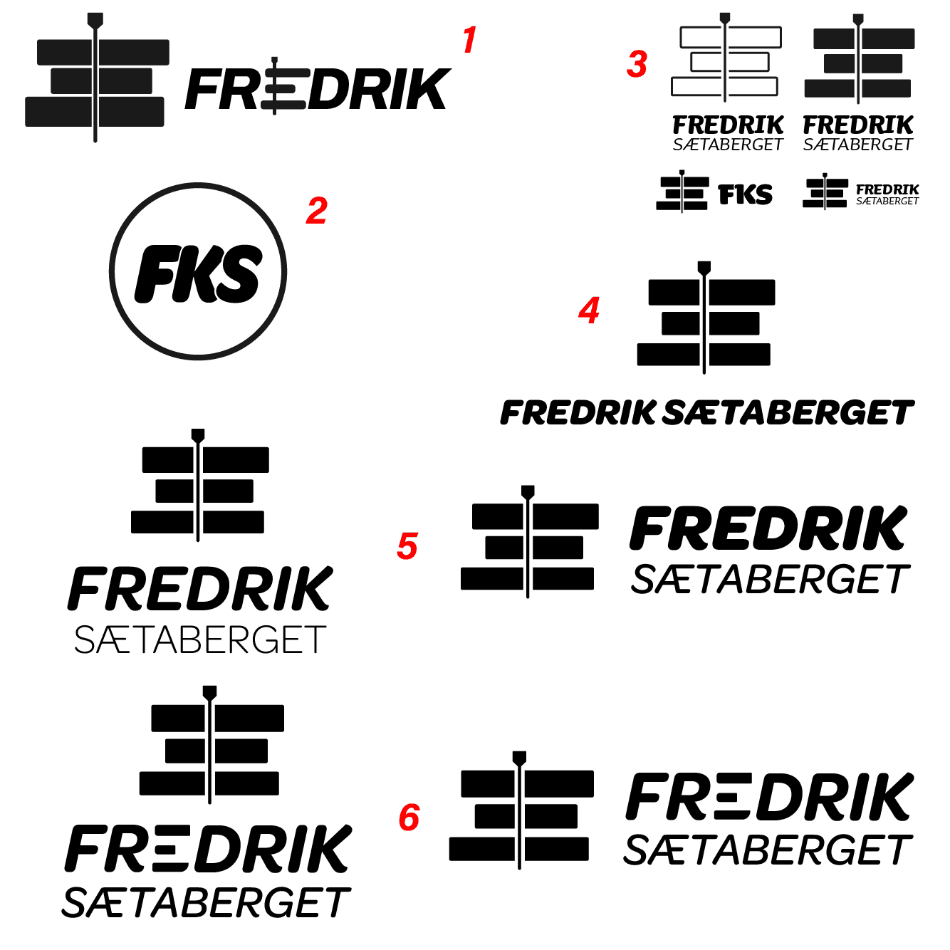
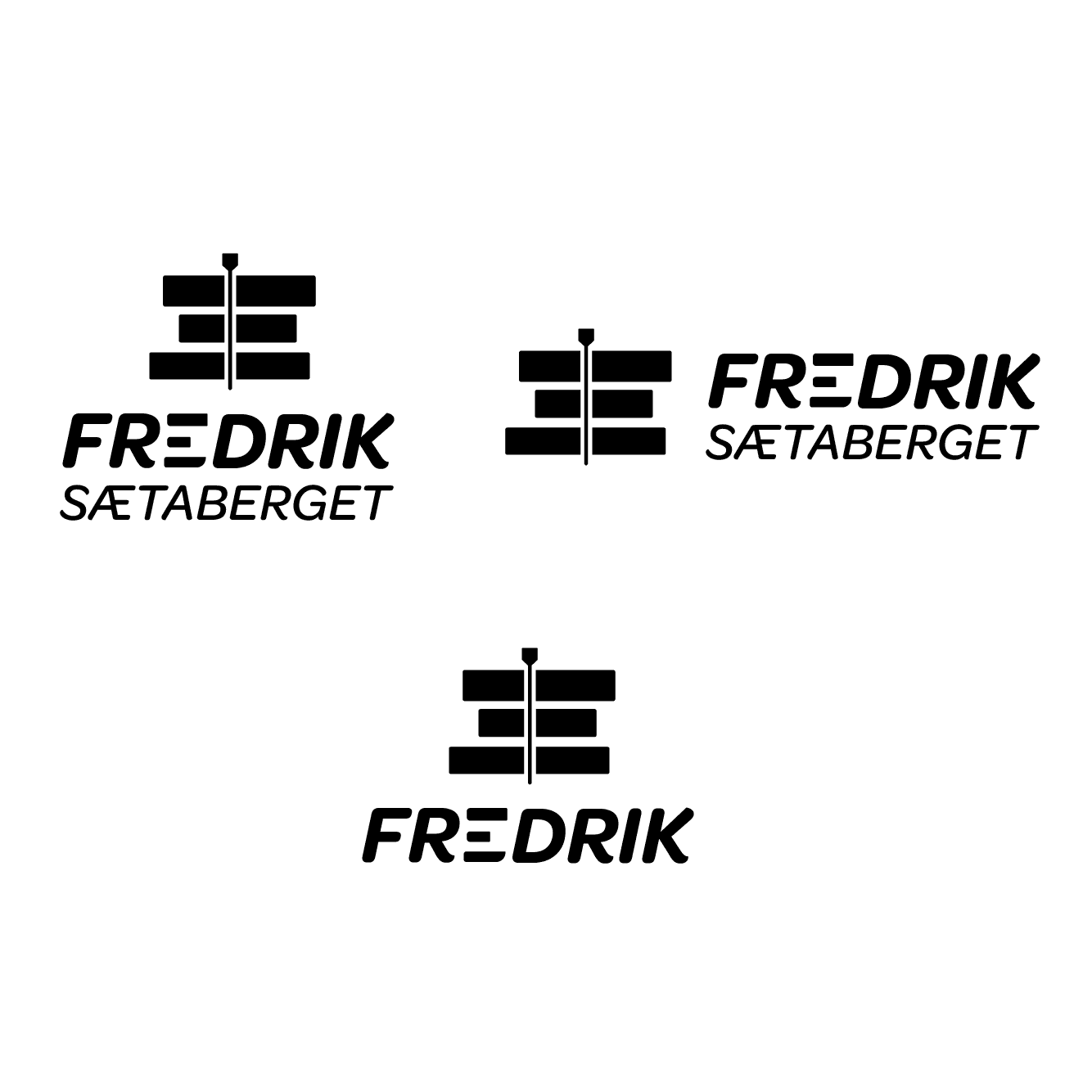
Logo & Visual Elements :
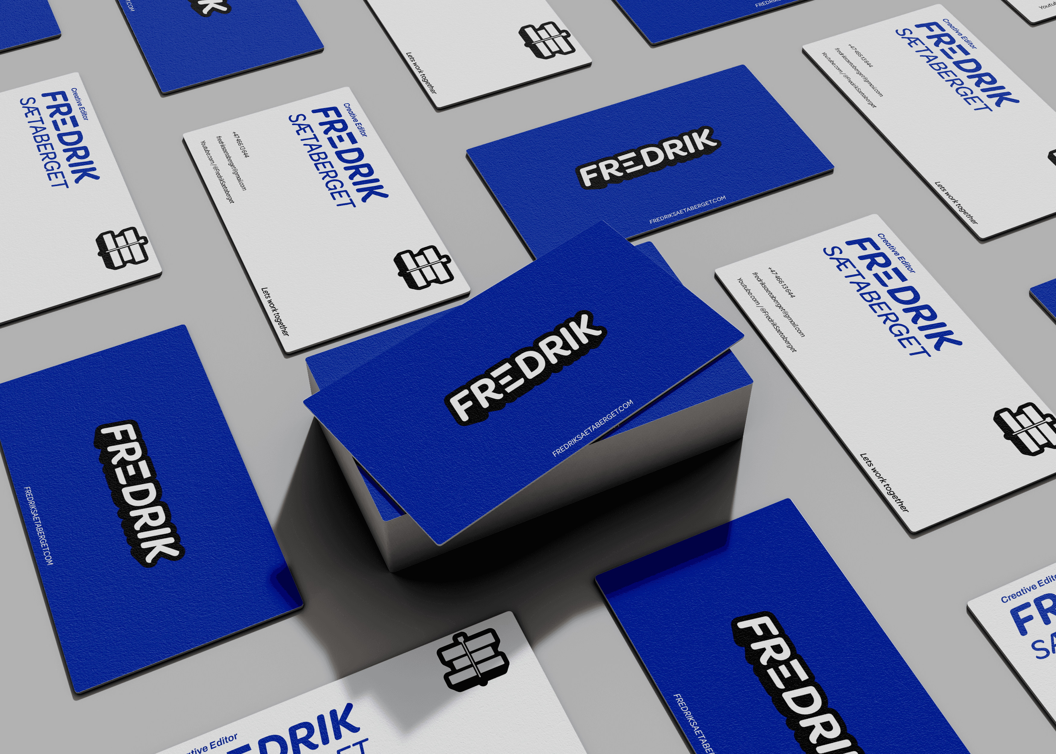
The logo system is constructed from simple geometric shapes, reflecting the structure and precision of film editing. Multiple configurations were created—horizontal, stacked, compact, and monogram—ensuring the mark adapts seamlessly across YouTube banners, social thumbnails, business cards, and web headers.
Supporting elements, including the circular profile mark and icon variations, extend the brand’s visual language while maintaining strict shape consistency. This modular system makes the identity flexible for future expansion without losing recognition.
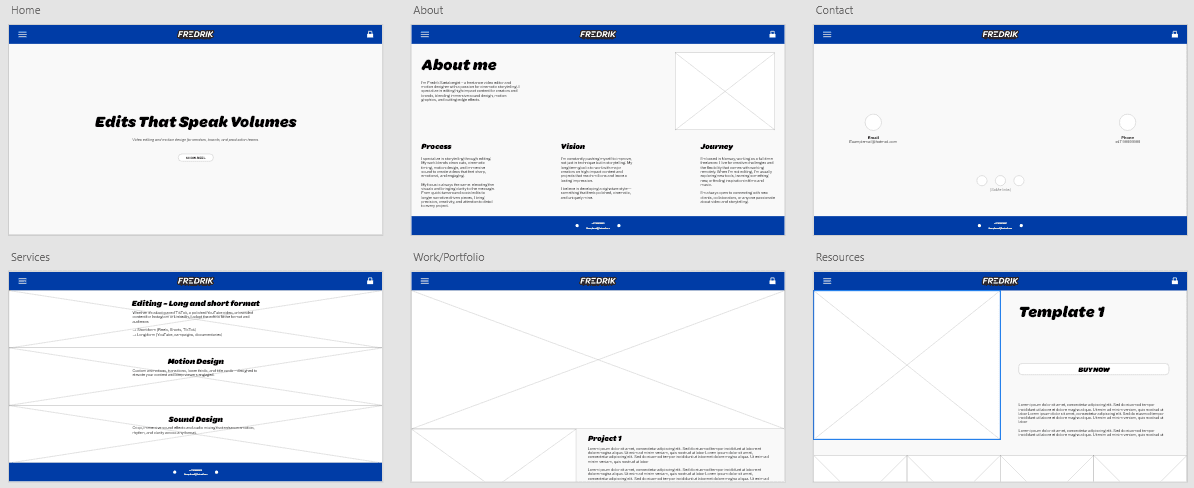
Layout & Composition :
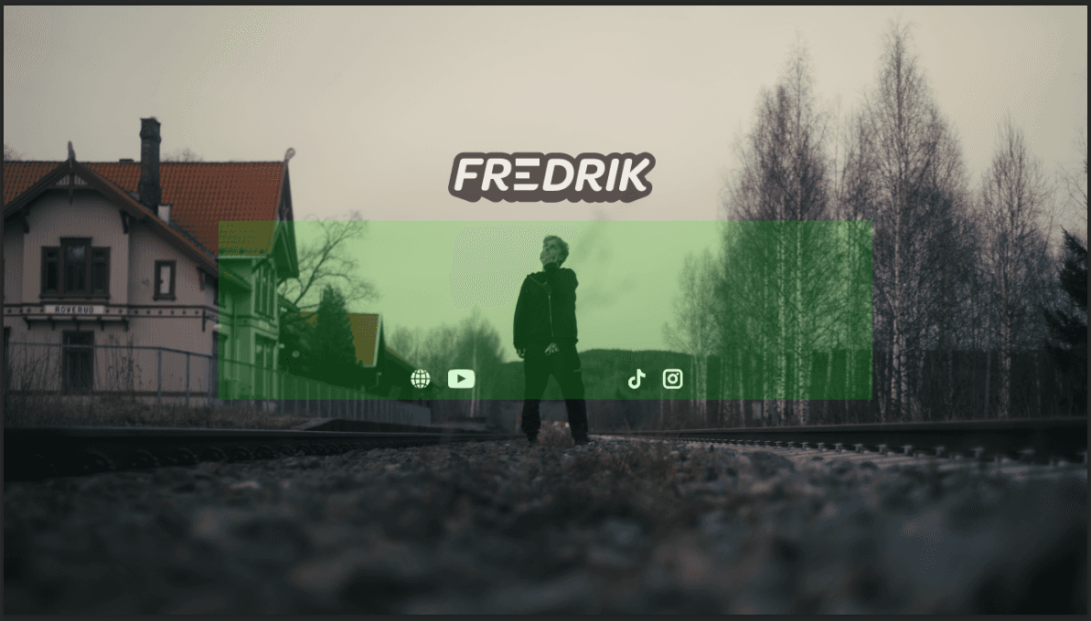
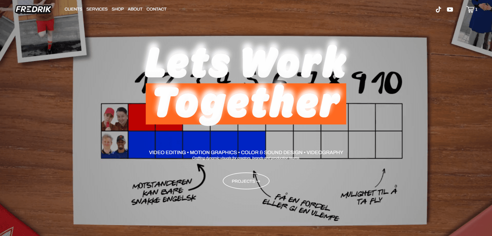
The layout follows a spacious, editorial-inspired grid with strong margins and clear hierarchy. Large imagery carries the visual weight of the identity, allowing Fredrik’s work to remain the focal point. Text is intentionally minimal and positioned to reinforce a clean top-left reading structure, while negative space helps maintain balance across both print and digital compositions.
Thumbnail designs use centered compositions, bold type, and strong color contrast to remain legible at small sizes, ensuring consistent performance on platforms like YouTube and TikTok.
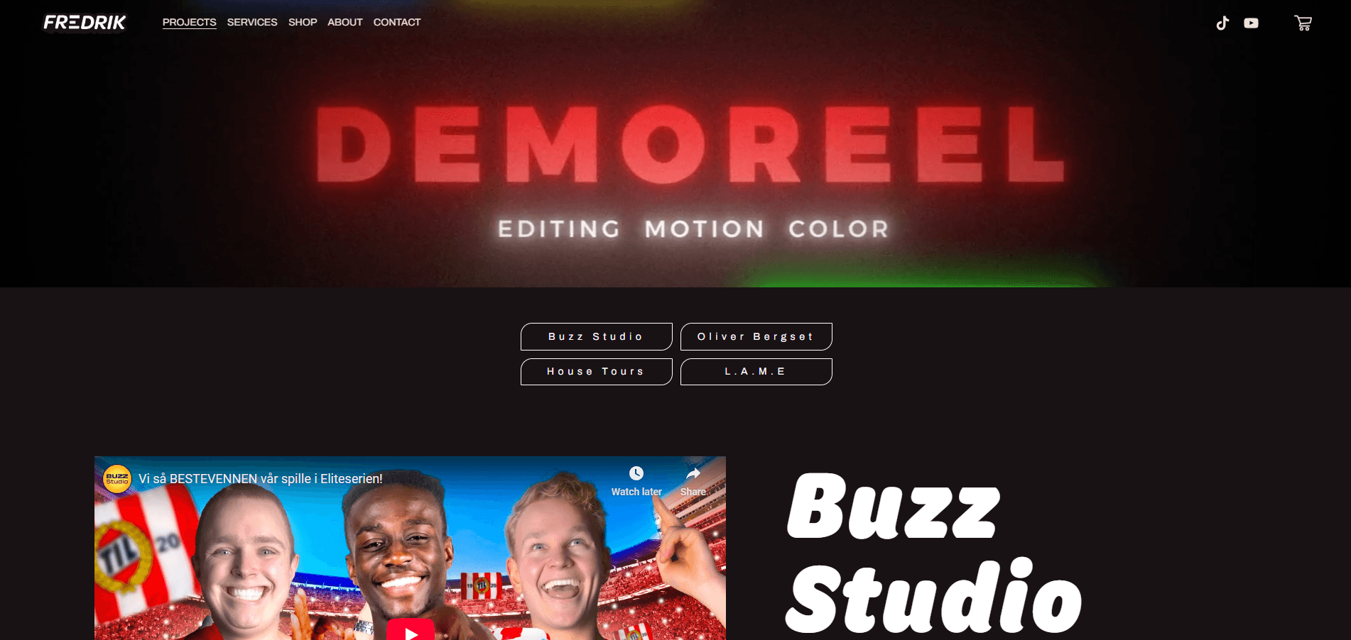
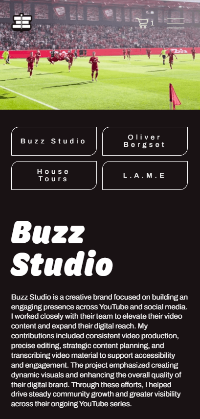
Interaction & Digital Decisions :
The website was designed as a streamlined showcase for Fredrik’s work. Navigation is kept minimal to maintain focus on the content, while responsive behavior ensures seamless transitions between mobile and desktop. Subtle hover and scroll interactions add depth without disrupting the cinematic tone.
The structure is intentionally simple—project pages emphasize large visuals, readable type, and consistent spacing to communicate professionalism and clarity.
Applications :
Challenge :
The challenge was in creating a system flexible enough to adapt across multiple touchpoints while still maintaining a strong, unified look. Balancing cinematic flair with professional minimalism was key to ensuring the identity felt unique but not over-designed.
Outcome / Summary :
The final identity and website gave Fredrik a cohesive visual system that works reliably across digital and print formats. The color palette, typography, and modular logo variations created a recognizable cinematic tone, while the website provided a clear and professional platform to present his work. The brand now feels consistent, scalable, and easy for him to maintain across social media, thumbnails, and future projects.
This project strengthened my ability to translate a creative style into a structured design system and taught me how to balance expressive visual elements with practical usability. Working with a real client sharpened my communication, helped me justify design choices more clearly, and reinforced the value of building identities that perform well in real-world applications.
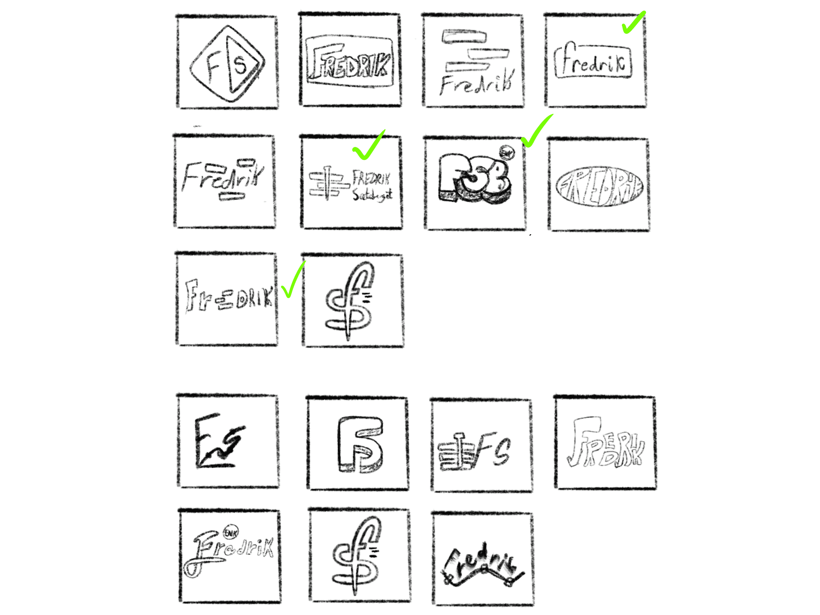
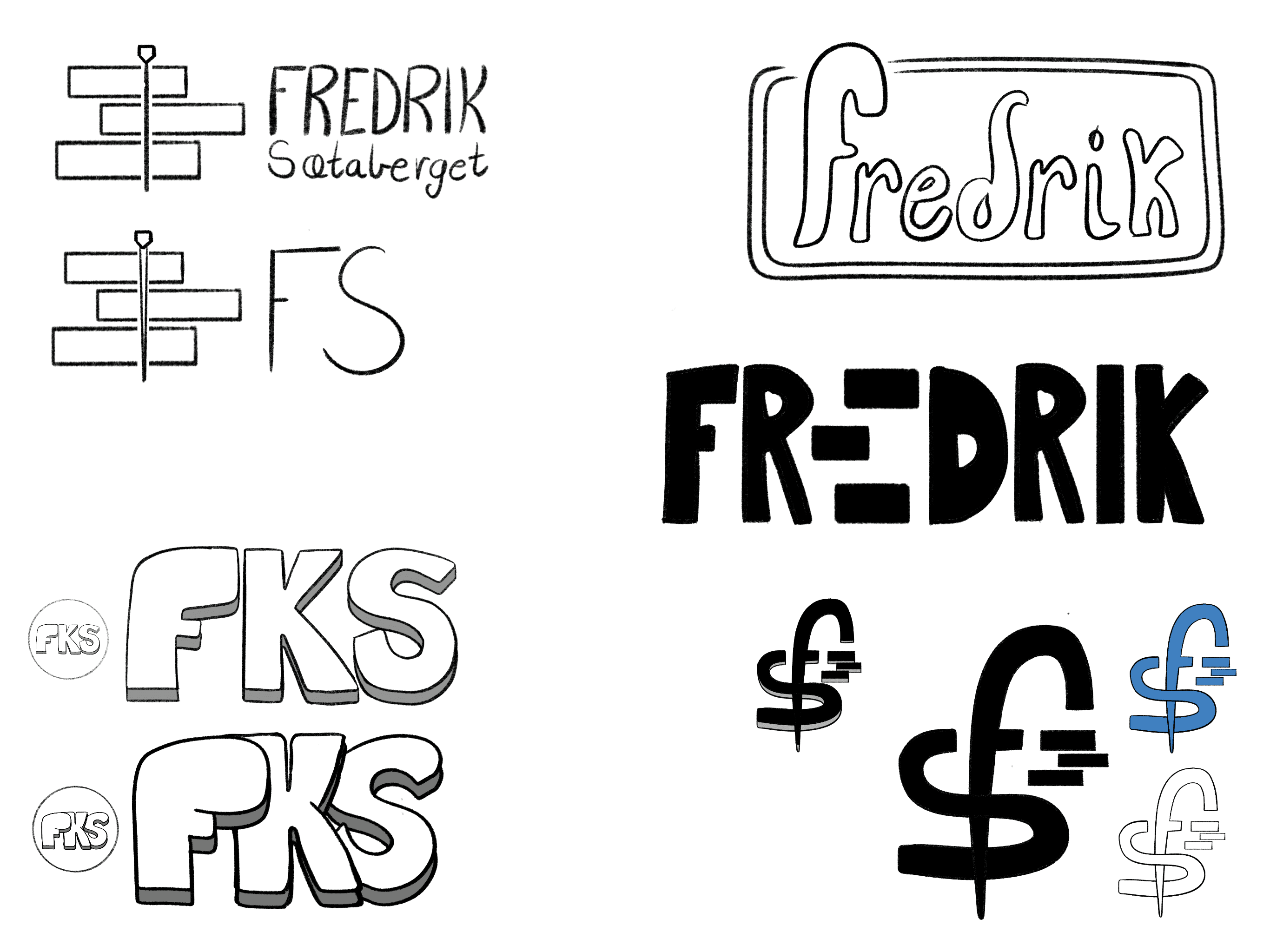
SKETCHES & PROCESS :
More Projects


Branding & UI / UX Design
Visual Identity & Web-design
Developed a full brand identity and responsive website for a cinematic video editor, including logo design, print materials, and social media assets. Built a cohesive and professional visual presence across all platforms. This was my final exam project at Noroff, where I collaborated with a real client to bring the assignment to life.
Year :
2025
Industry :
Film
Client :
Fredrik Sætaberget
Project Duration :
8 weeks
Website link
Website is currently down for maintenance.
Problem :
Fredrik Sætaberget, a video editor with a strong cinematic style, needed a cohesive brand identity that could work across digital platforms, print materials, and social media. His existing presence lacked consistency, which made it harder to stand out professionally and present his work in a polished way.
Solution :
I designed a complete visual identity system, starting with a custom cinematic-inspired logo and a responsive website with interactive features. To extend the brand, I created business cards, brochures, and a social media kit for YouTube and TikTok. A shop was also integrated into the website, making the brand more versatile and functional. Every element was designed to reflect Fredrik’s creative energy and provide a scalable, recognizable identity.
Color Palette :
The color palette is designed to support a cinematic and modern tone.
Blackberry Syrup (#191214) functions as a washed-black foundation that adds depth without overwhelming the content. Flint Bluing (#003CA8) is the primary brand color, used for strong visual presence and instant recognition across thumbnails, headers, and backgrounds. Tan Silver (#EDE8D8) and Dimmed White (#F9F9F9) soften the identity, creating balance and clarity in layouts. Finally, Pumpkin (#FF681F) is used sparingly as an accent to highlight key interactions and high-impact visual moments.
Together, these colors give the brand a bold, cinematic look that remains functional across both digital and print applications.
Typography :
The identity is built around a dual-typeface system combining Archivo and Omnes. Archivo serves as the primary typeface, used for body text and longer-form communication due to its geometric clarity and excellent readability at smaller sizes. Omnes introduces a more expressive tone through rounded forms and italic variations, making it ideal for headlines, highlights, and signature elements.
This pairing allows the identity to shift between professional precision and creative expression—matching Fredrik’s blend of technical editing skills and cinematic storytelling.
Logo & Visual Elements :
The logo system is constructed from simple geometric shapes, reflecting the structure and precision of film editing. Multiple configurations were created—horizontal, stacked, compact, and monogram—ensuring the mark adapts seamlessly across YouTube banners, social thumbnails, business cards, and web headers.
Supporting elements, including the circular profile mark and icon variations, extend the brand’s visual language while maintaining strict shape consistency. This modular system makes the identity flexible for future expansion without losing recognition.
Layout & Composition :
The layout follows a spacious, editorial-inspired grid with strong margins and clear hierarchy. Large imagery carries the visual weight of the identity, allowing Fredrik’s work to remain the focal point. Text is intentionally minimal and positioned to reinforce a clean top-left reading structure, while negative space helps maintain balance across both print and digital compositions.
Thumbnail designs use centered compositions, bold type, and strong color contrast to remain legible at small sizes, ensuring consistent performance on platforms like YouTube and TikTok.
Interaction & Digital Decisions :
The website was designed as a streamlined showcase for Fredrik’s work. Navigation is kept minimal to maintain focus on the content, while responsive behavior ensures seamless transitions between mobile and desktop. Subtle hover and scroll interactions add depth without disrupting the cinematic tone.
The structure is intentionally simple—project pages emphasize large visuals, readable type, and consistent spacing to communicate professionalism and clarity.
Applications :
Challenge :
The challenge was in creating a system flexible enough to adapt across multiple touchpoints while still maintaining a strong, unified look. Balancing cinematic flair with professional minimalism was key to ensuring the identity felt unique but not over-designed.
Outcome / Summary :
The final identity and website gave Fredrik a cohesive visual system that works reliably across digital and print formats. The color palette, typography, and modular logo variations created a recognizable cinematic tone, while the website provided a clear and professional platform to present his work. The brand now feels consistent, scalable, and easy for him to maintain across social media, thumbnails, and future projects.
This project strengthened my ability to translate a creative style into a structured design system and taught me how to balance expressive visual elements with practical usability. Working with a real client sharpened my communication, helped me justify design choices more clearly, and reinforced the value of building identities that perform well in real-world applications.
SKETCHES & PROCESS :
More Projects
Branding & UI / UX Design
Visual Identity & Web-design
Developed a full brand identity and responsive website for a cinematic video editor, including logo design, print materials, and social media assets. Built a cohesive and professional visual presence across all platforms. This was my final exam project at Noroff, where I collaborated with a real client to bring the assignment to life.
Year :
2025
Industry :
Film
Client :
Fredrik Sætaberget
Project Duration :
8 weeks
Website link
Website is currently down for maintenance.
Problem :
Fredrik Sætaberget, a video editor with a strong cinematic style, needed a cohesive brand identity that could work across digital platforms, print materials, and social media. His existing presence lacked consistency, which made it harder to stand out professionally and present his work in a polished way.
Solution :
I designed a complete visual identity system, starting with a custom cinematic-inspired logo and a responsive website with interactive features. To extend the brand, I created business cards, brochures, and a social media kit for YouTube and TikTok. A shop was also integrated into the website, making the brand more versatile and functional. Every element was designed to reflect Fredrik’s creative energy and provide a scalable, recognizable identity.
Color Palette :
The color palette is designed to support a cinematic and modern tone.
Blackberry Syrup (#191214) functions as a washed-black foundation that adds depth without overwhelming the content. Flint Bluing (#003CA8) is the primary brand color, used for strong visual presence and instant recognition across thumbnails, headers, and backgrounds. Tan Silver (#EDE8D8) and Dimmed White (#F9F9F9) soften the identity, creating balance and clarity in layouts. Finally, Pumpkin (#FF681F) is used sparingly as an accent to highlight key interactions and high-impact visual moments.
Together, these colors give the brand a bold, cinematic look that remains functional across both digital and print applications.
Typography :
The identity is built around a dual-typeface system combining Archivo and Omnes. Archivo serves as the primary typeface, used for body text and longer-form communication due to its geometric clarity and excellent readability at smaller sizes. Omnes introduces a more expressive tone through rounded forms and italic variations, making it ideal for headlines, highlights, and signature elements.
This pairing allows the identity to shift between professional precision and creative expression—matching Fredrik’s blend of technical editing skills and cinematic storytelling.
Logo & Visual Elements :
The logo system is constructed from simple geometric shapes, reflecting the structure and precision of film editing. Multiple configurations were created—horizontal, stacked, compact, and monogram—ensuring the mark adapts seamlessly across YouTube banners, social thumbnails, business cards, and web headers.
Supporting elements, including the circular profile mark and icon variations, extend the brand’s visual language while maintaining strict shape consistency. This modular system makes the identity flexible for future expansion without losing recognition.
Layout & Composition :
The layout follows a spacious, editorial-inspired grid with strong margins and clear hierarchy. Large imagery carries the visual weight of the identity, allowing Fredrik’s work to remain the focal point. Text is intentionally minimal and positioned to reinforce a clean top-left reading structure, while negative space helps maintain balance across both print and digital compositions.
Thumbnail designs use centered compositions, bold type, and strong color contrast to remain legible at small sizes, ensuring consistent performance on platforms like YouTube and TikTok.
Interaction & Digital Decisions :
The website was designed as a streamlined showcase for Fredrik’s work. Navigation is kept minimal to maintain focus on the content, while responsive behavior ensures seamless transitions between mobile and desktop. Subtle hover and scroll interactions add depth without disrupting the cinematic tone.
The structure is intentionally simple—project pages emphasize large visuals, readable type, and consistent spacing to communicate professionalism and clarity.
Applications :
Challenge :
The challenge was in creating a system flexible enough to adapt across multiple touchpoints while still maintaining a strong, unified look. Balancing cinematic flair with professional minimalism was key to ensuring the identity felt unique but not over-designed.
Outcome / Summary :
The final identity and website gave Fredrik a cohesive visual system that works reliably across digital and print formats. The color palette, typography, and modular logo variations created a recognizable cinematic tone, while the website provided a clear and professional platform to present his work. The brand now feels consistent, scalable, and easy for him to maintain across social media, thumbnails, and future projects.
This project strengthened my ability to translate a creative style into a structured design system and taught me how to balance expressive visual elements with practical usability. Working with a real client sharpened my communication, helped me justify design choices more clearly, and reinforced the value of building identities that perform well in real-world applications.
SKETCHES & PROCESS :