Graphic Design
TwinLeaf Product Design
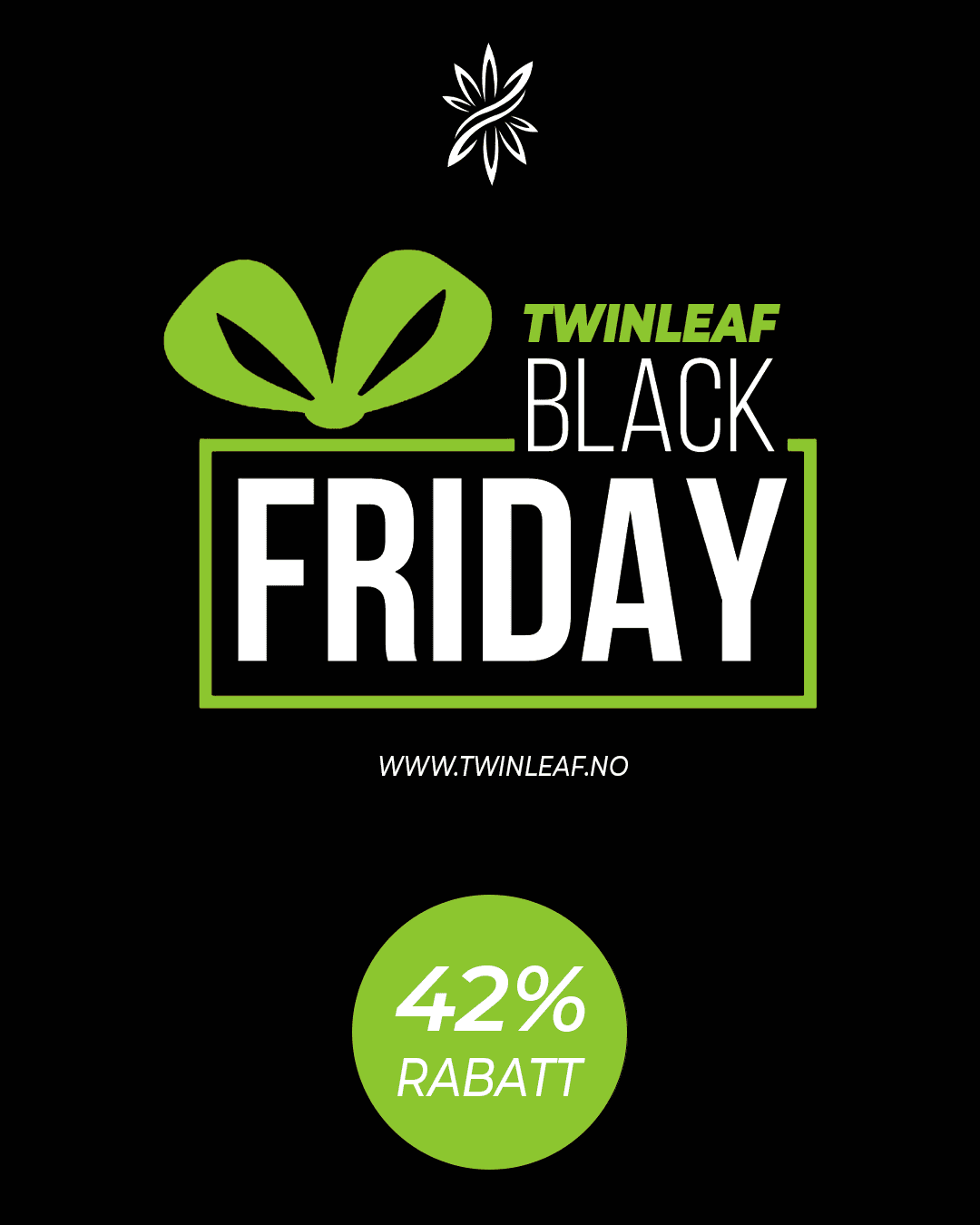
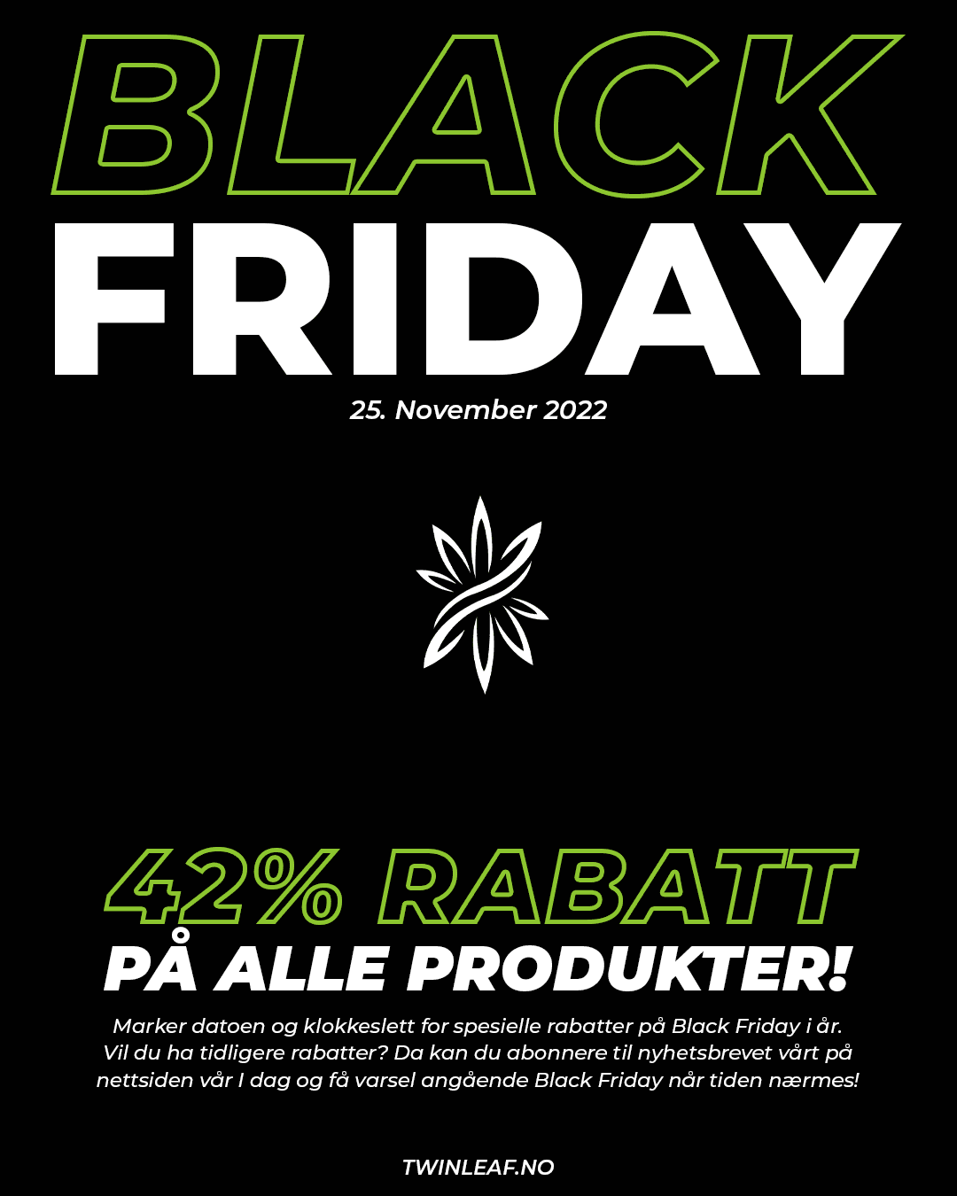
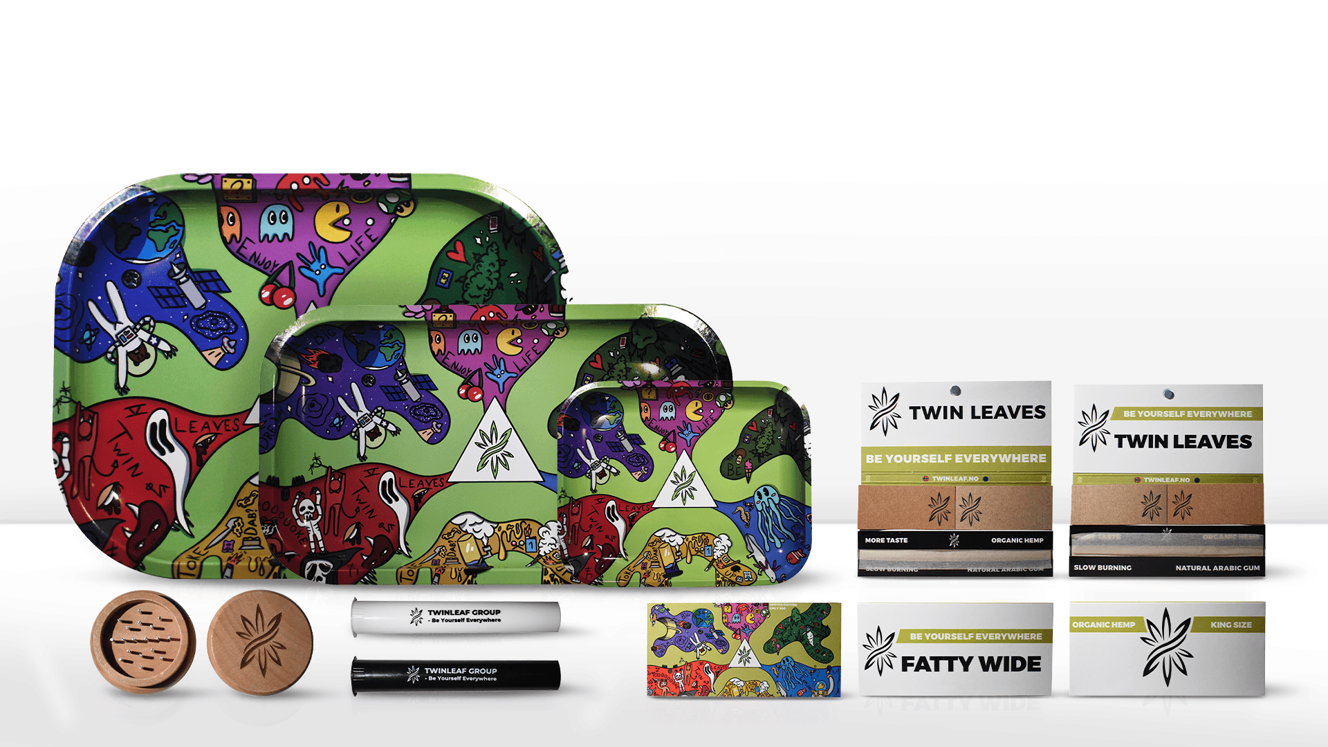
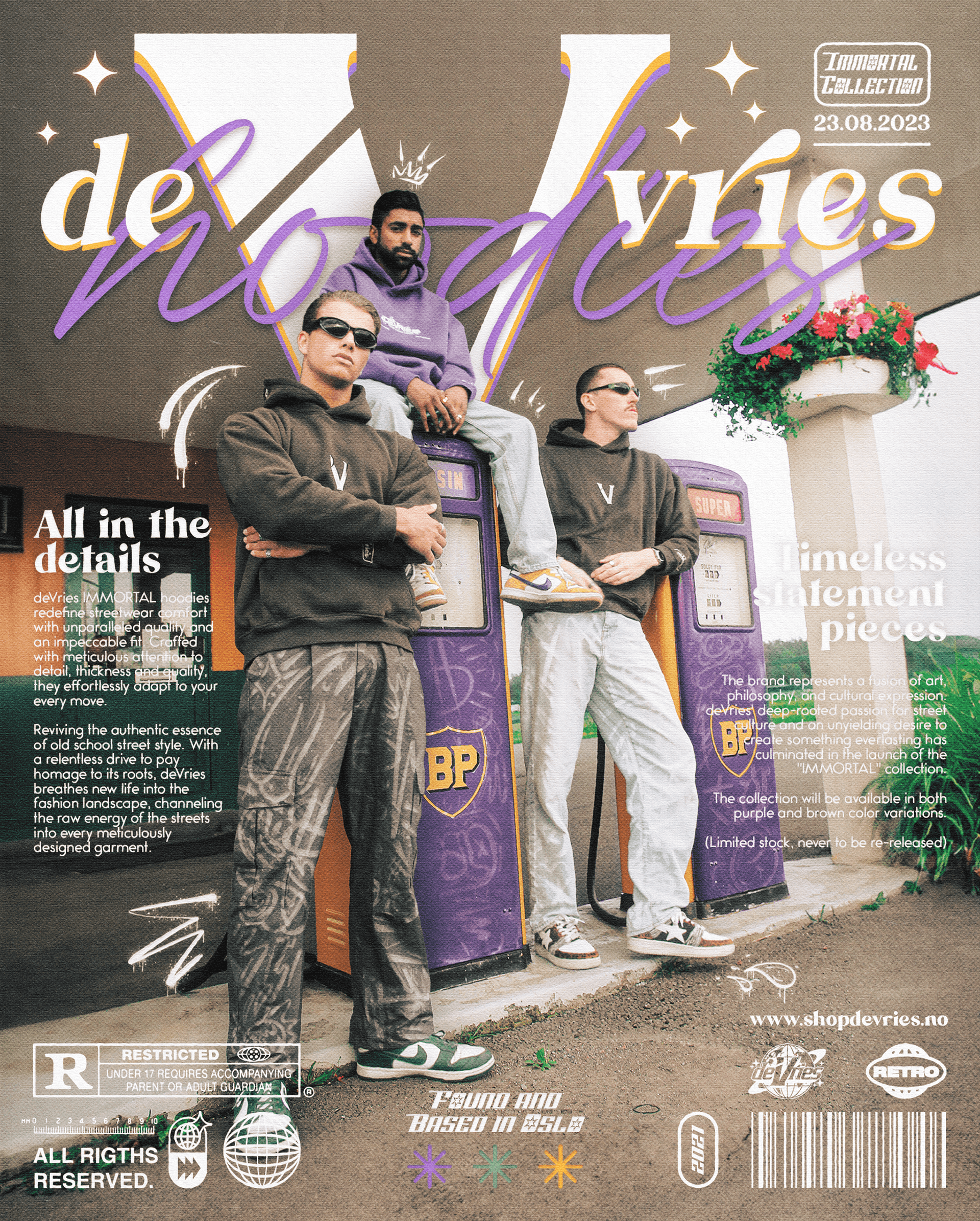
Created a scalable illustrative design for TwinLeaf’s lifestyle products, optimized for use across multiple physical sizes and materials while maintaining a clean and consistent brand aesthetic.
Year :
2023
Industry :
Health / Medicine
Client :
TwinLeaf Group
Project Duration :
3 weeks
Problem :
TwinLeaf Group wanted a cohesive line of lifestyle products aimed at a young, expressive audience with interests spanning creativity, exploration and alternative culture. Existing offerings in their market space often looked generic or overly minimal. The challenge was creating a product line with strong personality — something energetic, bold and instantly recognizable — while remaining functional across several different product types such as rolling trays, grinders, rolling papers, and accessory packaging.
Solution :
The project focused on applying the existing TwinLeaf visual style across a full set of products — trays, grinders, rolling papers, tubes and accessory packaging. Each item required thoughtful layout decisions, controlled cropping of illustrated sections, and careful integration of brand marks and product information. The goal was to make the visuals feel intentional and consistent across different shapes, materials and production constraints while staying true to TwinLeaf’s established tone.
Color Palette :
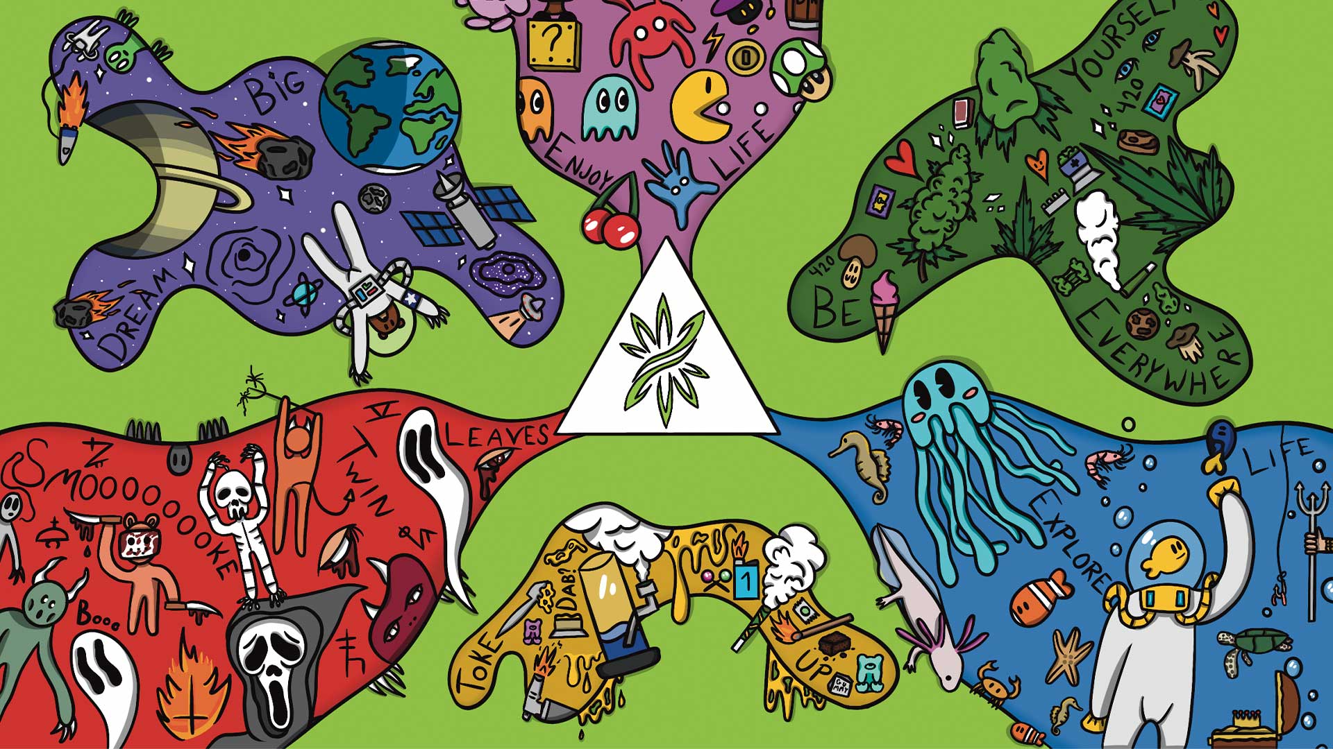
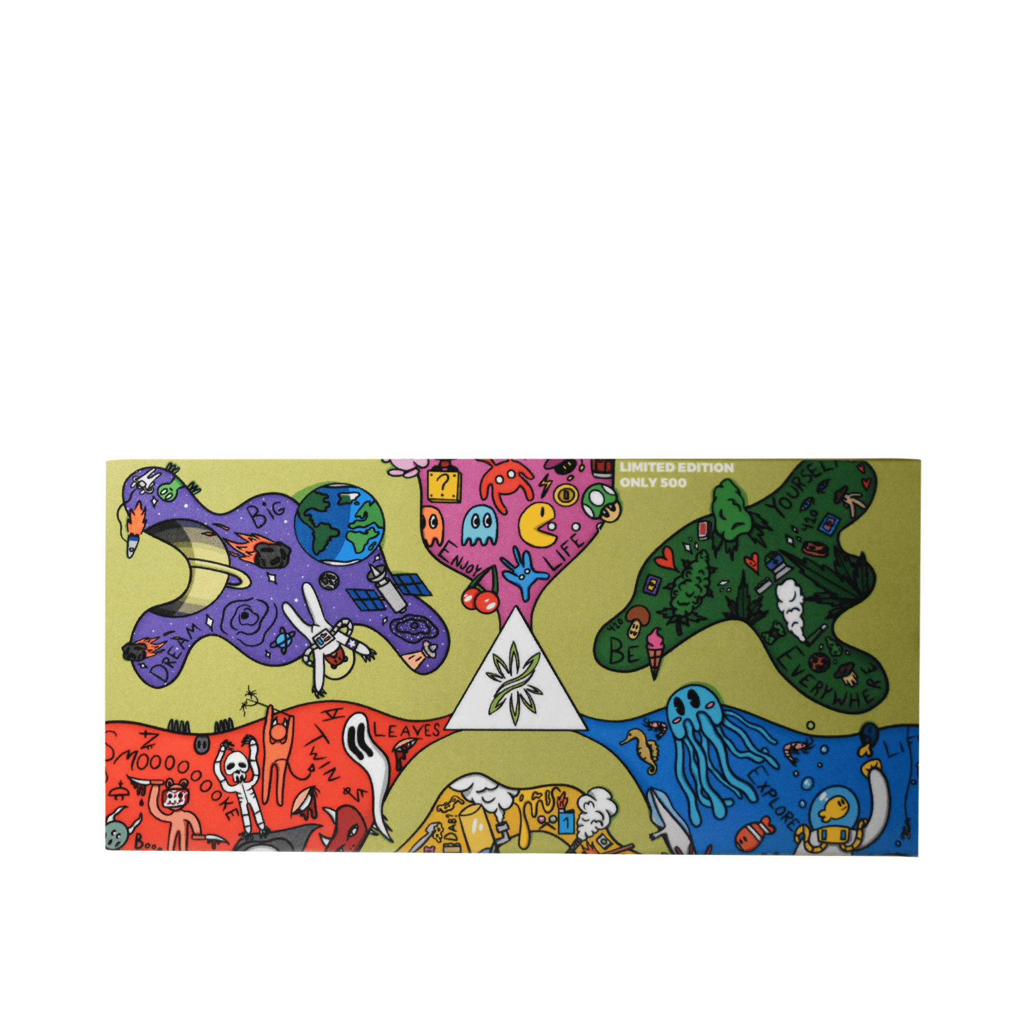
The illustration uses a highly saturated and vibrant color palette, with each thematic zone defined by its own dominant tone:
• Purple for space & exploration
• Magenta for gaming & pop culture
• Green for nature & self-expression
• Red for horror & chaotic energy
• Blue for ocean & curiosity
A bright green background unifies the composition, ensuring that all zones feel connected. The palette supports strong contrast, making the artwork visually impactful even when scaled down or printed on various materials.
Typography :
Typography follows the client’s established direction.
My task was applying it consistently across product packaging:
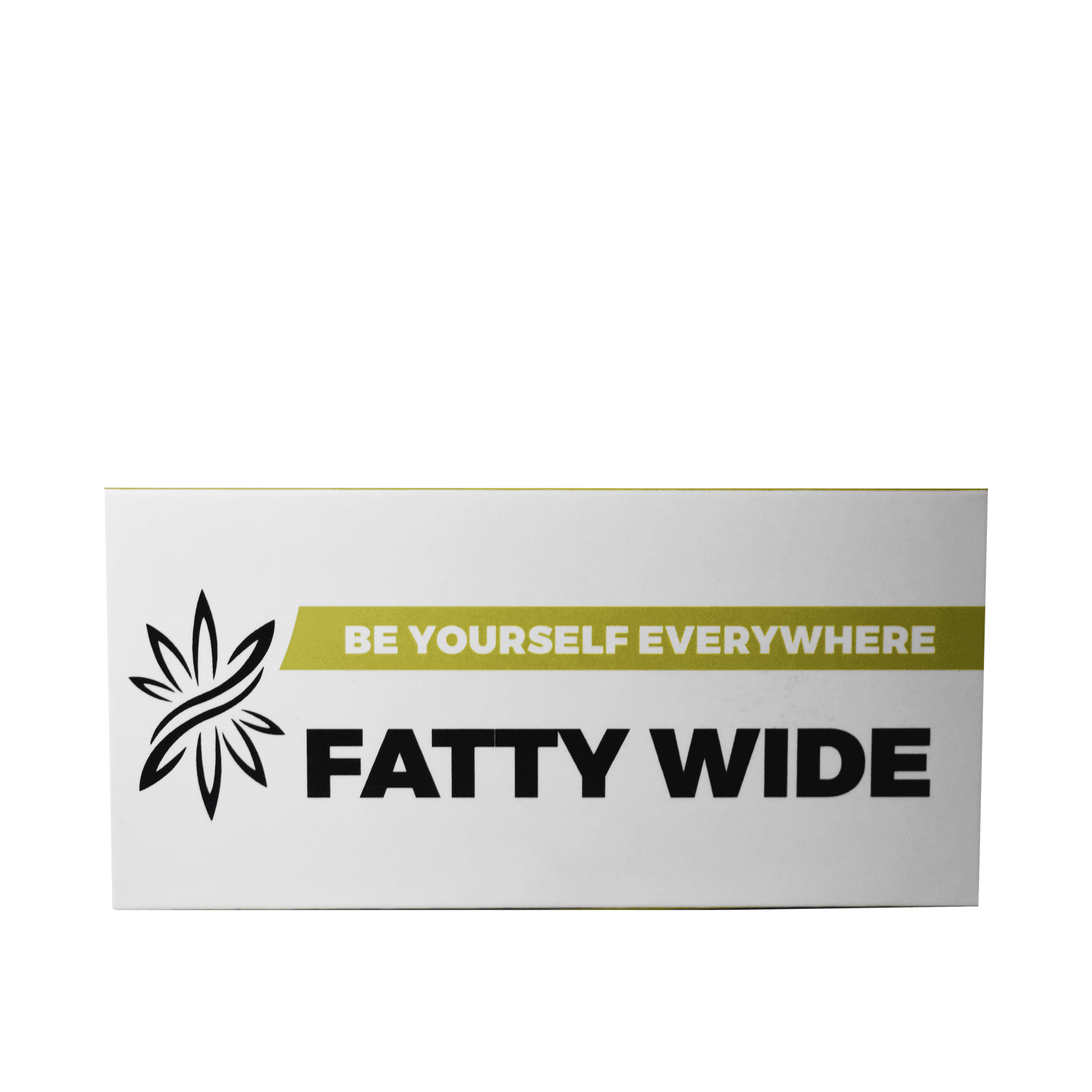
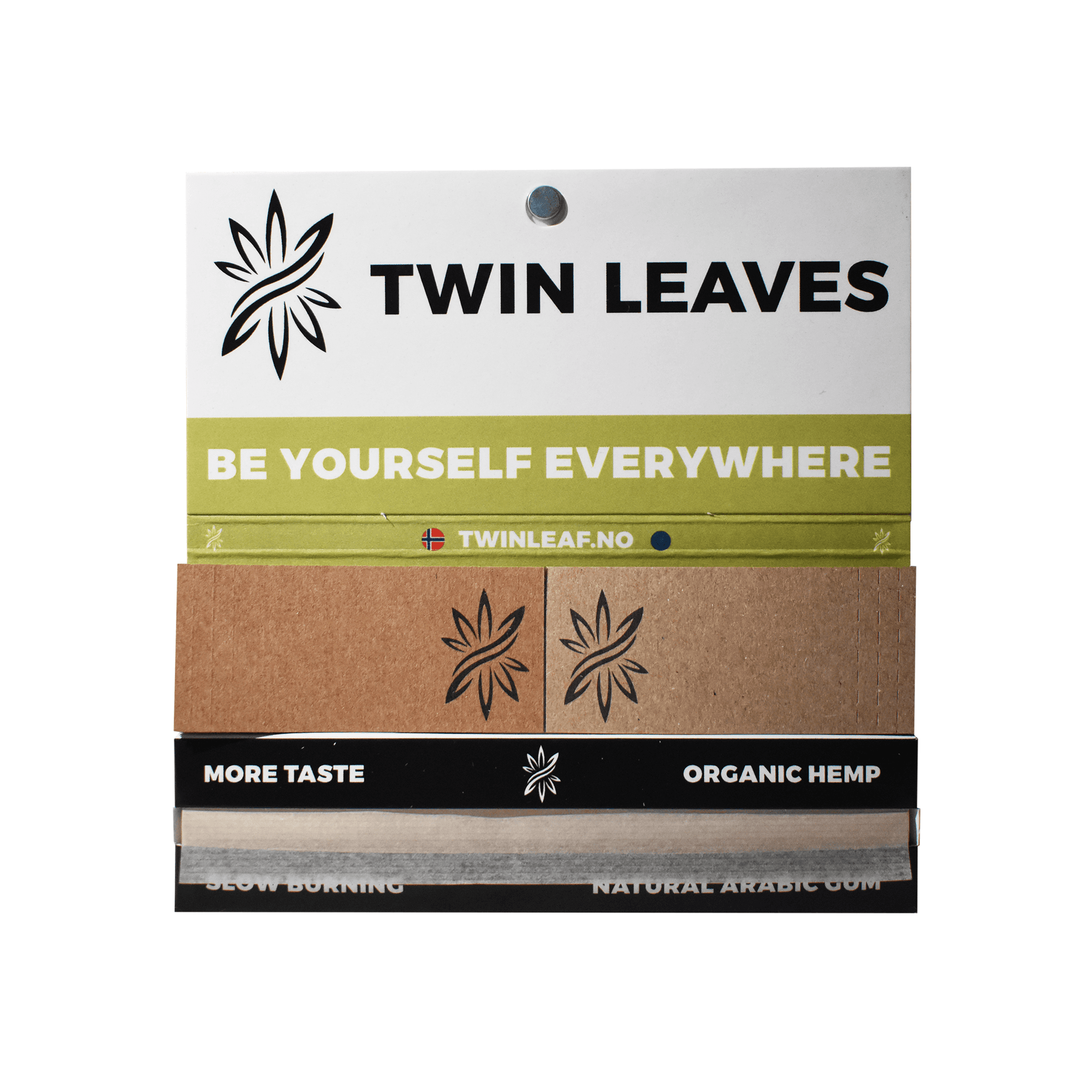
Clear hierarchy for product names (Fatty Wide, Organic Hemp, King Size)
Legible small-type for technical info (slow burning, natural gum, etc.)
Repetition of the brand slogan Be Yourself Everywhere
The emphasis was on clean typesetting, spacing and alignment to maintain clarity on small physical surfaces.
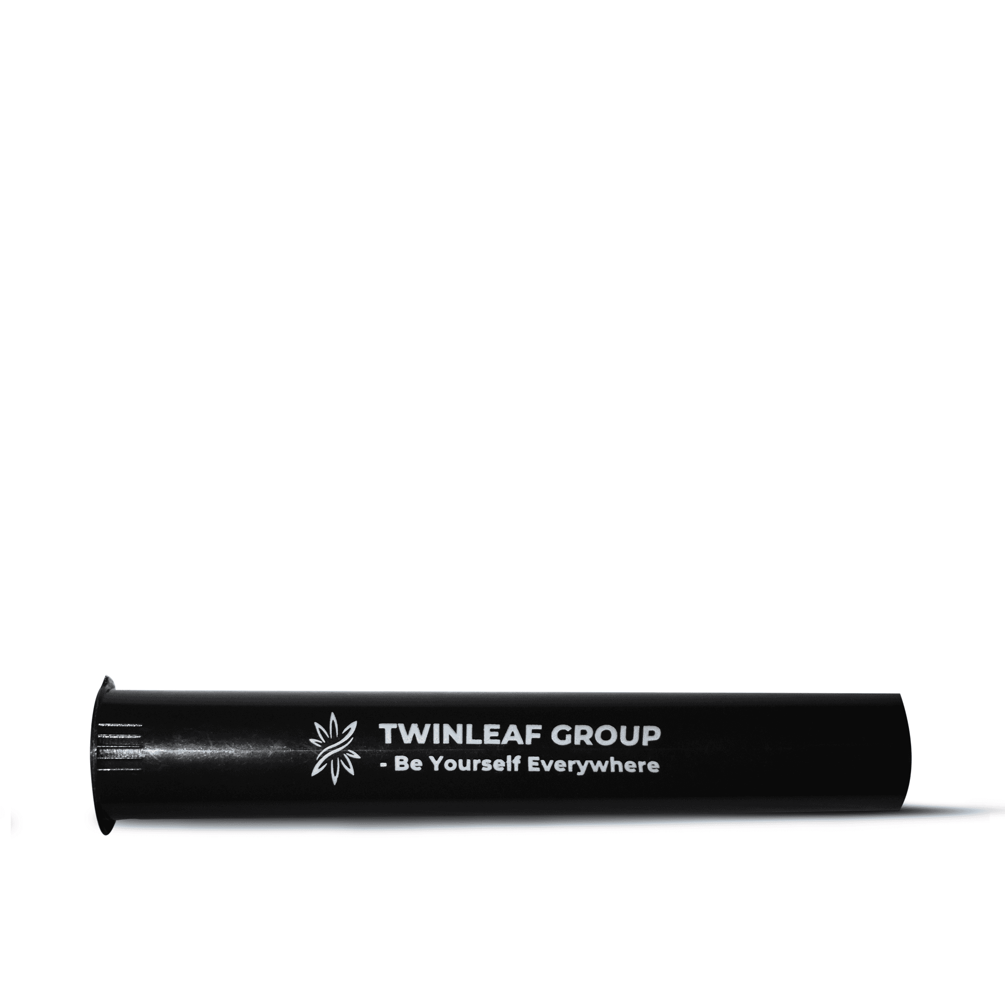
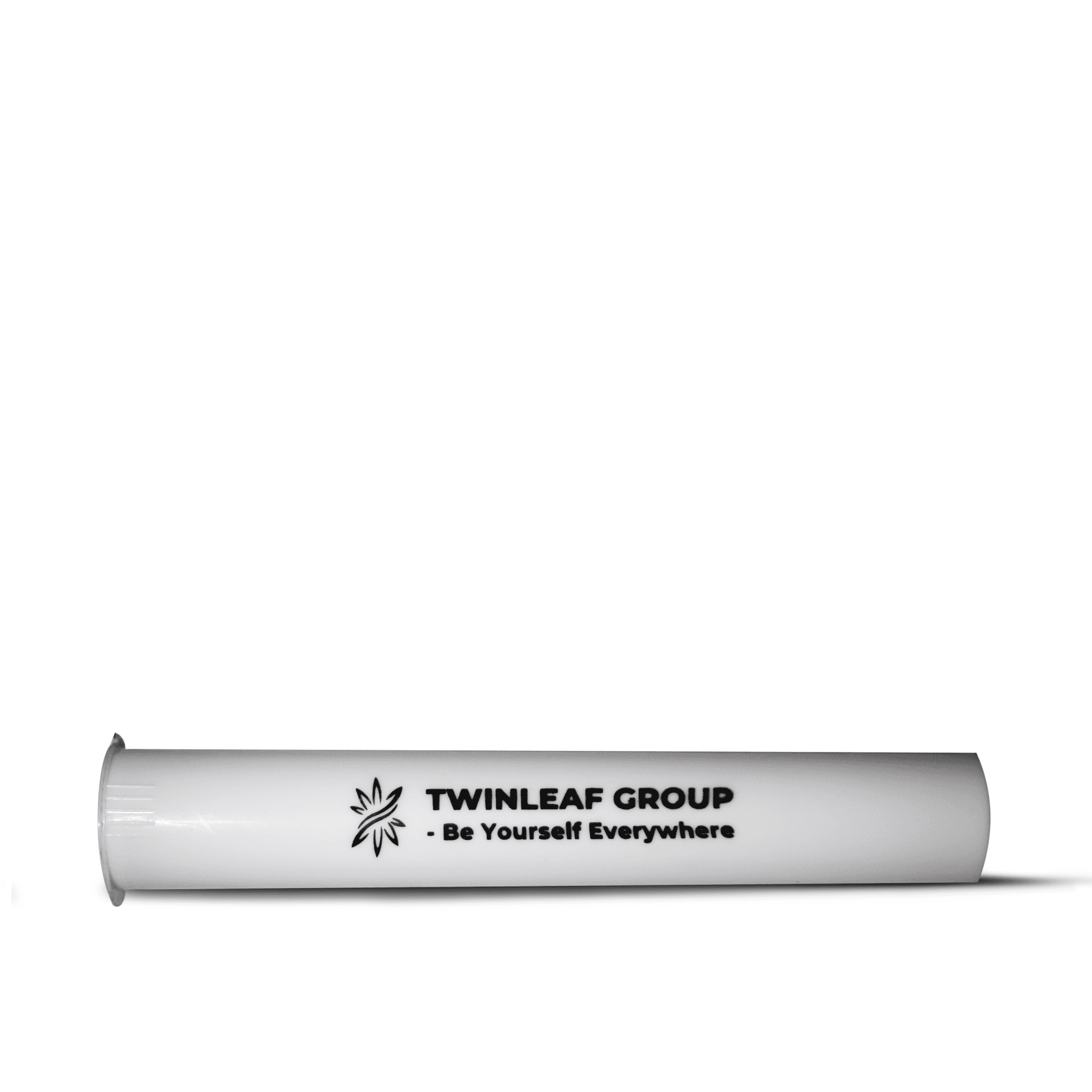
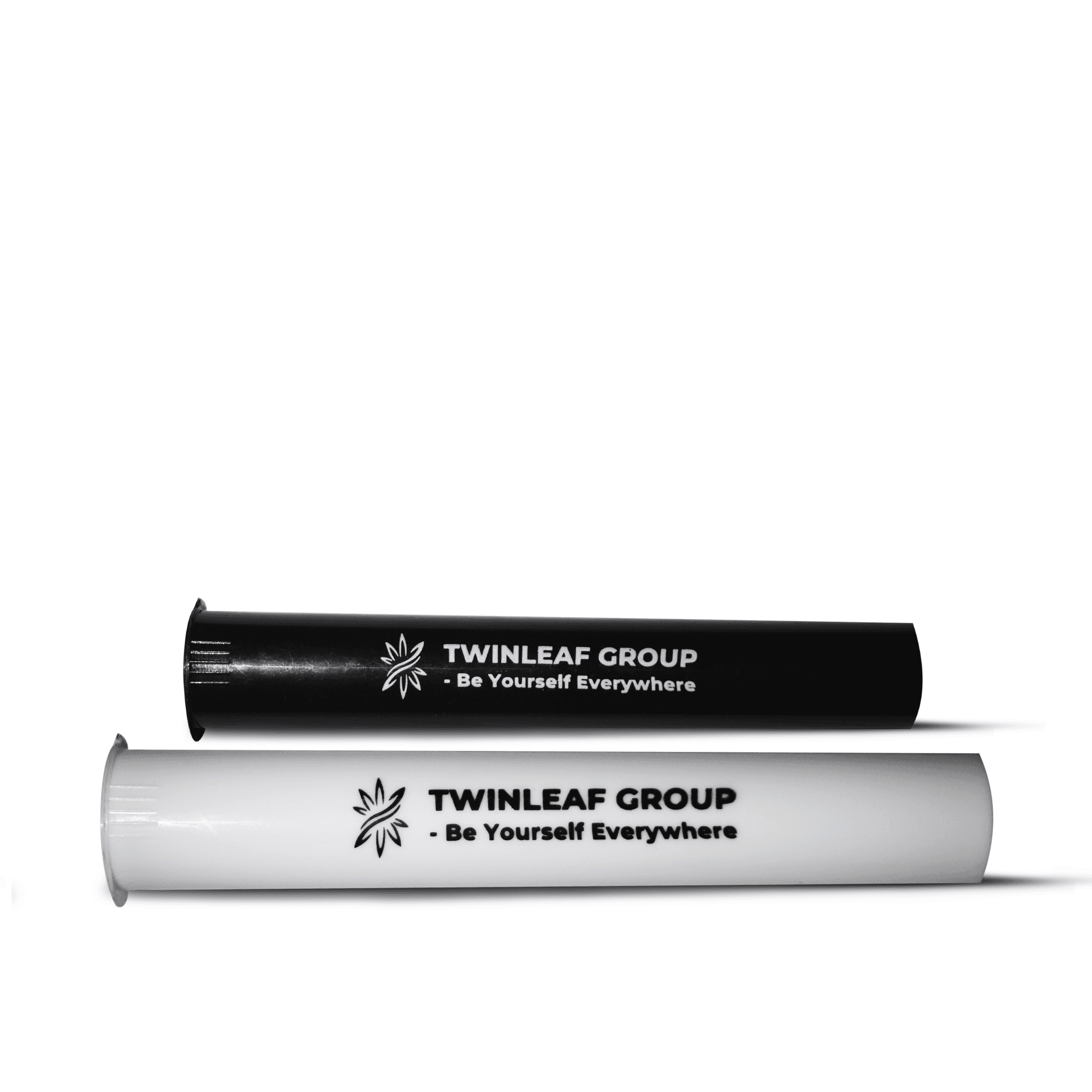
Logo & Visual Elements
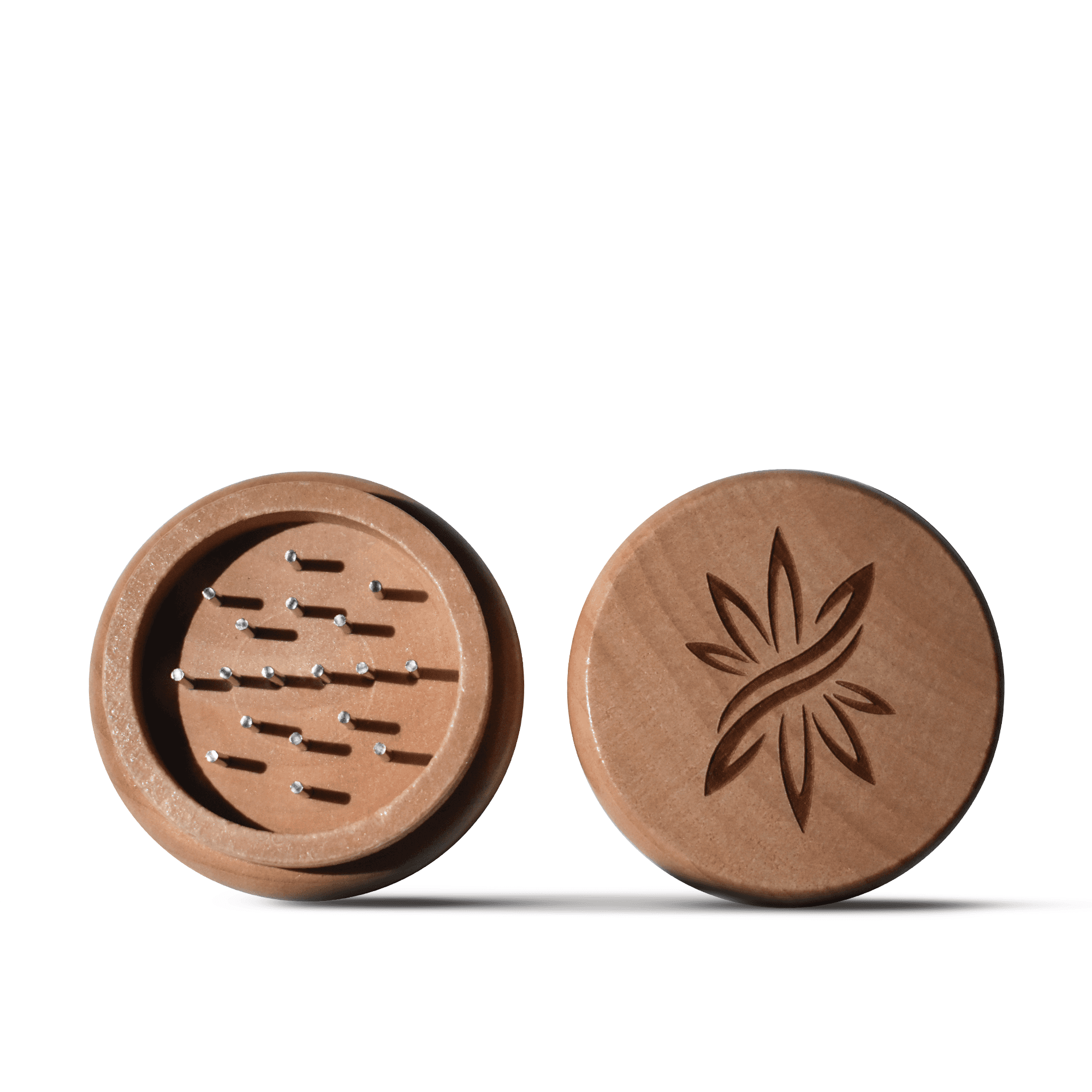
The TwinLeaf leaf-symbol acts as the anchor across all product types — engraved into wooden grinders, printed on papers, stamped on tubes and used as a central motif on trays. Surrounding visual elements come from the custom illustration: cartoon characters, themed doodles, symbols, and fluid shapes that mirror the lifestyle narratives connected to TwinLeaf’s community. These elements give the product line personality without overwhelming the branding.
Layout & Composition
The composition is structured into five radiating “clusters” that connect back into the central logo. Each cluster has its own shape, narrative flow, and color dominance, but they all share the same illustration style. This layout allows the artwork to be cropped, segmented, or applied selectively to products without losing coherence.
The fluid borders, bold outlines, and smooth pathing keep the artwork playful and energetic, while the radial structure ensures visual balance across the entire canvas.
Interaction & Digital Decisions
Digital files were prepared with print specifications for multiple materials:
Metal trays (CMYK coating environment)
Wood engraving files (vector line precision)
Paper packaging (bleed, fold lines, cut guides)
Tube prints (cylindrical alignment)
Mockups were generated for all products to preview final appearance before manufacturing, ensuring accurate color and detail reproduction.
Applications :
Challenge :
The biggest challenge was ensuring the illustration system remained consistent and readable across drastically different physical surfaces and sizes. Trays required large, uninterrupted artwork; grinders needed simplified engravings; rolling papers demanded clean information hierarchy. Maintaining a unified identity across such varied formats required careful control over scaling, cropping, and placement.
Outcome / Summary :
The final product line successfully translates the TwinLeaf brand world into a set of cohesive physical products. Each item carries the brand’s playful, bold personality without sacrificing readability or usability. The project demonstrates the ability to adapt an existing visual identity into a fully functional product ecosystem, balancing creativity with material and production requirements.
More Projects


Graphic Design
TwinLeaf Product Design
Created a scalable illustrative design for TwinLeaf’s lifestyle products, optimized for use across multiple physical sizes and materials while maintaining a clean and consistent brand aesthetic.
Year :
2023
Industry :
Health / Medicine
Client :
TwinLeaf Group
Project Duration :
3 weeks
Problem :
TwinLeaf Group wanted a cohesive line of lifestyle products aimed at a young, expressive audience with interests spanning creativity, exploration and alternative culture. Existing offerings in their market space often looked generic or overly minimal. The challenge was creating a product line with strong personality — something energetic, bold and instantly recognizable — while remaining functional across several different product types such as rolling trays, grinders, rolling papers, and accessory packaging.
Solution :
The project focused on applying the existing TwinLeaf visual style across a full set of products — trays, grinders, rolling papers, tubes and accessory packaging. Each item required thoughtful layout decisions, controlled cropping of illustrated sections, and careful integration of brand marks and product information. The goal was to make the visuals feel intentional and consistent across different shapes, materials and production constraints while staying true to TwinLeaf’s established tone.
Color Palette :
The illustration uses a highly saturated and vibrant color palette, with each thematic zone defined by its own dominant tone:
• Purple for space & exploration
• Magenta for gaming & pop culture
• Green for nature & self-expression
• Red for horror & chaotic energy
• Blue for ocean & curiosity
A bright green background unifies the composition, ensuring that all zones feel connected. The palette supports strong contrast, making the artwork visually impactful even when scaled down or printed on various materials.
Typography :
Typography follows the client’s established direction.
My task was applying it consistently across product packaging:
Clear hierarchy for product names (Fatty Wide, Organic Hemp, King Size)
Legible small-type for technical info (slow burning, natural gum, etc.)
Repetition of the brand slogan Be Yourself Everywhere
The emphasis was on clean typesetting, spacing and alignment to maintain clarity on small physical surfaces.
Logo & Visual Elements
The TwinLeaf leaf-symbol acts as the anchor across all product types — engraved into wooden grinders, printed on papers, stamped on tubes and used as a central motif on trays. Surrounding visual elements come from the custom illustration: cartoon characters, themed doodles, symbols, and fluid shapes that mirror the lifestyle narratives connected to TwinLeaf’s community. These elements give the product line personality without overwhelming the branding.
Layout & Composition
The composition is structured into five radiating “clusters” that connect back into the central logo. Each cluster has its own shape, narrative flow, and color dominance, but they all share the same illustration style. This layout allows the artwork to be cropped, segmented, or applied selectively to products without losing coherence.
The fluid borders, bold outlines, and smooth pathing keep the artwork playful and energetic, while the radial structure ensures visual balance across the entire canvas.
Interaction & Digital Decisions
Digital files were prepared with print specifications for multiple materials:
Metal trays (CMYK coating environment)
Wood engraving files (vector line precision)
Paper packaging (bleed, fold lines, cut guides)
Tube prints (cylindrical alignment)
Mockups were generated for all products to preview final appearance before manufacturing, ensuring accurate color and detail reproduction.
Applications :
Challenge :
The biggest challenge was ensuring the illustration system remained consistent and readable across drastically different physical surfaces and sizes. Trays required large, uninterrupted artwork; grinders needed simplified engravings; rolling papers demanded clean information hierarchy. Maintaining a unified identity across such varied formats required careful control over scaling, cropping, and placement.
Outcome / Summary :
The final product line successfully translates the TwinLeaf brand world into a set of cohesive physical products. Each item carries the brand’s playful, bold personality without sacrificing readability or usability. The project demonstrates the ability to adapt an existing visual identity into a fully functional product ecosystem, balancing creativity with material and production requirements.
More Projects
Graphic Design
TwinLeaf Product Design
Created a scalable illustrative design for TwinLeaf’s lifestyle products, optimized for use across multiple physical sizes and materials while maintaining a clean and consistent brand aesthetic.
Year :
2023
Industry :
Health / Medicine
Client :
TwinLeaf Group
Project Duration :
3 weeks
Problem :
TwinLeaf Group wanted a cohesive line of lifestyle products aimed at a young, expressive audience with interests spanning creativity, exploration and alternative culture. Existing offerings in their market space often looked generic or overly minimal. The challenge was creating a product line with strong personality — something energetic, bold and instantly recognizable — while remaining functional across several different product types such as rolling trays, grinders, rolling papers, and accessory packaging.
Solution :
The project focused on applying the existing TwinLeaf visual style across a full set of products — trays, grinders, rolling papers, tubes and accessory packaging. Each item required thoughtful layout decisions, controlled cropping of illustrated sections, and careful integration of brand marks and product information. The goal was to make the visuals feel intentional and consistent across different shapes, materials and production constraints while staying true to TwinLeaf’s established tone.
Color Palette :
The illustration uses a highly saturated and vibrant color palette, with each thematic zone defined by its own dominant tone:
• Purple for space & exploration
• Magenta for gaming & pop culture
• Green for nature & self-expression
• Red for horror & chaotic energy
• Blue for ocean & curiosity
A bright green background unifies the composition, ensuring that all zones feel connected. The palette supports strong contrast, making the artwork visually impactful even when scaled down or printed on various materials.
Typography :
Typography follows the client’s established direction.
My task was applying it consistently across product packaging:
Clear hierarchy for product names (Fatty Wide, Organic Hemp, King Size)
Legible small-type for technical info (slow burning, natural gum, etc.)
Repetition of the brand slogan Be Yourself Everywhere
The emphasis was on clean typesetting, spacing and alignment to maintain clarity on small physical surfaces.
Logo & Visual Elements
The TwinLeaf leaf-symbol acts as the anchor across all product types — engraved into wooden grinders, printed on papers, stamped on tubes and used as a central motif on trays. Surrounding visual elements come from the custom illustration: cartoon characters, themed doodles, symbols, and fluid shapes that mirror the lifestyle narratives connected to TwinLeaf’s community. These elements give the product line personality without overwhelming the branding.
Layout & Composition
The composition is structured into five radiating “clusters” that connect back into the central logo. Each cluster has its own shape, narrative flow, and color dominance, but they all share the same illustration style. This layout allows the artwork to be cropped, segmented, or applied selectively to products without losing coherence.
The fluid borders, bold outlines, and smooth pathing keep the artwork playful and energetic, while the radial structure ensures visual balance across the entire canvas.
Interaction & Digital Decisions
Digital files were prepared with print specifications for multiple materials:
Metal trays (CMYK coating environment)
Wood engraving files (vector line precision)
Paper packaging (bleed, fold lines, cut guides)
Tube prints (cylindrical alignment)
Mockups were generated for all products to preview final appearance before manufacturing, ensuring accurate color and detail reproduction.
Applications :
Challenge :
The biggest challenge was ensuring the illustration system remained consistent and readable across drastically different physical surfaces and sizes. Trays required large, uninterrupted artwork; grinders needed simplified engravings; rolling papers demanded clean information hierarchy. Maintaining a unified identity across such varied formats required careful control over scaling, cropping, and placement.
Outcome / Summary :
The final product line successfully translates the TwinLeaf brand world into a set of cohesive physical products. Each item carries the brand’s playful, bold personality without sacrificing readability or usability. The project demonstrates the ability to adapt an existing visual identity into a fully functional product ecosystem, balancing creativity with material and production requirements.