Graphic Design
Print Magazine assignment
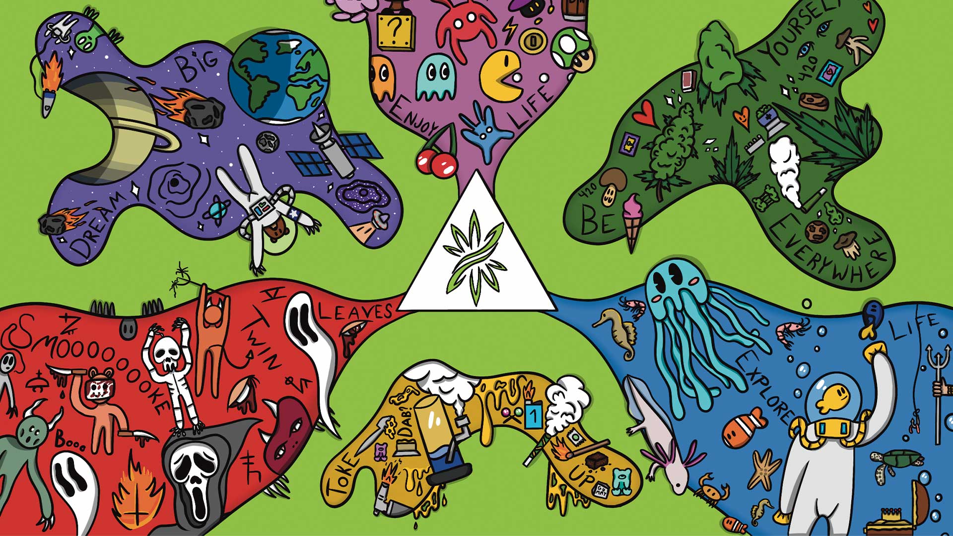
A magazine design project completed during my studies at Noroff, focusing on editorial layout, typography, and visual storytelling to create a cohesive and professional publication.
Year :
2025
Industry :
Graphic Design
Client :
University Assignment
Project Duration :
6 weeks

Problem :
As part of my studies at Noroff, I was tasked with designing a magazine that would demonstrate not just layout skills, but strong editorial design—balancing text, imagery, typography, and overall visual flow. The existing work lacked cohesion, so the brief required creating something polished, readable, and stylistically unified for print.
Solution :
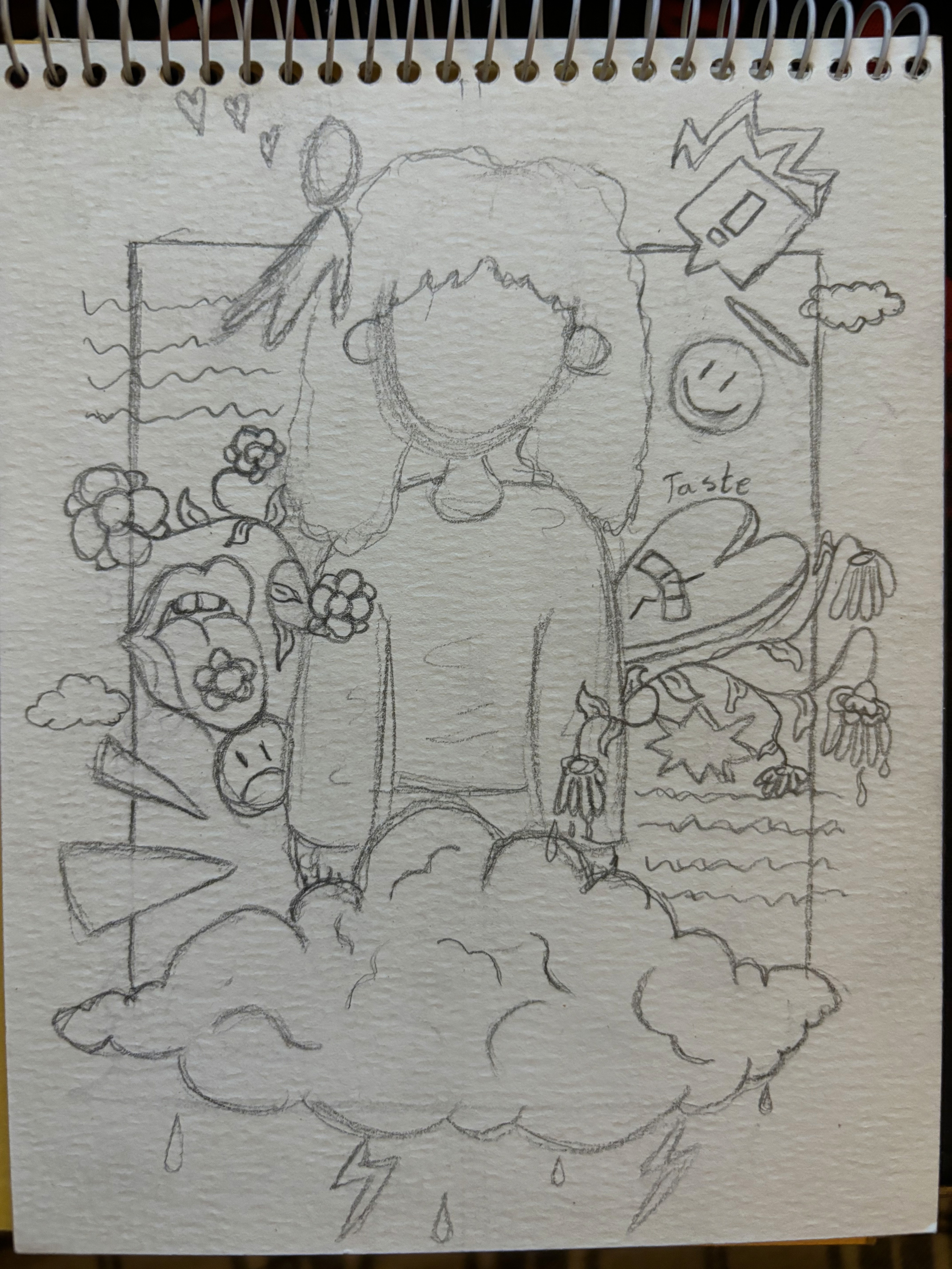
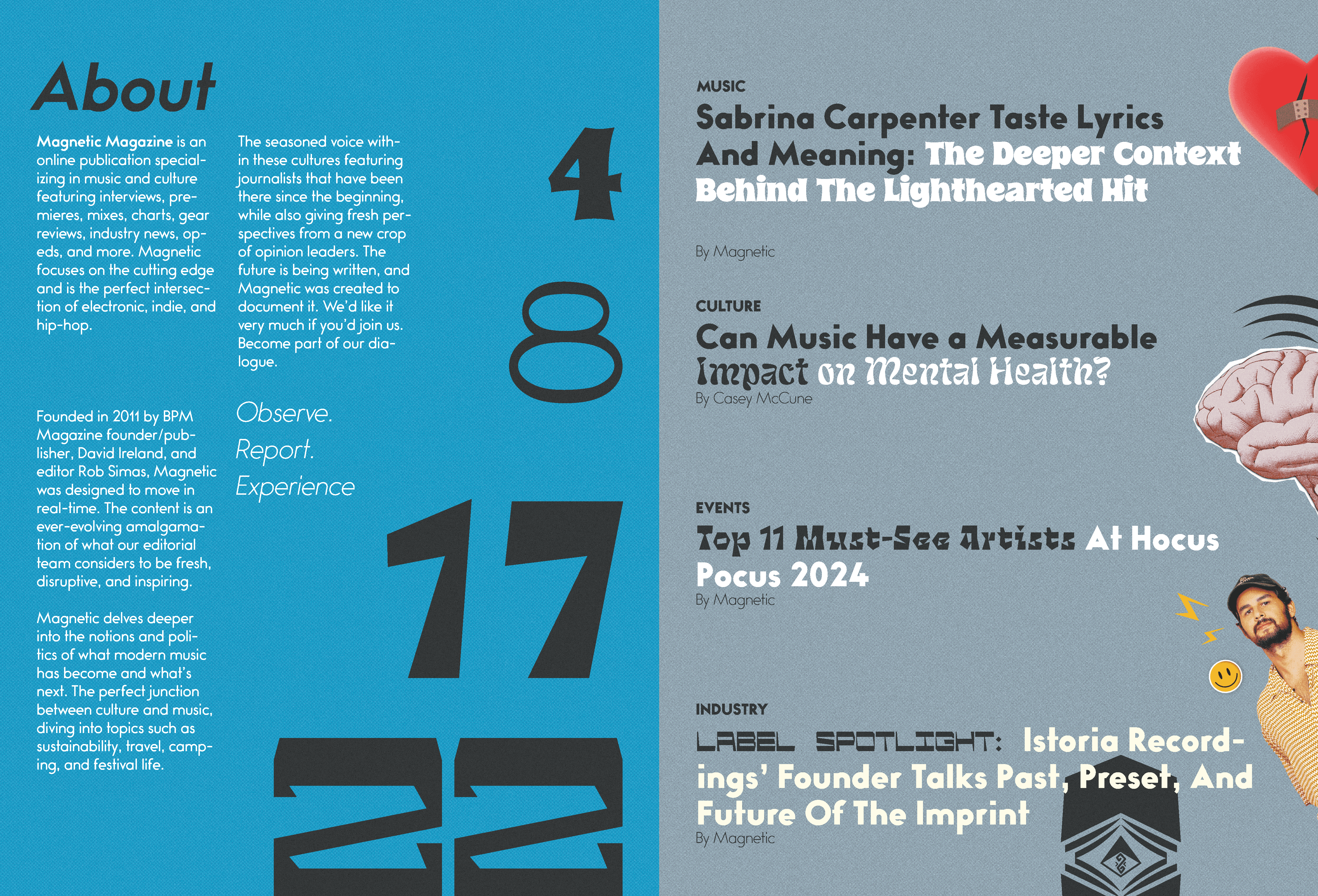
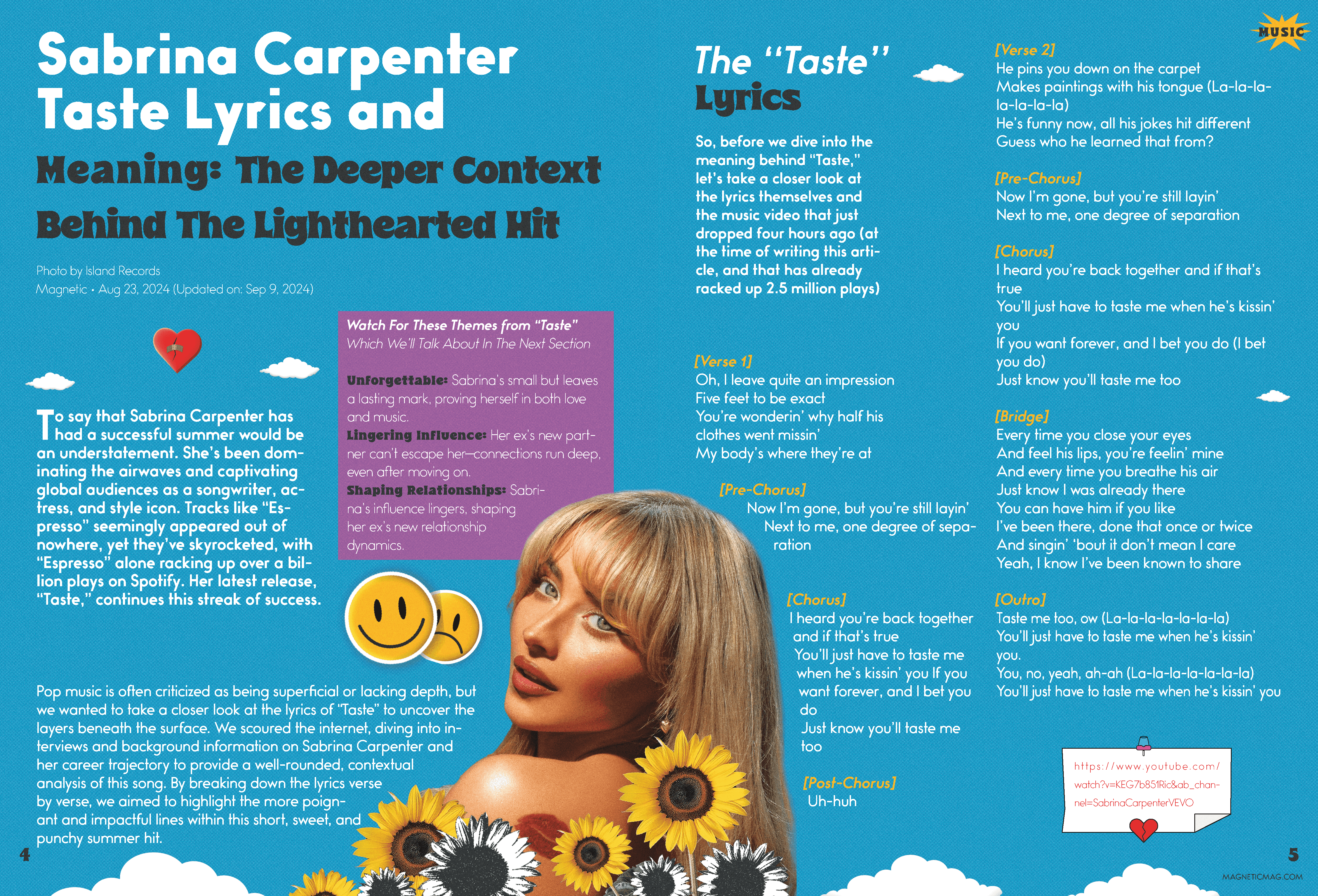
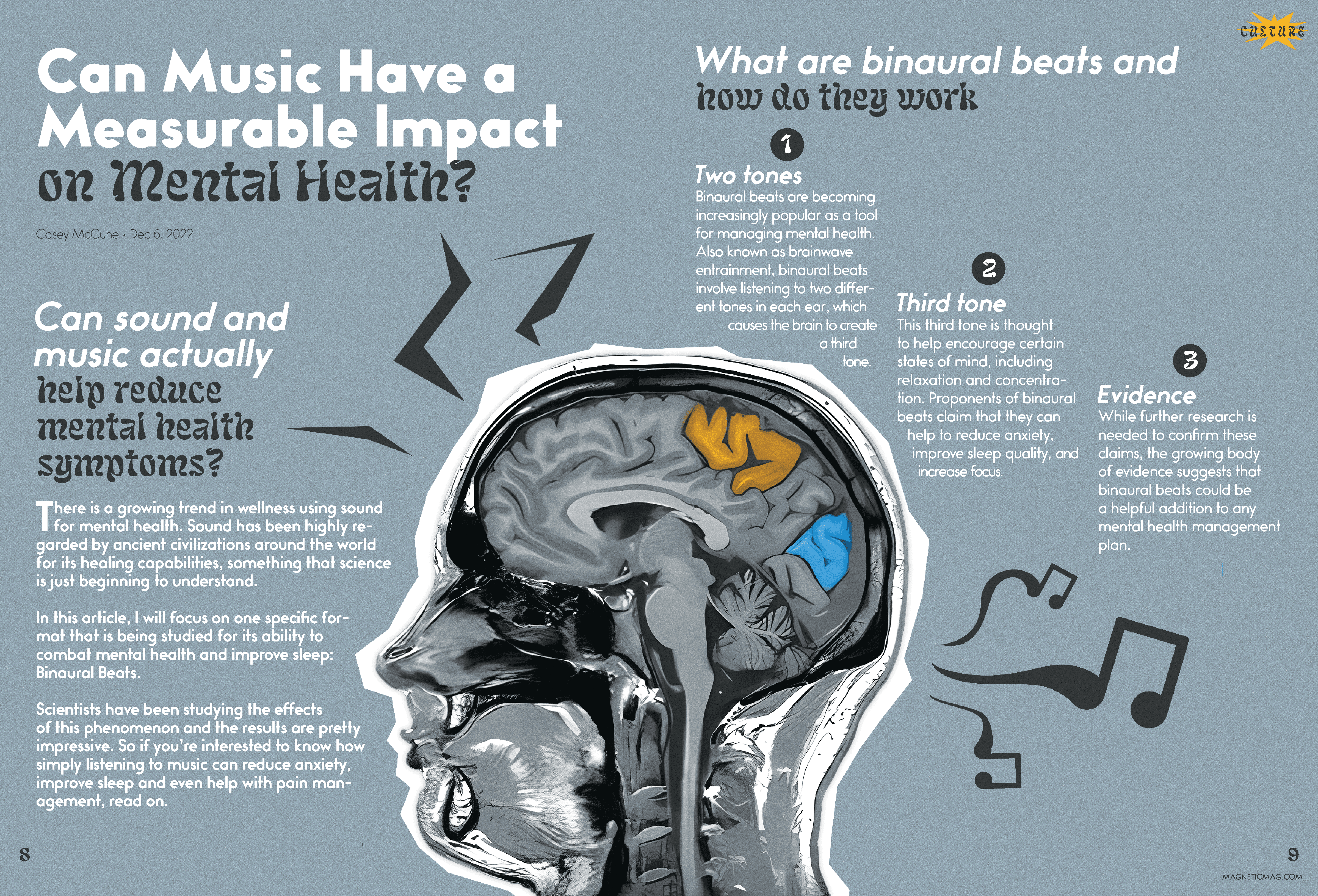
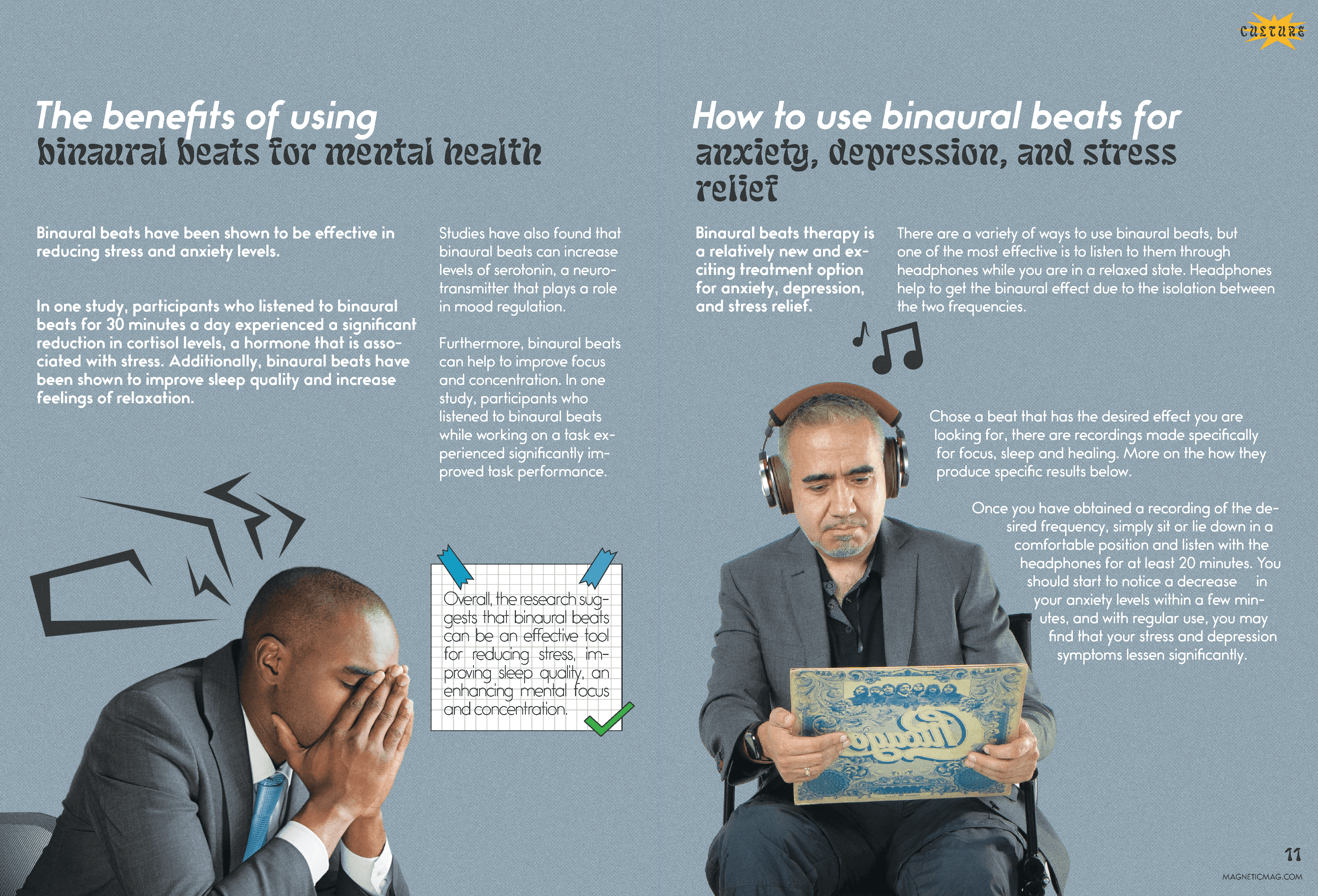
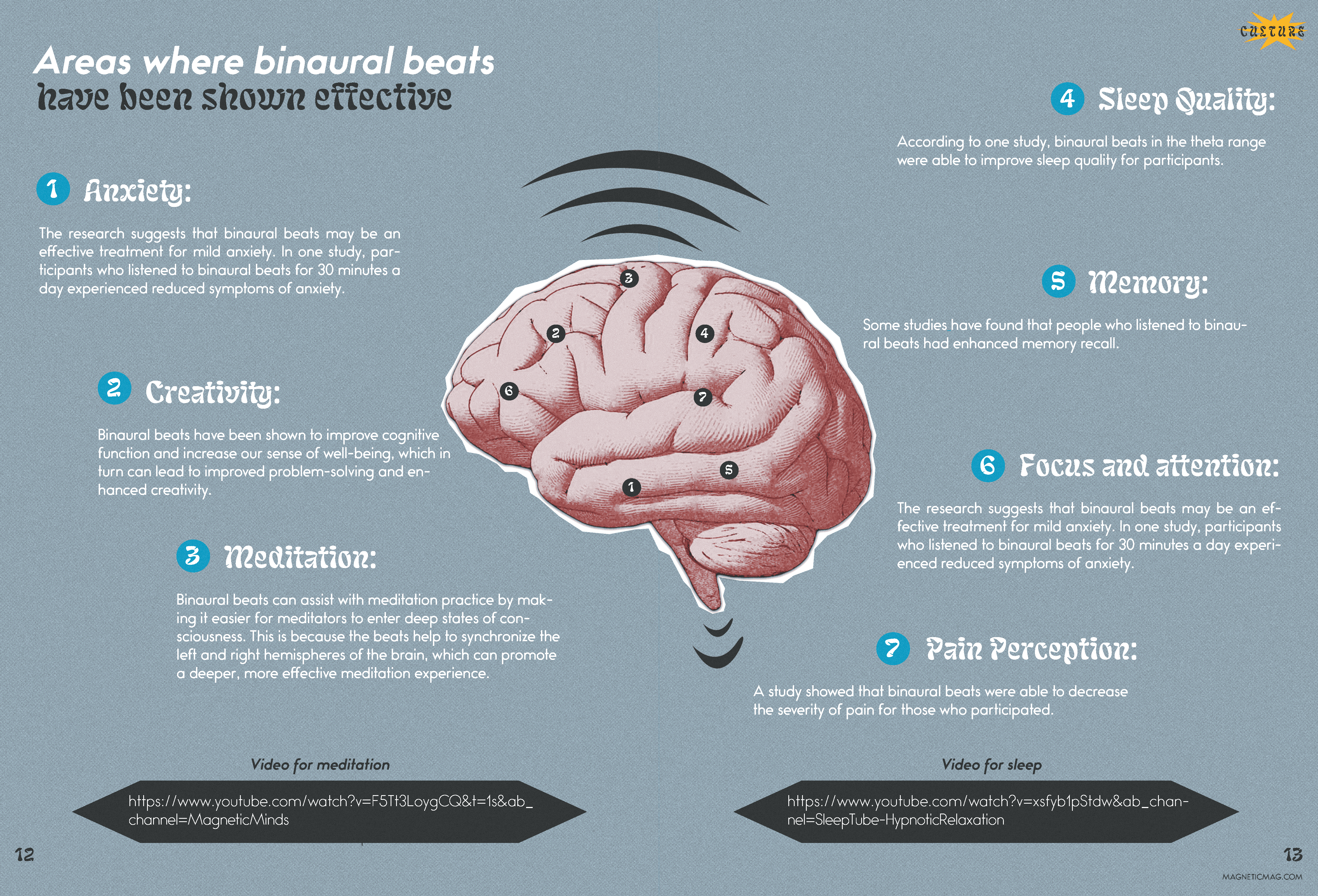
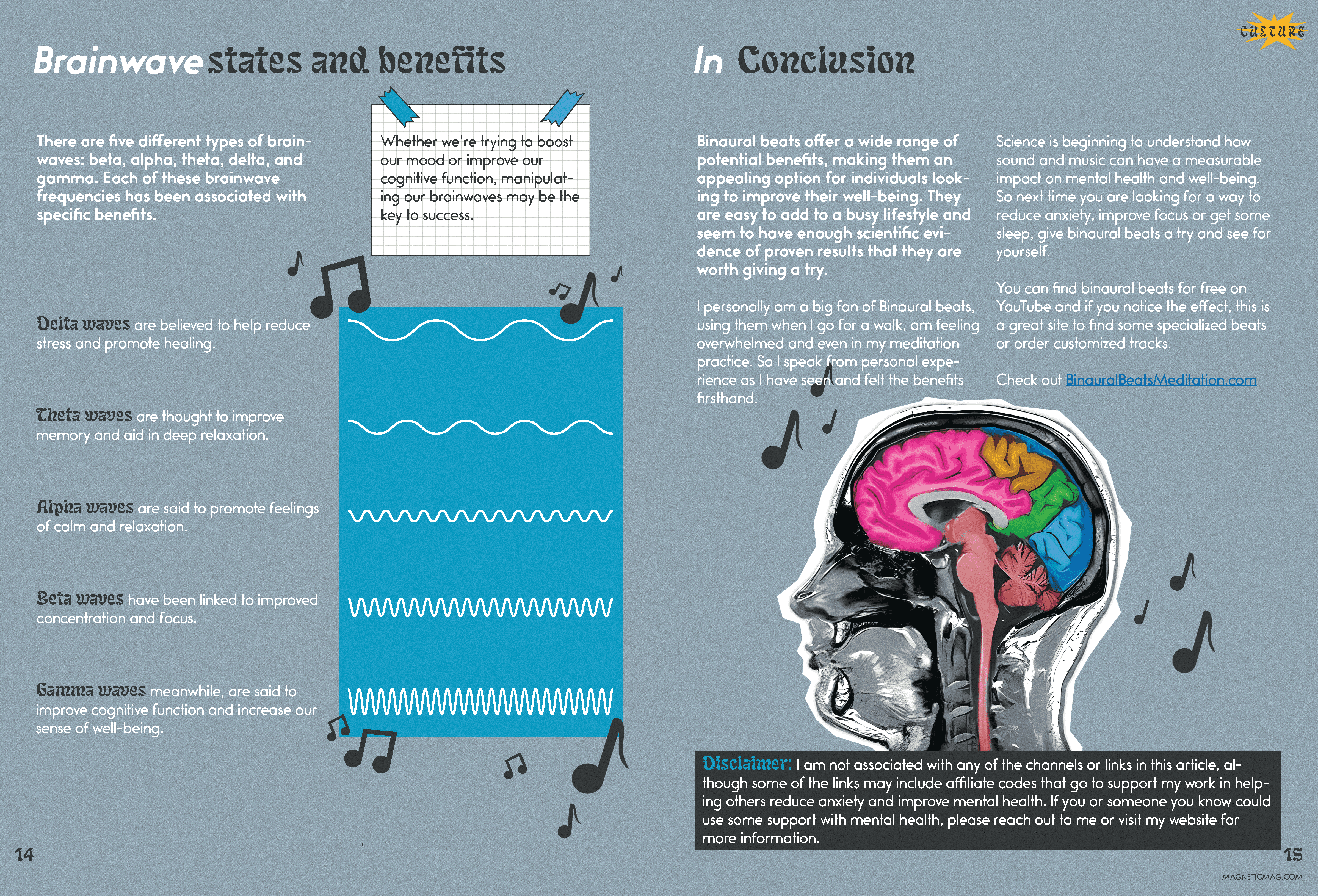
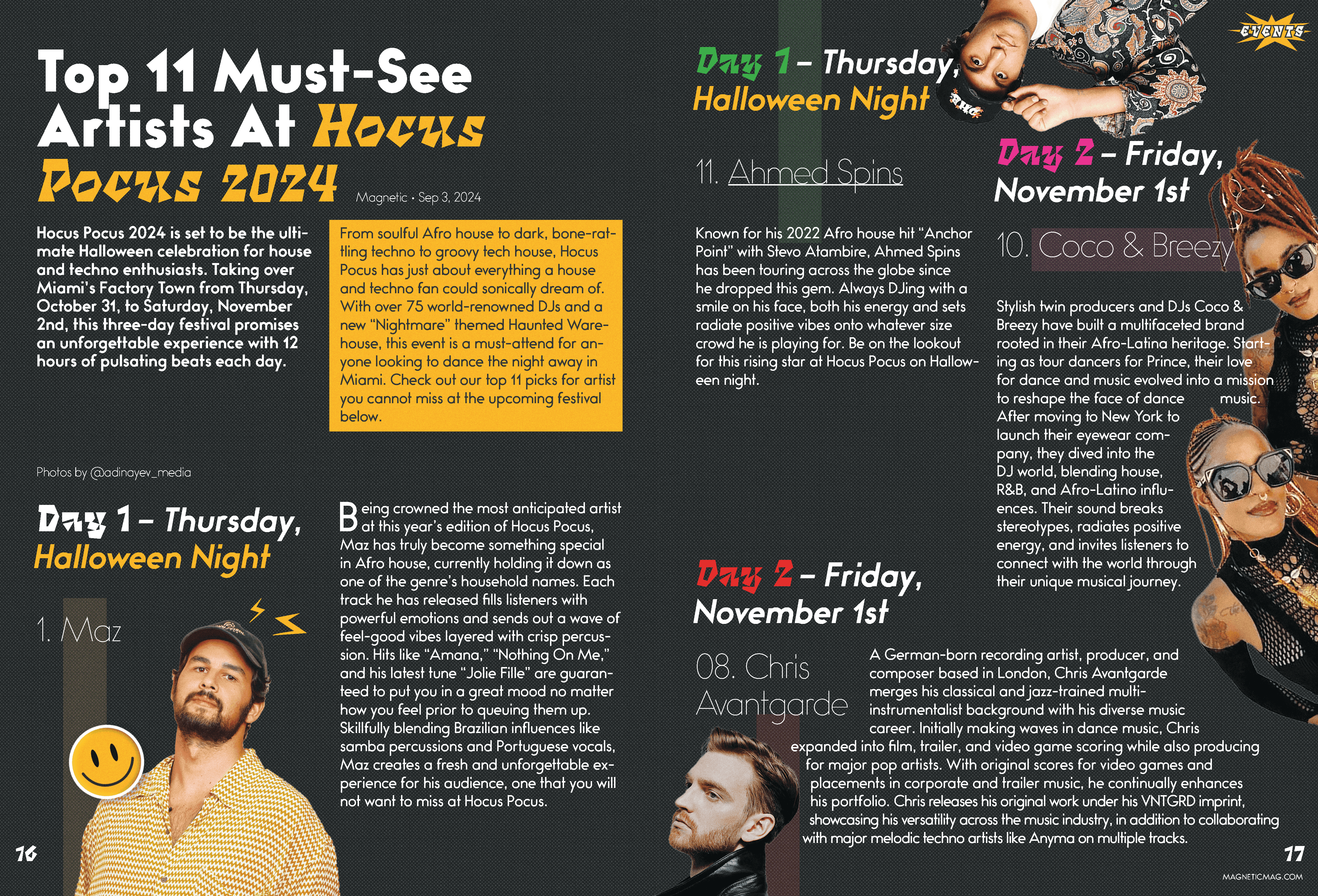
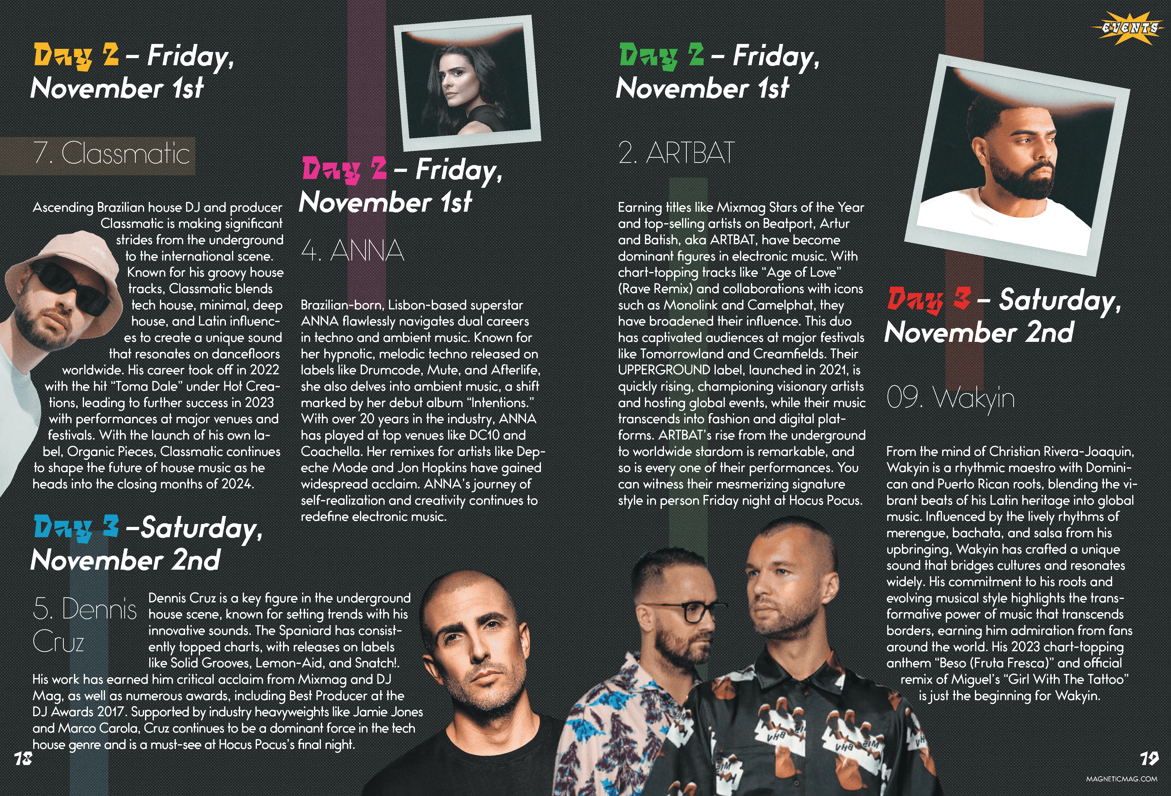
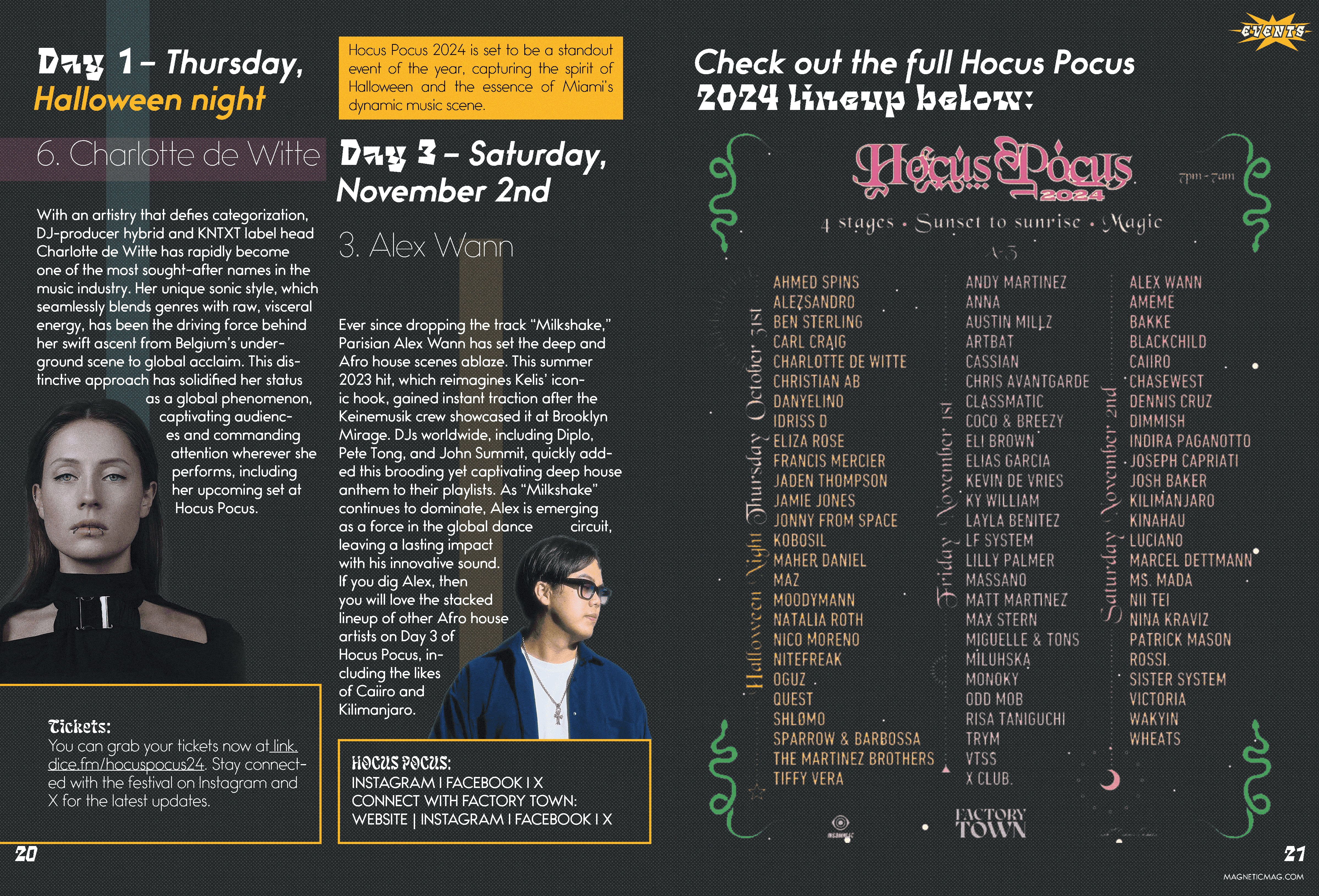
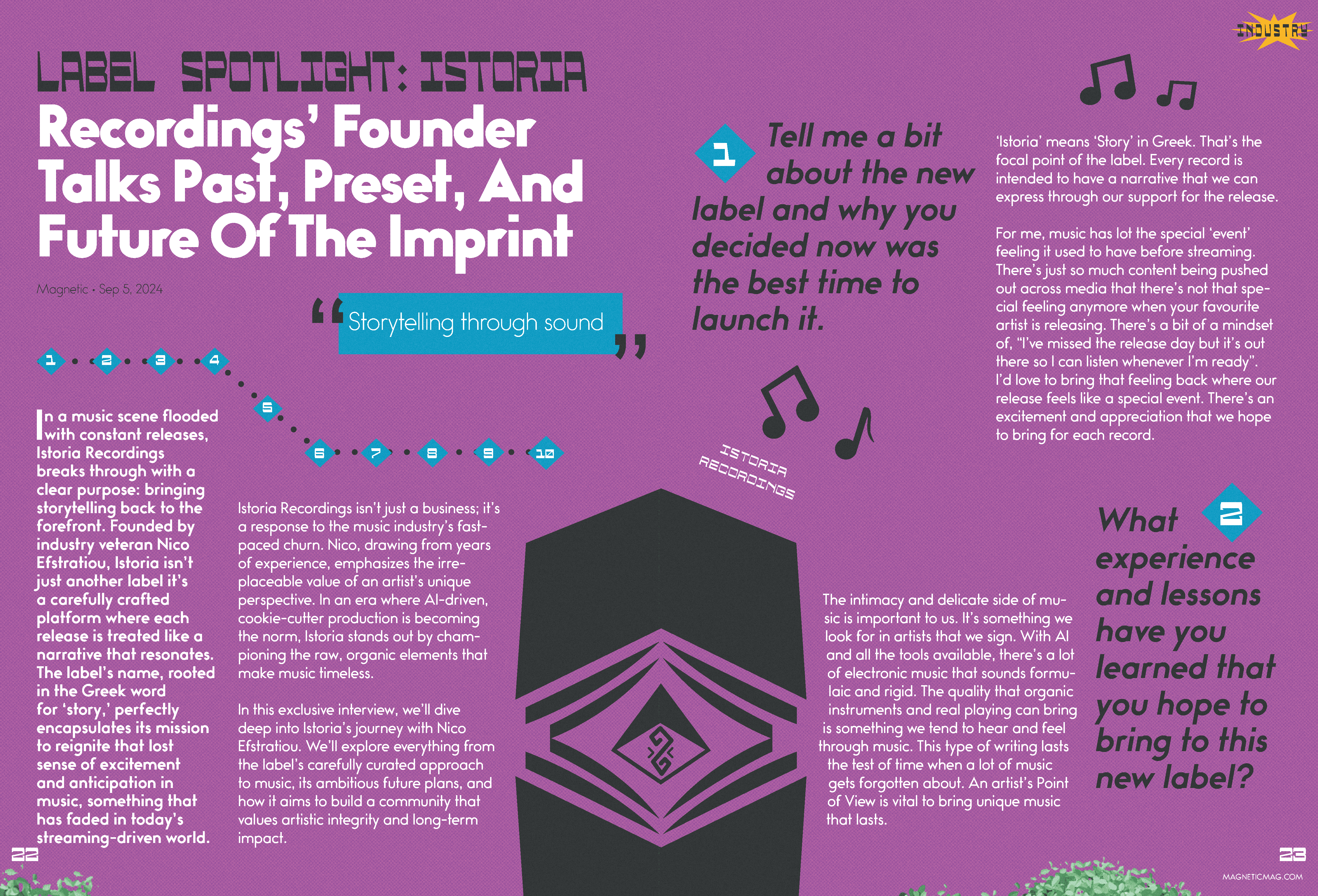
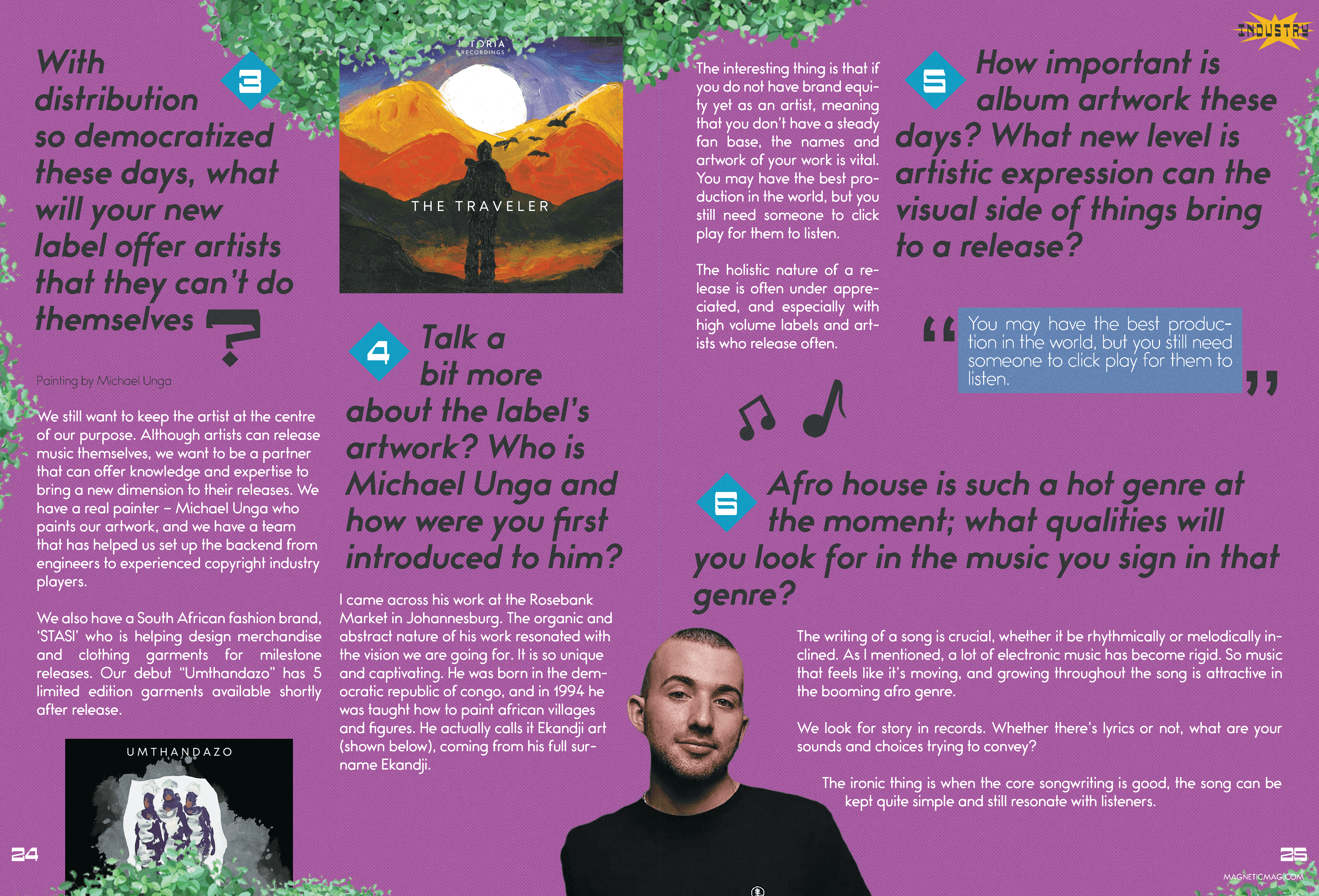
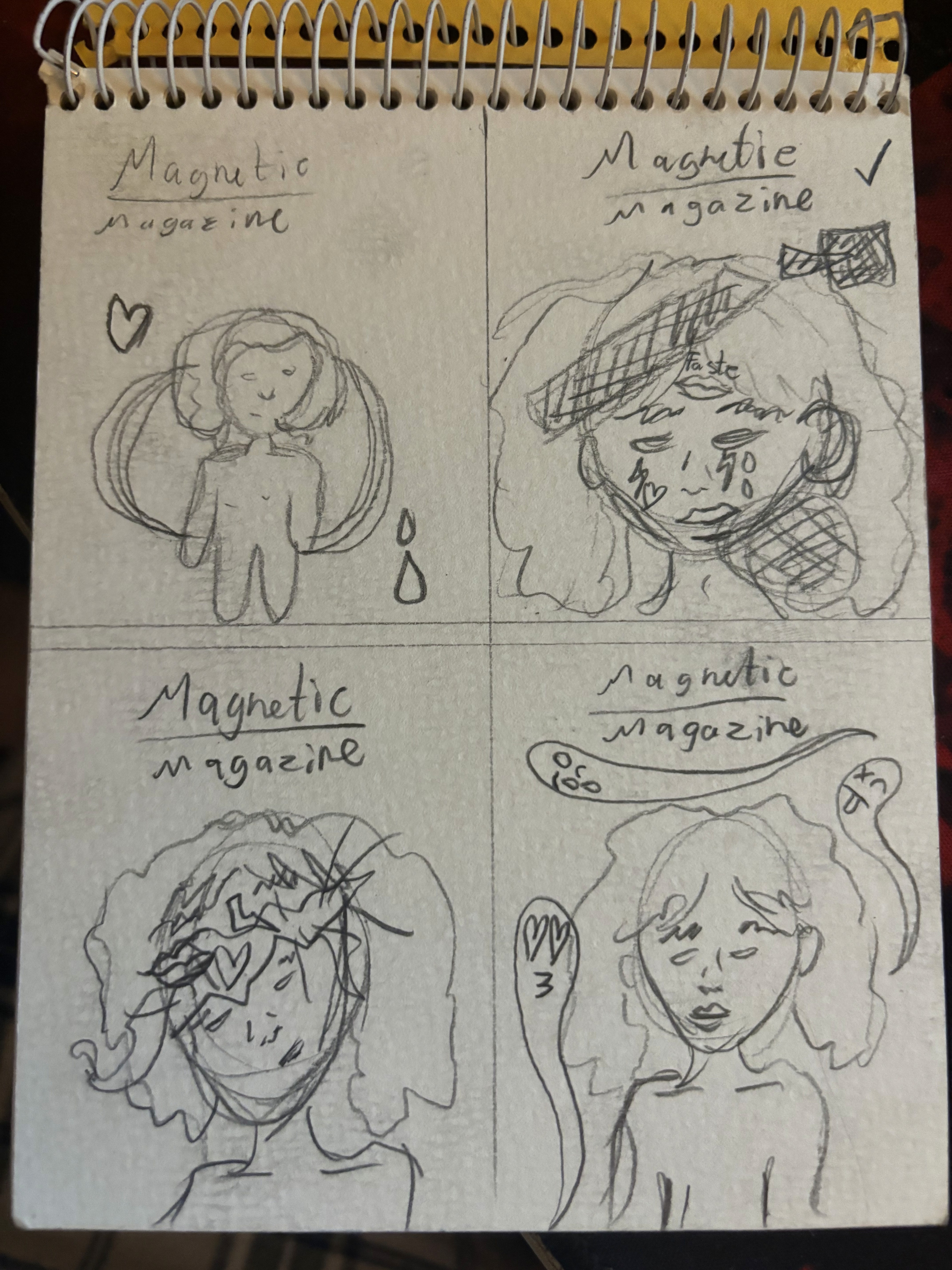
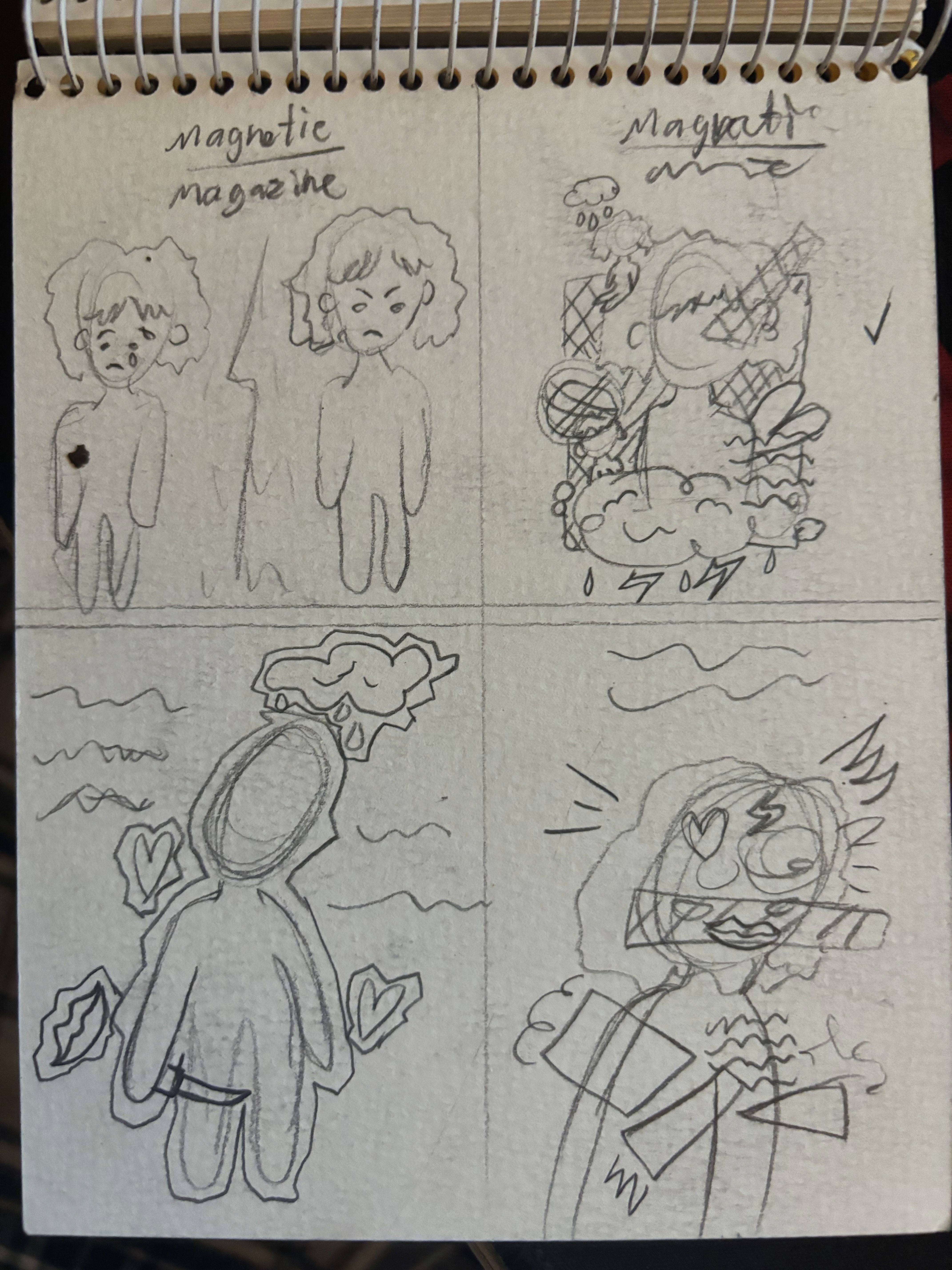
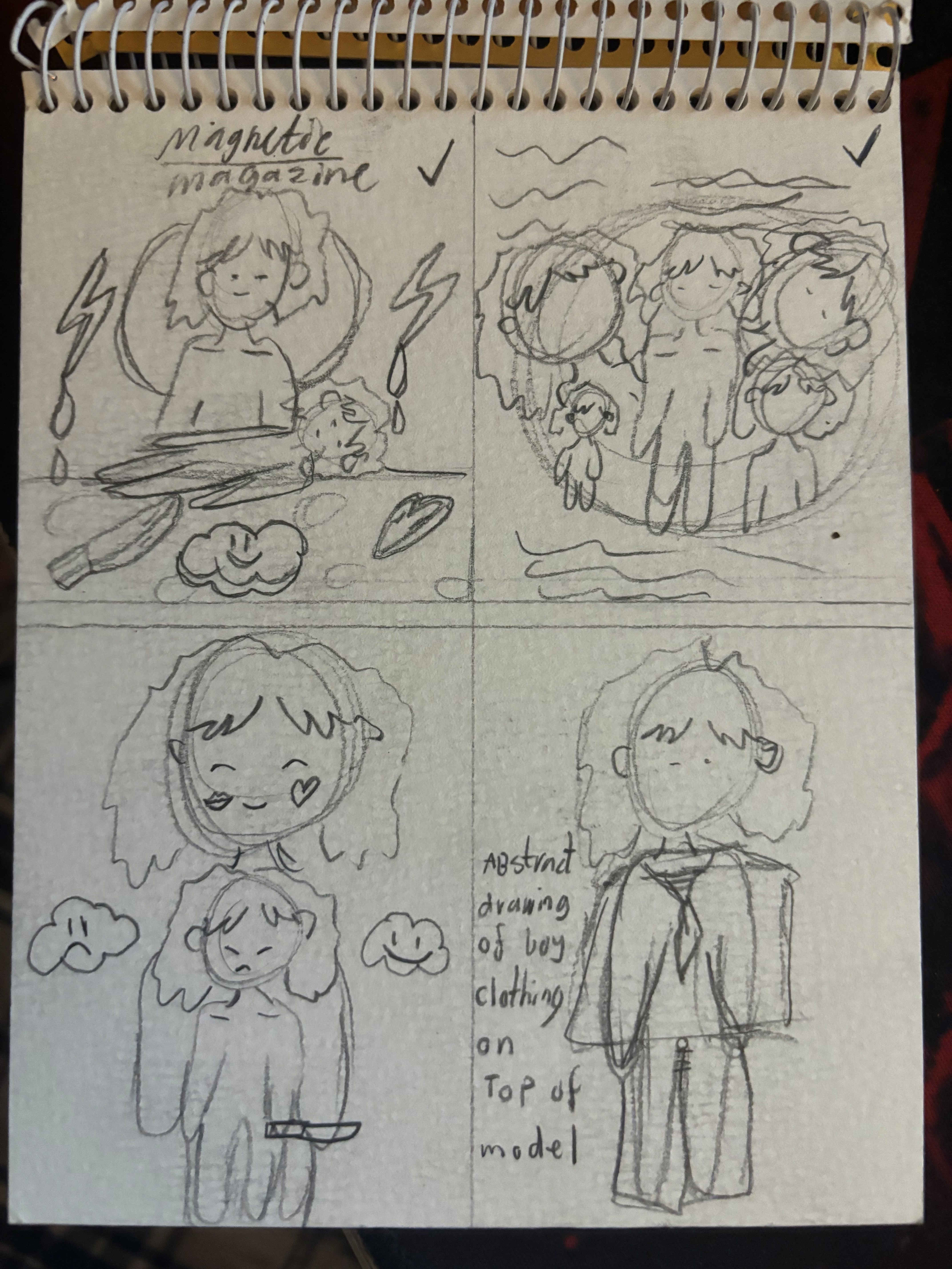
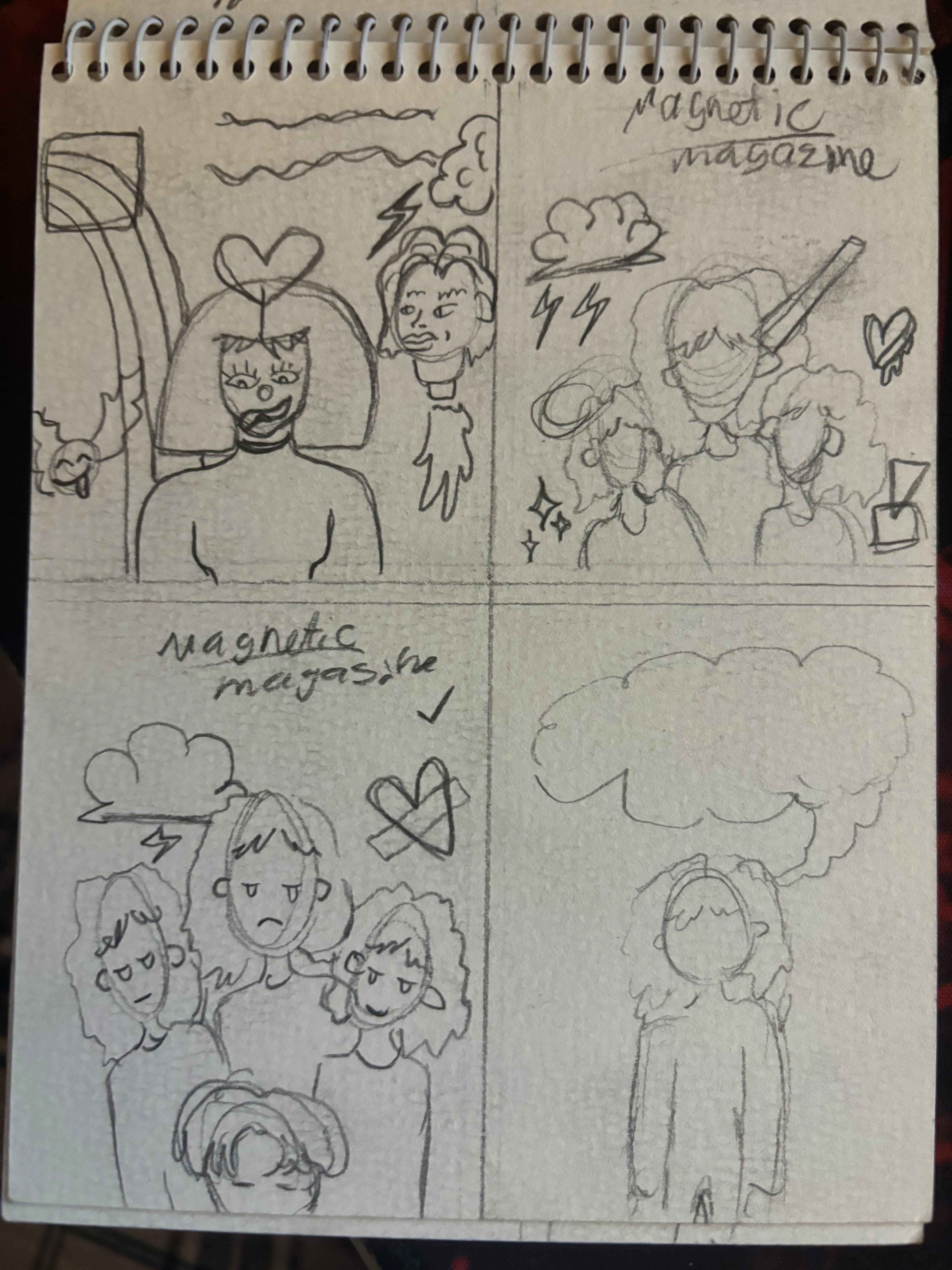
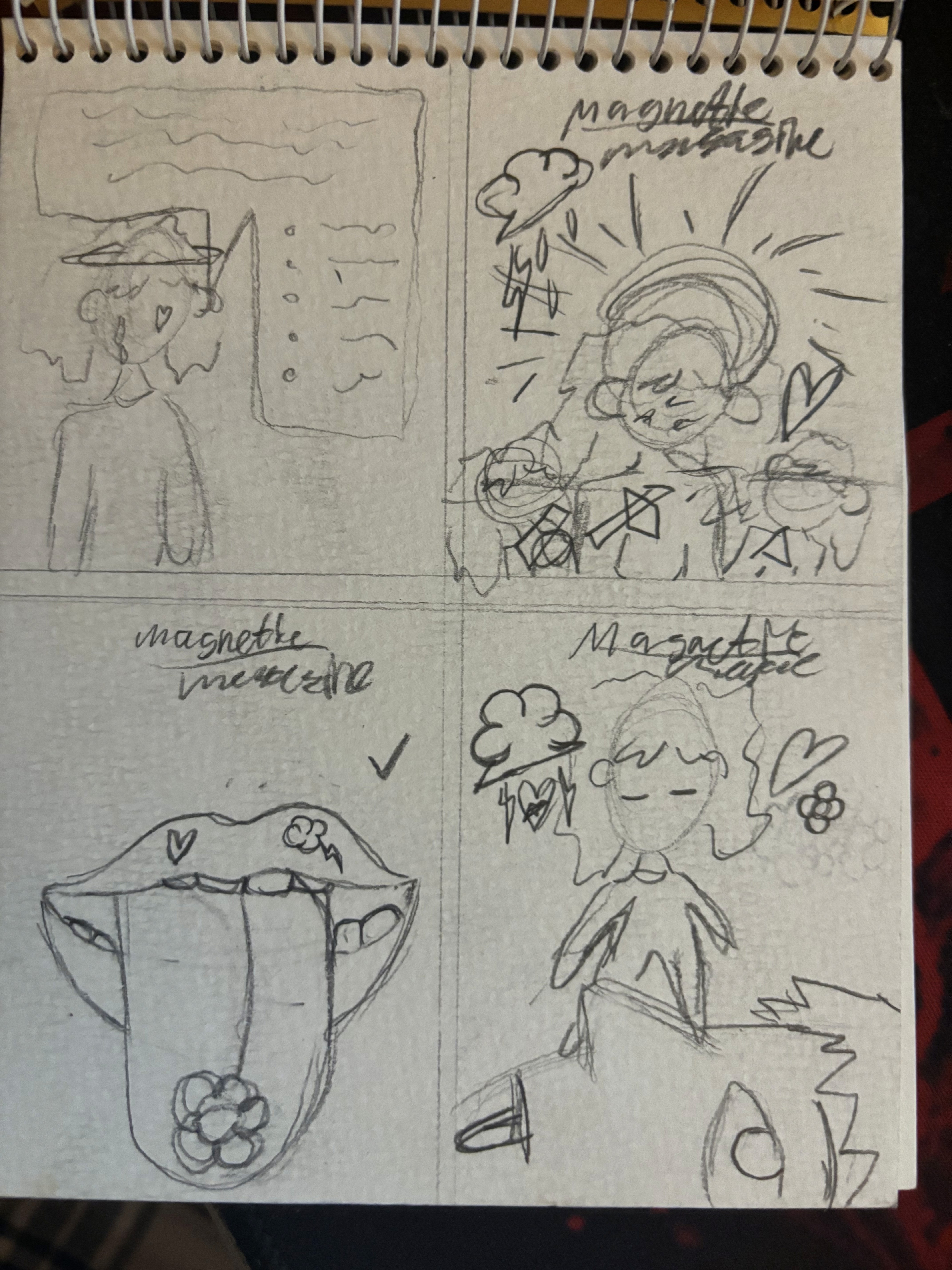
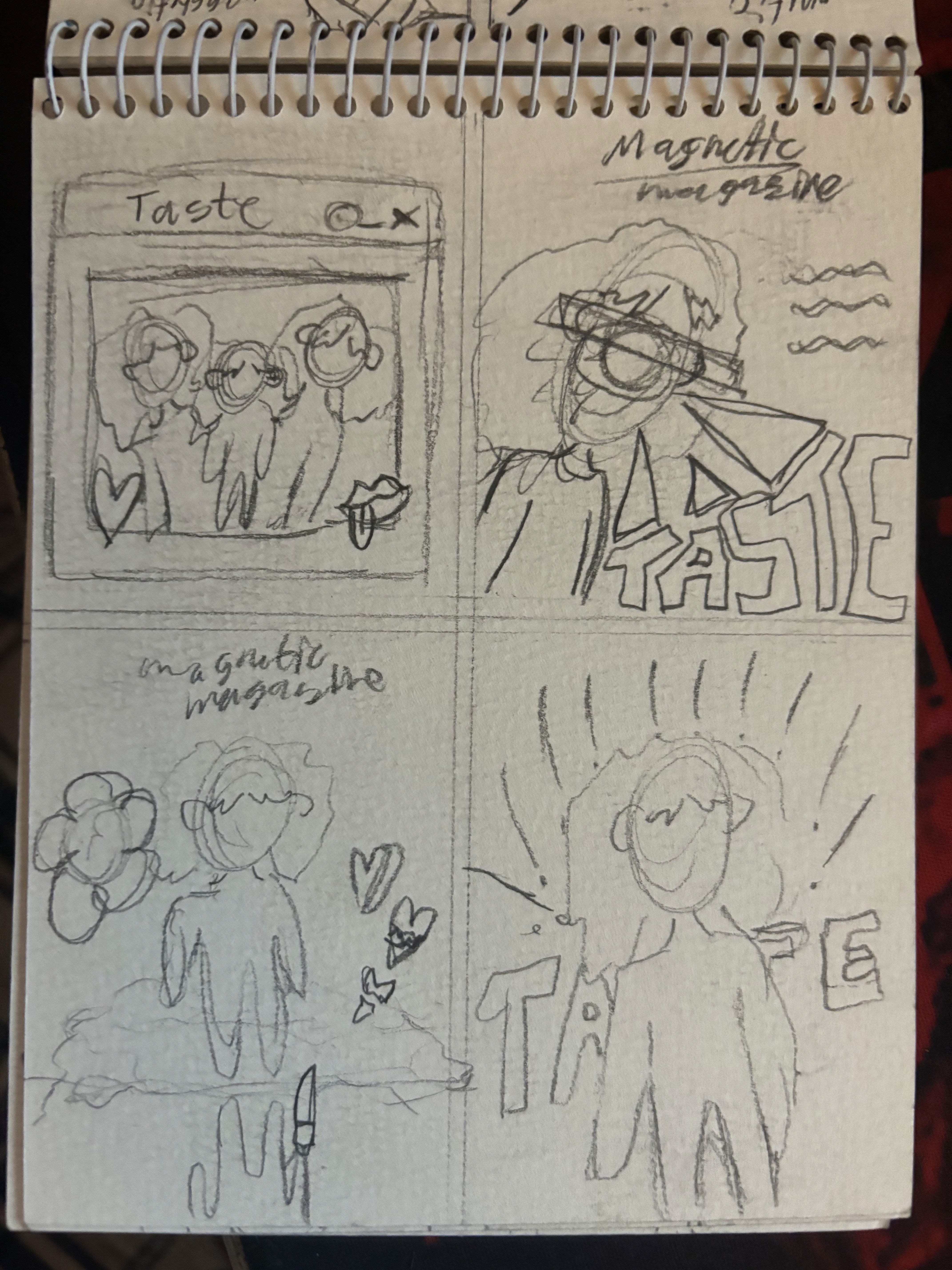
I developed the magazine from concept through to final layout, selecting a visual theme and grid system to guide consistency. Chose typography, image treatments, and colour palette that would support readability while also giving the magazine personality. Created mockups of spreads (cover, contents, feature articles) to show how layout elements work across pages. Paid attention to margins, hierarchy of text, visual pacing, and how images lead the reader through content.


Challenge :
The main challenges were managing information density (lots of text), making sure each spread had visual interest without feeling cluttered, and ensuring consistent typographic hierarchy throughout. Also, designing for both print and digital mockups meant considering how colours and layouts translate when printed vs displayed on screen.
Summary :
Magnetic Magazine successfully demonstrates my ability to plan, design, and execute an editorial project with coherence and style. It shows strong skills in layout design, typographic decision-making, and visual storytelling. The completed magazine mockups present a refined publication that reflects both creative vision and practical design standards.

More Projects


Graphic Design
Print Magazine assignment
A magazine design project completed during my studies at Noroff, focusing on editorial layout, typography, and visual storytelling to create a cohesive and professional publication.
Year :
2025
Industry :
Graphic Design
Client :
University Assignment
Project Duration :
6 weeks
Problem :
As part of my studies at Noroff, I was tasked with designing a magazine that would demonstrate not just layout skills, but strong editorial design—balancing text, imagery, typography, and overall visual flow. The existing work lacked cohesion, so the brief required creating something polished, readable, and stylistically unified for print.
Solution :
I developed the magazine from concept through to final layout, selecting a visual theme and grid system to guide consistency. Chose typography, image treatments, and colour palette that would support readability while also giving the magazine personality. Created mockups of spreads (cover, contents, feature articles) to show how layout elements work across pages. Paid attention to margins, hierarchy of text, visual pacing, and how images lead the reader through content.
Challenge :
The main challenges were managing information density (lots of text), making sure each spread had visual interest without feeling cluttered, and ensuring consistent typographic hierarchy throughout. Also, designing for both print and digital mockups meant considering how colours and layouts translate when printed vs displayed on screen.
Summary :
Magnetic Magazine successfully demonstrates my ability to plan, design, and execute an editorial project with coherence and style. It shows strong skills in layout design, typographic decision-making, and visual storytelling. The completed magazine mockups present a refined publication that reflects both creative vision and practical design standards.
More Projects
Graphic Design
Print Magazine assignment
A magazine design project completed during my studies at Noroff, focusing on editorial layout, typography, and visual storytelling to create a cohesive and professional publication.
Year :
2025
Industry :
Graphic Design
Client :
University Assignment
Project Duration :
6 weeks
Problem :
As part of my studies at Noroff, I was tasked with designing a magazine that would demonstrate not just layout skills, but strong editorial design—balancing text, imagery, typography, and overall visual flow. The existing work lacked cohesion, so the brief required creating something polished, readable, and stylistically unified for print.
Solution :
I developed the magazine from concept through to final layout, selecting a visual theme and grid system to guide consistency. Chose typography, image treatments, and colour palette that would support readability while also giving the magazine personality. Created mockups of spreads (cover, contents, feature articles) to show how layout elements work across pages. Paid attention to margins, hierarchy of text, visual pacing, and how images lead the reader through content.
Challenge :
The main challenges were managing information density (lots of text), making sure each spread had visual interest without feeling cluttered, and ensuring consistent typographic hierarchy throughout. Also, designing for both print and digital mockups meant considering how colours and layouts translate when printed vs displayed on screen.
Summary :
Magnetic Magazine successfully demonstrates my ability to plan, design, and execute an editorial project with coherence and style. It shows strong skills in layout design, typographic decision-making, and visual storytelling. The completed magazine mockups present a refined publication that reflects both creative vision and practical design standards.